Civil Air Patrol Unit Logo Design Guide: Squadron Branding & Recognition
Every Civil Air Patrol cadet squadron operates under the same official roundel — the distinctive red-and-blue propeller emblem that the organization has carried since its earliest years as the Air Force’s auxiliary. But within the CAP brand framework, individual squadrons have meaningful room to develop unit-specific visual identity: the graphics, crests, banner layouts, and design language that make Composite Squadron 42 at a high school in Virginia instantly distinguishable from Composite Squadron 114 at a school in Arizona. A well-designed civil air patrol unit logo does not compete with the official emblem — it complements it, adding the local personality, school connection, and unit history that the national mark cannot convey on its own.
Read More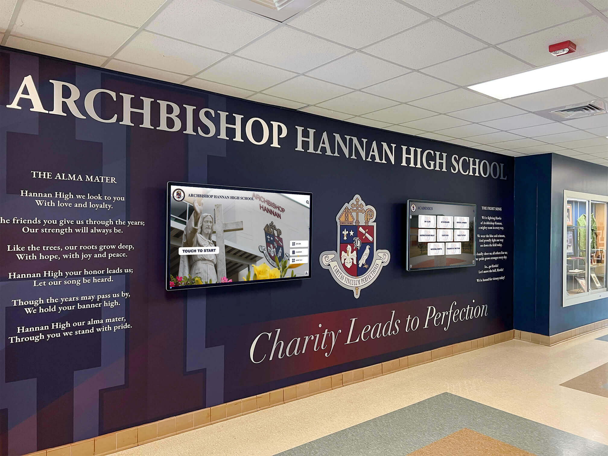
JROTC Logo Design Ideas for School Recognition Displays
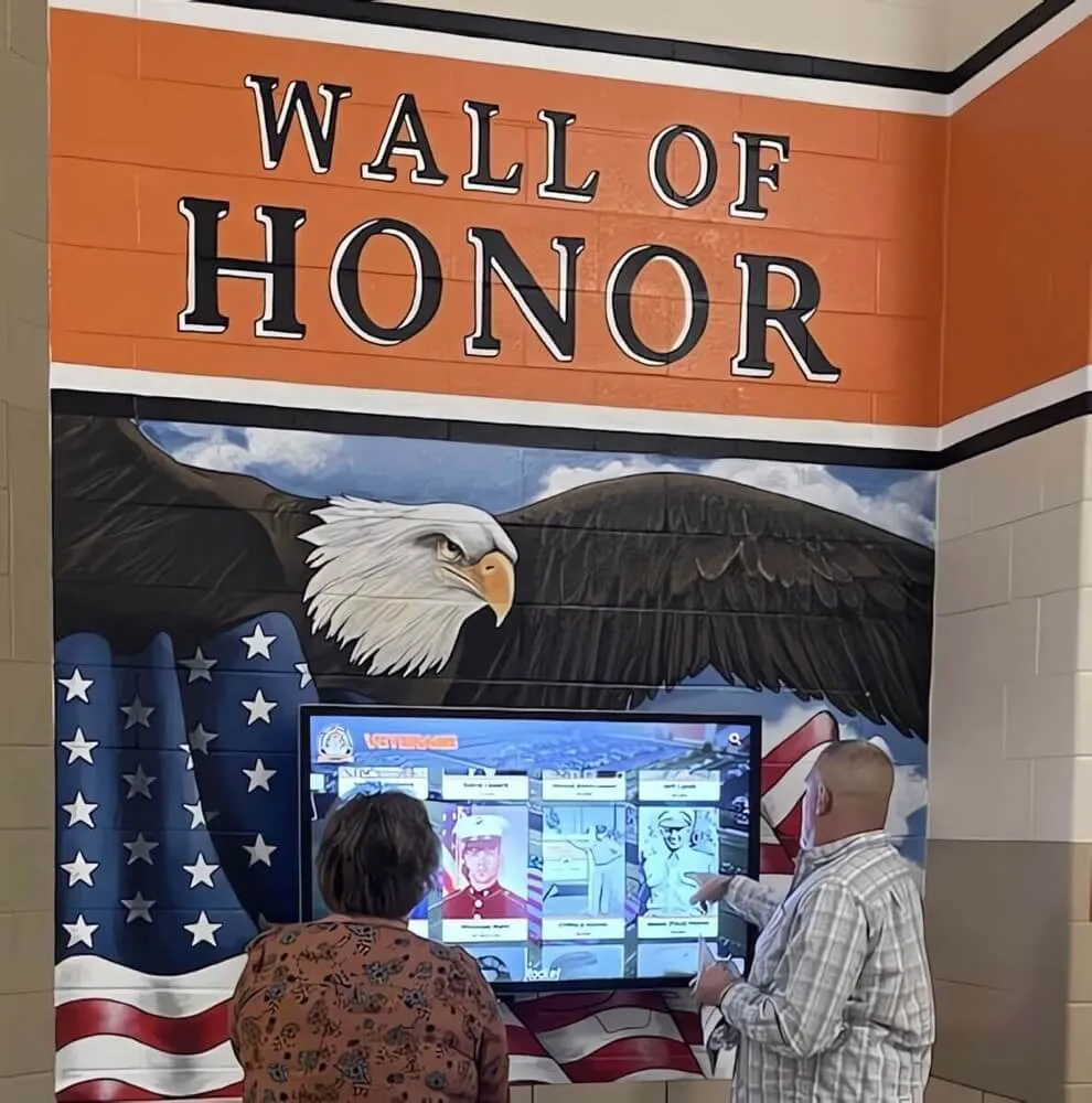
Every JROTC unit carries a visual identity that reaches far beyond the classroom — showing up on the building lobby wall, the program banner, the cadet’s uniform shoulder, and the recognition display that greets prospective members on their first visit to campus. The logo, crest, or unit emblem a battalion designs is not just a graphic; it is the face of a program that demands discipline, earns respect, and builds leaders year after year. Done well, a JROTC unit logo anchors every display in the school’s recognition environment and makes clear that this program is something worth joining.
Read More