Effective sports banner design is not about choosing the most visually impressive layout — it’s about ensuring that every person who encounters a banner can read it quickly, clearly, and from the distance at which they’ll actually see it. A championship banner mounted twenty feet above a gymnasium floor has completely different readability requirements than a social media graphic viewed on a phone screen, and both differ from a touchscreen recognition display that a student reads from arm’s length in the hallway. When athletic departments design each banner format using the same conventions, the result is visual inconsistency that undermines program identity. When they design each format using rules matched to its environment, every banner — physical, digital, or social — reads as part of a coherent, professional athletic program.
This guide covers readability rules for sports banners across three distinct environments that school athletic departments manage simultaneously: gymnasium and facility banners, social media and digital graphics, and permanent recognition displays. The rules aren’t interchangeable between environments, but the underlying principle is the same in all three: legibility at the right viewing distance is the design’s primary job.
Why Readability Is the Core Challenge in Sports Banner Design
A banner that looks polished in design software can fail completely in the environment where it’s actually displayed. The most common failure modes are predictable: text too small to read from viewing distance, color combinations with insufficient contrast under fluorescent lighting, fonts with fine details that blur at reduced size, and information hierarchies that don’t tell a viewer where to look first.
The signage industry has established letter height guidelines based on viewing distance: for every 10 feet of viewing distance, letter height should be approximately 1 inch. A championship banner mounted at the 25-foot line of a gymnasium requires letters at least 2.5 inches tall — which, when translated to a typical banner width of 3 feet, means the primary text must be set at a very large point size with minimal secondary elements competing for visual space.
Social media graphics flip this entirely. An Instagram feed post is viewed at 6–10 inches, but the graphic is rendered at 390–430px wide on most phones. Text that reads easily at 72pt in design software may be illegible at thumbnail size if the font has narrow strokes or complex letterforms.
Recognition displays occupy a middle ground: viewed at 3–8 feet, interactive, and expected to communicate layered information rather than a single headline.
Understanding which environment a banner serves is the prerequisite for every other sports banner design decision.

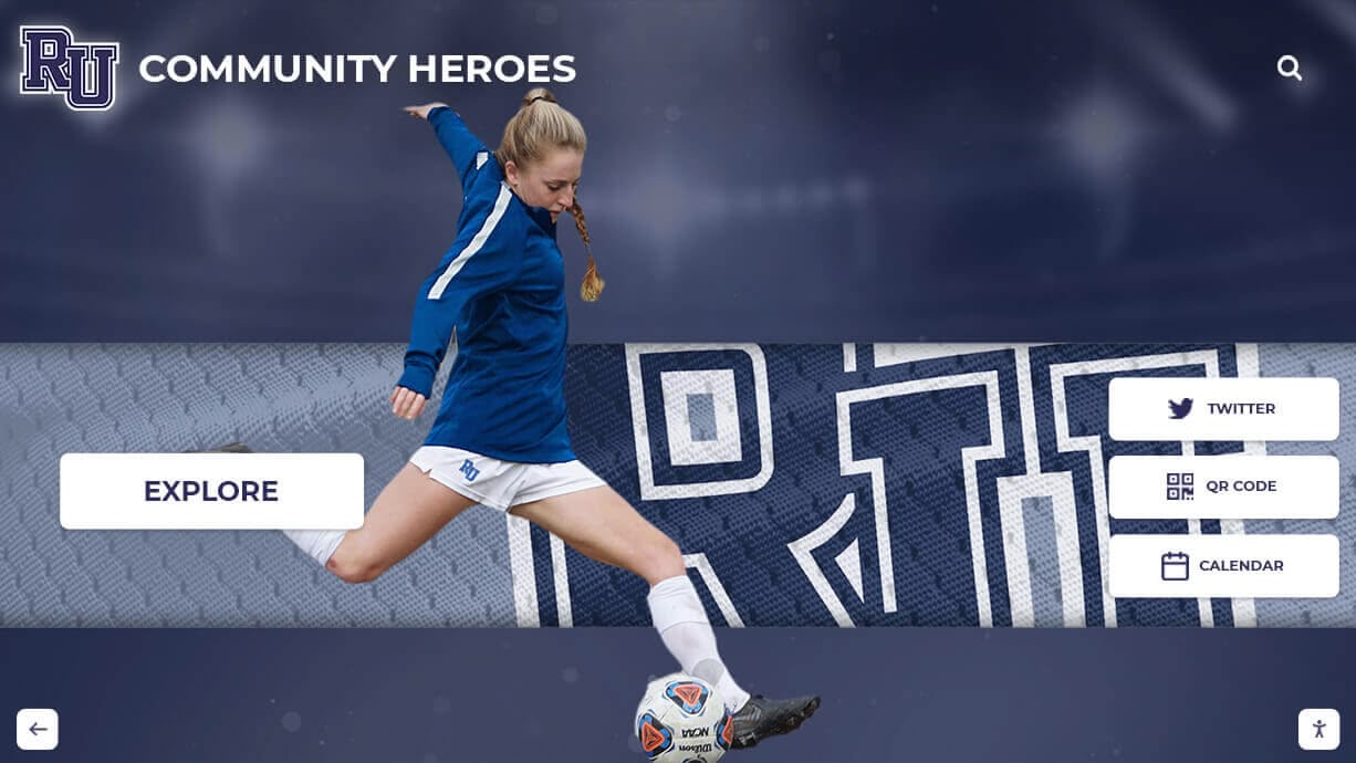
A community heroes banner display must communicate sport, identity, and recognition at multiple distances simultaneously — the same readability challenges that govern championship gym banners apply to large-format recognition displays
Readability Rules for School Gym Banners
Physical gymnasium banners — championship banners, retired number banners, conference title banners, and athletic hall of fame recognition banners — are among the most permanent communications an athletic department produces. They hang in the same location for decades, which means design errors that looked minor at the production stage become permanent fixtures.
Letter Height and Viewing Distance
Use the 10-foot rule as your starting point: 1 inch of letter height per 10 feet of viewing distance. For a banner mounted at 20–25 feet, primary text needs to be at minimum 2–2.5 inches tall. For banners mounted above the court line at a typical high school gymnasium (35–40 feet at the apex), primary text should be 3.5–4 inches tall.
This rule applies to the smallest text a viewer needs to read from the center of the floor. Supporting text — dates, conference names, coach names — can be smaller, but should not appear smaller than 1 inch at viewing distance unless it’s supplementary information that viewers are meant to approach the wall to read.
Font Weight for Gym Environments
Bold and extra-bold weight condensed sans-serif fonts outperform everything else in gymnasium environments. The combination of condensed width (which allows more text to fit at a readable scale) and heavy weight (which holds contrast under variable gymnasium lighting) is the foundation of effective gym banner typography.
Avoid:
- Script and italic fonts — the slant creates legibility problems at distance
- Light or thin weight typefaces — strokes disappear against fabric backgrounds under overhead lighting
- Display fonts with complex decorative elements — detail blurs at 25+ feet
Prefer:
- Condensed bold or extra-bold sans-serifs for primary text (championship year, athlete name)
- Regular or medium weight condensed sans-serif for secondary text (sport, conference)
- Single font family with multiple weights rather than mixing unrelated typefaces
Contrast Requirements for Physical Banners
The WCAG 2.1 standard requires a minimum contrast ratio of 4.5:1 for normal text. For gymnasium banners viewed from 20–40 feet under overhead lighting — which can wash out contrast significantly — a target of 7:1 or higher is more appropriate. White text on a dark school color background, or dark school colors on a white or light background, consistently outperform medium-value combinations.
The highest-contrast combinations for school gym banners:
- White on navy, dark green, maroon, or black
- Black or dark navy on gold, white, or light gray
- Avoid: gold on white, medium blue on white, red on green, or any medium-value combination
Color naming conventions on school banners should always use actual school brand hex codes when designing for print production — a navy that’s slightly off-specification reproduces differently across banner print runs and creates visible inconsistency when multiple banners from different years hang in the same gymnasium.

School athletic hallways that combine physical mural elements with digital recognition screens must maintain consistent readability standards across both surface types — the design rules for gym banners carry directly into digital display environments
Sports Banner Design for Social Graphics
Social media athletic graphics follow different rules from physical banners, but readability remains the same priority. The viewing distance is shorter — a phone held at arm’s length — but the attention window is drastically compressed. A social post competes with everything else in a feed and has roughly 2–3 seconds to communicate its primary message.
The Thumbnail Test
Every social sports graphic should pass the thumbnail test before publishing: resize the design to 150×150 pixels and check whether the primary information — score, athlete name, game result, opponent — is still readable. If any critical text becomes illegible at thumbnail size, the font size is too small or the weight is too light for the platform.
For the sports banner templates and social graphics that athletic departments produce at volume across a full season, this thumbnail test is a reliable quality check that can be applied in seconds before any graphic is published.
Information Hierarchy for Social Banners
Social sports graphics need a strict information hierarchy — one element that dominates at any size, with all supporting information visually subordinate to it.
Dominant element (largest, highest contrast): Score, athlete name, or event name
Secondary elements (clearly smaller, same weight family): Opponent, date, sport, team level
Tertiary elements (smallest, lowest emphasis): School logo, hashtag, website
A common mistake in school social banner design is treating the school logo and athlete’s name as visually equal elements. The logo is identity; it confirms whose program this is. The athlete’s name or game result is the communication; it’s what viewers came to read. Give the communication visual priority and let the logo confirm context.
Dimensions for Social Sports Banners
| Platform / Format | Recommended Dimensions | Use Case |
|---|---|---|
| Instagram Story | 1080 × 1920px | Senior night announcement, game countdown |
| Instagram Feed (square) | 1080 × 1080px | Score update, player spotlight |
| Instagram Feed (landscape) | 1080 × 566px | Schedule or team photo |
| Facebook Post | 1200 × 630px | Season preview, event promotion |
| Twitter / X | 1600 × 900px | Quick score, game result |
| Digital Lobby Screen (landscape) | 1920 × 1080px | Corridor display, entrance screen |
| Digital Lobby Screen (portrait) | 1080 × 1920px | Vertical hallway display |
| Printed Gym Banner (horizontal) | 3’ × 6’ at 150 DPI | Championship recognition |
| Printed Gym Banner (vertical) | 2’ × 5’ at 150 DPI | Retired number, MVP recognition |
The most important dimension rule for social sports banner design: always design at the largest format first. Scaling a 1920 × 1080px lobby screen graphic down to an Instagram Story maintains quality. Scaling a 1080px square up to a lobby screen introduces visible blur that makes a polished graphic look unprofessional.
Championship Banner Design Conventions
Championship banners are the most visible long-term investment in sports banner design a school athletic program makes. They hang for decades and they’re read by every student, athlete, and visiting team that enters the gymnasium. They also function as a competitive signal — a wall of championship banners communicates program history and achievement to recruits, parents, and rival programs before a single game is played.
Standard conventions for championship banner design follow a narrow range of accepted formats because they’ve evolved over generations of athletic program practice.
Standard Championship Banner Elements
Every championship banner should include:
- Sport and team level — “Varsity Boys Basketball,” not just “Basketball”
- Championship type — District, Regional, State, Conference, National
- Year — Four-digit year, large and readable (this is the primary data point)
- School name or mascot — Present on every banner; athletics logo version preferred
- School colors — Applied to banner background and text in official brand colors
Optional but common additions:
- Coach’s name (for title banners during their tenure)
- Final record (for state or national championship banners)
- Conference or organization name (IHSA, NFHS regional classification, etc.)
Recognizing championship athletes across your school’s history extends naturally from physical championship banners into digital recognition — touchscreen halls of fame can display the same championship information with expanded context, photographs, and player rosters that a physical banner doesn’t have space for.
Championship Banner Series Consistency
When a program has earned multiple championship banners over multiple decades, the visual consistency of the series becomes an asset. A wall of banners in matching dimensions, matching color treatment, and matching typographic conventions reads as an institutional achievement. A wall of banners in five different formats, mixed colors, and mismatched fonts reads as a collection of individual events that never coalesced into a program tradition.
If you’re redesigning a championship banner for a current year and the gymnasium already has a series of existing banners, match the established format — even if it’s not your ideal design. Visual continuity matters more than the aesthetic preferences of any single year’s production.

A championship recognition environment with consistent color treatment and layout — the visual coherence of a matched banner series communicates program tradition more effectively than individual banners optimized for individual seasons
Recognition Displays and Digital Banners
Recognition displays — athletic hall of fame installations, donor walls, community hero panels, retired number presentations — present a distinct sports banner design challenge: they need to communicate layered information that a viewer may engage with briefly (a student walking past in the hallway) or in depth (an alum returning for homecoming). Both audiences need to succeed with the same display.
Layered Information Architecture
The most effective recognition displays use a three-layer information architecture that serves both audiences:
Layer 1 — Identity (readable from 10+ feet): Name, sport, primary achievement (championship year, record, award). Large type, maximum contrast.
Layer 2 — Context (readable from 5 feet): Team, year inducted, career summary. Medium type, secondary visual weight.
Layer 3 — Detail (readable at arm’s length): Full career statistics, biographical notes, season records. Small type, fine detail that rewards closer engagement.
This architecture means the banner never fails either audience: the walking-past viewer reads name and sport and moves on; the engaged visitor gets the full story at closer range.
Athletic hall of fame displays that incorporate this layered approach — whether physical or digital — consistently outperform single-layer designs that try to communicate everything at the same visual weight.
Digital vs. Physical Recognition Banners
Physical recognition banners are permanent and require no maintenance once installed, but they can’t be updated, don’t support search, and can’t expand to accommodate new inductees without reprinting the entire panel.
Digital recognition displays — touchscreen walls, LED banner displays, corridor screens — support dynamic content that can be updated annually, include searchable athlete databases, and display photography and video that a printed banner cannot carry. For schools managing youth sports award programs across multiple sports and grade levels, a digital display system dramatically reduces the production cost of keeping recognition current.
The readability rules for digital recognition displays adapt the physical banner principles:
- Minimum 48pt equivalent for primary name display at full screen size
- Minimum 7:1 contrast ratio for all text on digital displays (screens wash out contrast in bright ambient lighting)
- White or very light backgrounds require dark text; dark backgrounds require white or light text — avoid medium-value color combinations
- Limit information density to what fits without scrolling on the primary display state — let interactive elements reveal additional detail

A physical champions wall and trophy case environment — the layered information architecture that makes recognition displays effective applies equally to physical trophy installations and digital display systems
Building a Visual System Across All Banner Formats
The highest-impact investment an athletic department can make in sports banner design is not improving individual graphics — it’s building a visual system that applies consistent rules across all formats simultaneously. When the same color palette, the same font family, and the same logo treatment appear on the gymnasium championship banner, the social media post, the corridor recognition display, and the printed program, the cumulative effect is a program identity that feels established, professional, and worth following.
System Elements to Standardize
Color palette: Document official hex codes for all school colors. Apply them consistently across every format — no approximations, no variations based on vendor defaults. Request proof copies of physical banner prints before approving full production runs.
Typography: Select two typefaces for the entire system — a bold condensed primary font for names, scores, and headlines, and a clean regular-weight secondary font for supporting information. Apply the same pairing across social graphics, physical banners, and digital displays.
Logo treatment: Establish one rule for logo placement and size in each format type, and apply it consistently. The logo appearing in different positions and sizes across different graphics creates visual noise that works against program identity.
Mascot usage: Define how the mascot graphic appears as a background element versus a featured element versus a badge. Consistent mascot treatment across the full system creates the visual coherence that makes a program’s communications feel intentional.
For athletic departments looking to build comprehensive recognition and award systems that extend from printed banners through digital displays, the same visual system standards apply — the tools change, but the identity requirements remain constant.
Youth sports award recognition programs that incorporate consistent banner design across physical and digital environments communicate a level of organizational investment that enhances both the award’s significance and the recipient’s experience.

A student interacting with a community heroes recognition display — the sports banner design principles that govern physical gymnasium banners carry directly into this digital recognition context, where readability at multiple distances determines whether the display serves passing students and engaged visitors alike
Connecting Banner Design to Permanent Athletic Recognition
The visual decisions made in sports banner design — colors, typography, mascot treatment, information hierarchy — don’t stop at the gymnasium wall or the Instagram feed. The same visual identity that appears in a senior night social graphic should extend to the physical championship banner, the corridor recognition display, and the school’s digital hall of fame.
Athletic departments that coordinate recognition across hall of fame tools and digital display platforms create a more complete and lasting recognition environment — one where a student athlete’s career is documented from the first season graphic through the permanent hall-of-fame installation, all in a consistent visual language.
For schools planning reunions and anniversary events, athletic recognition that spans historical records and current seasons creates the kind of institutional continuity that makes returning alumni feel genuinely recognized rather than simply invited.
Donor recognition programs that incorporate sports banner design standards into their recognition walls create an environment where athletic achievement and donor investment are presented with the same level of visual quality — reinforcing that both are valued equally by the institution.
For school athletic programs looking to turn scattered seasonal graphics into a coherent, permanent recognition system, Rocket Alumni Solutions builds touchscreen halls of fame, digital record boards, and recognition displays that apply the same readability standards across every surface — from the first season social graphic to the permanent corridor installation.

A school hall of fame lobby display with banner-scale identification — the Skyhawk Nation installation demonstrates how sports banner design principles translate from gymnasium championship banners to permanent corridor recognition environments
Frequently Asked Questions About Sports Banner Design
What are the most important readability rules for school gym banners?
The most important rules are letter height, font weight, and contrast. Apply 1 inch of letter height per 10 feet of viewing distance. Use bold or extra-bold condensed sans-serif fonts that hold under gymnasium lighting. Target 7:1 contrast between text and background — white on dark school colors or dark colors on white outperform medium-value combinations at distance.
What is the standard size for a championship banner in a school gymnasium?
Championship banners range from 2’ × 4’ to 3’ × 6’ depending on mounting height. At 20–30 feet, primary text needs at least 2–3 inches of letter height. At 35–40 feet near the gymnasium apex, use 3.5–4 inch letter height for center-court readability. Print at 100–150 DPI for vinyl or fabric output at banner scale.
How do you design a sports banner for social media?
Use correct platform dimensions: 1080 × 1080px for Instagram feed, 1080 × 1920px for Instagram Stories, 1200 × 630px for Facebook. Apply a strict visual hierarchy where one element — score, name, or event — dominates. Resize to 150×150px as a thumbnail test: if critical text becomes illegible, the font size or weight needs adjustment before publishing.
What fonts work best for sports banner design?
Bold condensed sans-serif fonts perform best across all banner environments. Bebas Neue, Impact, Anton, and Oswald ExtraBold deliver high legibility at gymnasium viewing distance. For social and digital displays, Barlow Condensed and Montserrat Bold work across screen sizes. Use a maximum of two typefaces per design system — one bold condensed for primary information, one clean regular-weight for supporting details.
How should a school athletic department create consistent sports banner design across formats?
Document four standards: official color hex codes, a two-font family, fixed logo placement rules per format, and defined mascot usage guidelines. Apply the same system to physical gym banners, social graphics, digital corridor displays, and recognition installations. Consistent visual identity across all surfaces creates a program that reads as organized and established, rather than a collection of individually designed, unconnected assets.
From Gym Banners to Digital Recognition Walls
Rocket Alumni Solutions helps school athletic departments build recognition environments where every surface — from gymnasium championship banners to touchscreen halls of fame, digital record boards, and corridor recognition displays — applies the same readability standards and visual identity. Connect your season-by-season graphics to a permanent recognition system that serves students, alumni, and the entire school community.
Explore Athletic Recognition Solutions