A school athletic graphics color profile checklist is a structured reference that documents official team color values, configures design tools to use them correctly, and schedules regular audits so every graphic — from game-day social posts to hall of fame display panels — reproduces your brand colors accurately. Schools that follow one avoid the slow color drift that erodes visual identity across a season: a navy that renders as royal blue on a phone screen, a gold that slides toward yellow on a lobby display, or a maroon that prints darker than expected on the backdrop behind the scorer’s table.
Managing color profiles is an operational task, not a design preference. It belongs alongside content approval workflows and display maintenance schedules — a process that protects the program’s investment in its visual identity. This checklist is written for athletic directors, school administrators, AV and IT staff, and recognition program owners who produce graphics in-house and need a repeatable framework to keep team colors consistent year over year.
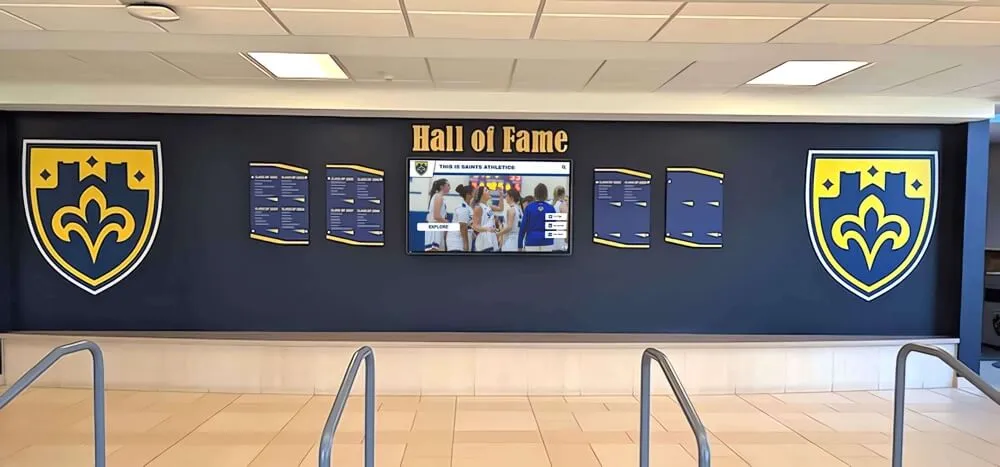
A hall of fame wall that consistently renders navy and gold shows what a managed color profile protects — the visual identity of the program across years of recognition content and multiple graphic producers
What a School Athletic Graphics Color Profile Covers
A color profile, in practical terms, is the combination of color values and export settings that tells every tool in your workflow — design software, social media platforms, digital display systems, and print vendors — how to reproduce your school colors accurately.
For school athletic graphics, this covers four areas:
- Color values: Official Pantone (PMS), CMYK, RGB, and hex codes for every color in your athletic identity.
- Design tool configuration: How those values are saved and locked inside the software your staff uses to build graphics.
- Export profiles: The color space and format settings that control how files are delivered to each destination — social media, print, or digital display.
- Audit cadence: A schedule for reviewing produced graphics against a color standard and correcting drift before it becomes the new normal.
Each area has its own failure mode. Undocumented color values mean every designer starts from a slightly different starting point. Unconfigured design tools allow staff to accidentally use a near-match instead of the official color. Wrong export profiles cause accurate on-screen colors to shift during file conversion. No audit cadence means small discrepancies accumulate invisibly until the brand looks noticeably different from what it did three seasons ago.
Why Color Consistency Is an Operational Problem, Not Just a Preference
School athletics programs produce graphics at a volume that makes color consistency a real operational challenge. Over a typical school year, a mid-size athletic department may publish hundreds of social graphics for game-day results, senior nights, schedule announcements, and award recognitions. Each is an opportunity for color to drift.
The problem compounds when graphics feed into long-lived recognition environments. A player photo wall, digital trophy case, or touchscreen hall of fame installation may include inductee profiles going back decades — each produced by a different tool at a different time. If no color standard governed those productions, the institution’s colors may look subtly different on every profile, undermining the authority of the recognition program.
The International Color Consortium (ICC), the standards body whose color management specifications underpin most professional design software, defines color profiles as descriptions of a device’s color space that allow images to be accurately converted between devices. For athletic graphic production, this means the color profile settings in your design software determine whether a file exported for social media matches what you see on your monitor — and whether a print file matches what a banner vendor’s press will produce.
Memorabilia display cases that combine trophies, photos, and donor gifts illustrate this problem at scale: when physical artifacts and digital panels share space, inconsistent color reproduction across the digital components stands out against physical reference points that do not change.
School Athletic Graphics Color Profile Checklist: Seven Steps
Step 1: Document Official Color Values in All Four Formats
Pull your school’s official athletic brand colors from the most authoritative source available — the district brand guide, the athletics department style guide, or the original vendor file from your uniform supplier. Record each color in all four standard formats:
| Format | Purpose | Example |
|---|---|---|
| Pantone (PMS) | Print matching — fabric, signage, banners | PMS 289 C |
| CMYK | Full-color print — flyers, programs, posters | C:100 M:70 Y:0 K:18 |
| RGB | Screen display — social media, digital signage | R:0 G:47 B:108 |
| Hex | Web and design software — social graphics, websites | #002F6C |
If your school only has one or two formats on file, use a Pantone-to-digital conversion tool — Adobe Color, Pantone Connect, or your print vendor’s matching guide — to derive the missing values. Document conversions and note that they are approximate, since not all Pantone colors have perfect RGB or hex equivalents. Capture every color in your athletic palette: primary, secondary, and any accent colors used in uniforms, championship banners, or official graphic templates.
Step 2: Create a Locked Color Reference Document
A color reference document is a single file — PDF, shared Google Doc, or laminated one-pager — that every person producing athletics graphics can access. It should include:
- All four color value formats for each palette color
- A labeled color swatch rendered in the correct RGB or hex values
- The source and date of the values (e.g., “from district brand guide, revised August 2025”)
- A printed swatch for visual comparison against physical outputs and display panels
Distribute this document to everyone involved in graphics production: coaches who build their own social posts, communications staff who design event graphics, AV staff who manage display content, and any vendors who produce print materials for the athletics program.
Staff who create seasonal graphics — tryout announcements, individual sport graphics like volleyball tryout promotions, or schedule releases — rely on this reference to avoid guessing which shade of blue or red is the official one.
Step 3: Configure Color Swatches in Every Design Tool Your Department Uses
Most design tools used for school athletic graphics — Canva, Adobe Express, Google Slides, Adobe Illustrator, or Photoshop — allow you to save custom color palettes or brand kits. Set up your official school colors in the color library of every tool your department uses.
For Canva (the most common school tool):
- Open Brand Kit in your account settings.
- Add each official color by entering its hex code exactly.
- Name each color clearly (“Official Navy #002F6C,” not just “Navy”).
- If your Canva plan supports it, restrict team members to Brand Kit colors only.
For Adobe Illustrator or Photoshop:
- Open the Swatches panel.
- Click “New Swatch” and enter the color name and values — CMYK for print output, RGB for screen output.
- Save the swatch library as a shared file and distribute it to all staff with access.
For Google Slides:
- Use the Custom Color option to enter hex codes directly.
- Document the hex codes in your shared reference document so staff can re-enter them in new presentations.
The goal at this step is to make using the correct color the path of least resistance. If the correct color is one click away in a saved palette, it will be used. If staff have to remember a hex code or guess visually, it will not.
Step 4: Set Export Profiles by Output Type
The same graphic can look different depending on how it is exported. Color profiles embedded in exported files determine whether colors that looked correct on your monitor render accurately on a phone screen, a print press, or a lobby digital display.
| Output Type | Color Space | File Format | Notes |
|---|---|---|---|
| Social media (Instagram, Facebook, X) | sRGB | PNG or JPG | Platforms convert to sRGB; export in sRGB to prevent unexpected shifts |
| School website | sRGB | WebP or PNG | sRGB is the web standard |
| Print (banners, posters, programs) | CMYK | PDF with embedded ICC profile | Confirm format with your print vendor |
| Digital signage / lobby display | sRGB | PNG or JPG | sRGB is standard for most commercial panels |
| Touchscreen recognition display | sRGB | PNG or JPG | Coordinate specific requirements with your display software vendor |
| Email graphics | sRGB | JPG or PNG | Email clients strip embedded profiles; sRGB provides the most consistent fallback |
Using the wrong color space is one of the most common causes of “that doesn’t look like our color” problems. A CMYK file displayed on a screen without proper color management will appear dull or shifted. An RGB file sent to a print vendor without conversion will produce unpredictable results on press.
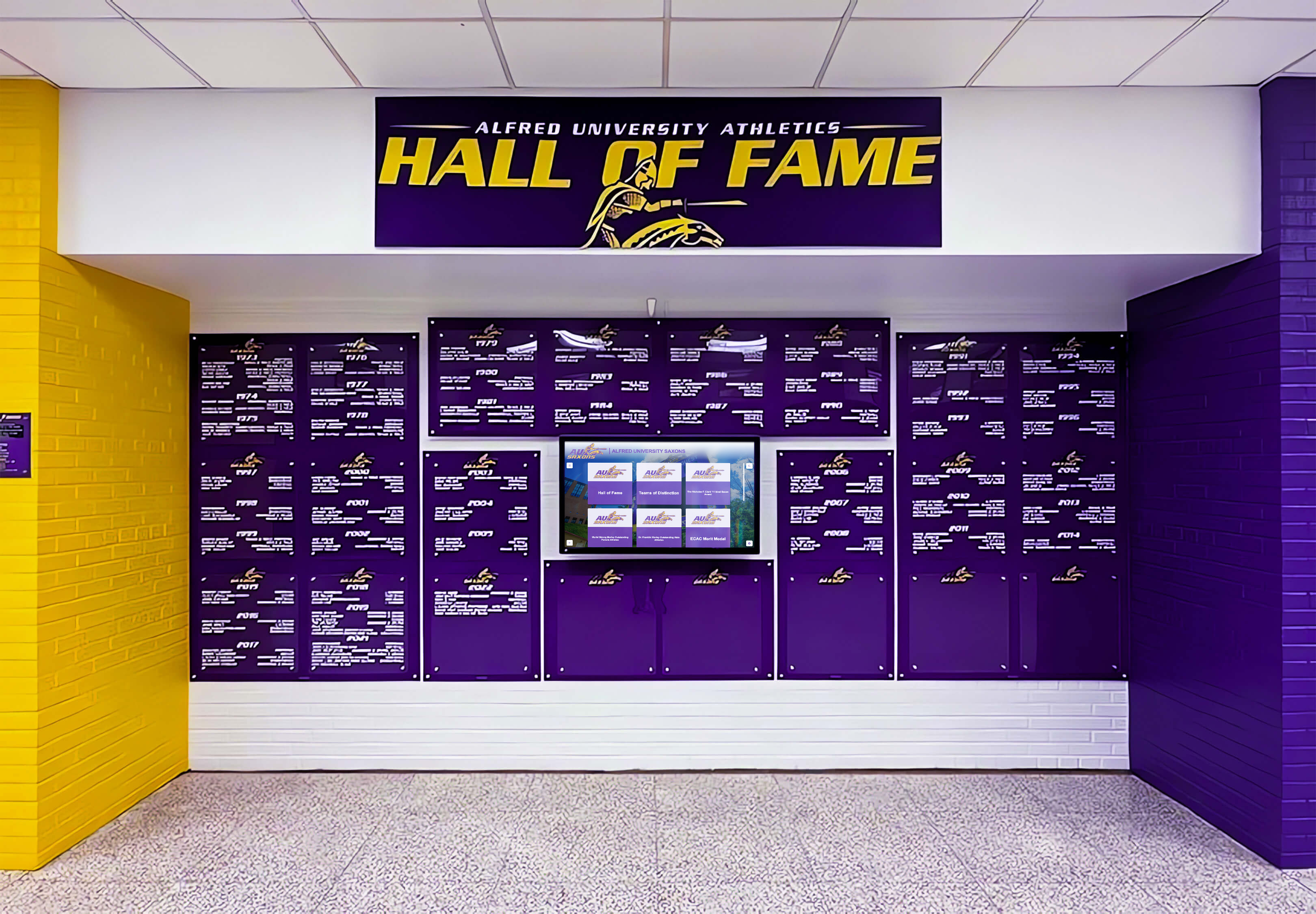
Vivid, on-brand colors like purple and gold on a recognition wall depend on correct export profiles and display calibration working together — an accurate source file is the first requirement, display maintenance is the second
Step 5: Build Templates with Color-Locked Design Elements
Templates reduce color errors by moving color choices upstream. Instead of each staff member picking a background color when building a graphic, a template uses the correct navy or maroon as a fixed element. Staff fill in the content — player name, score, event date — but cannot accidentally change the primary background color.
Build or commission templates for your most-produced graphic types:
- Game-day result announcements
- Player spotlights and senior recognition
- Season schedule graphics
- Award and achievement announcements
- Event promotions for banquets and awards nights
Well-designed templates for athletic banquet and awards ceremony programs need consistent color treatment — the template used for a coaches award graphic should reproduce school colors identically to the one used for a senior night post, so recognition content looks unified across an entire season.
Step 6: Audit Existing Graphics Against the Color Standard
Before relying on a new color reference document, audit what has already been published. Pull a representative sample of graphics from the previous season — twenty to thirty posts covering different sports, events, and graphic types. Compare each against the official color standard using a color picker tool or by placing the graphic next to the laminated color swatch.
Note any consistent deviations: a template using a slightly wrong shade of red, an older Canva design that drifted because the Brand Kit was not configured at the time, or social graphics posted by individual coaches using their own best-guess colors. Audit findings become the correction list for Steps 3 and 5. Update the affected templates before the next season so the audit does not repeat the same corrections year after year.
Step 7: Schedule Recurring Color Reviews
A color reference document and updated templates degrade slowly as staff turns over and new tools are adopted. Schedule two reviews per school year:
- Pre-season (August/September): Confirm all design tools have the current color palette. Update templates for the new year. Distribute the reference document to any new staff or coaches producing graphics.
- Post-season (May/June): Review the season’s graphic output for color consistency. Log deviations. Update templates before summer so corrections are in place for the following fall.
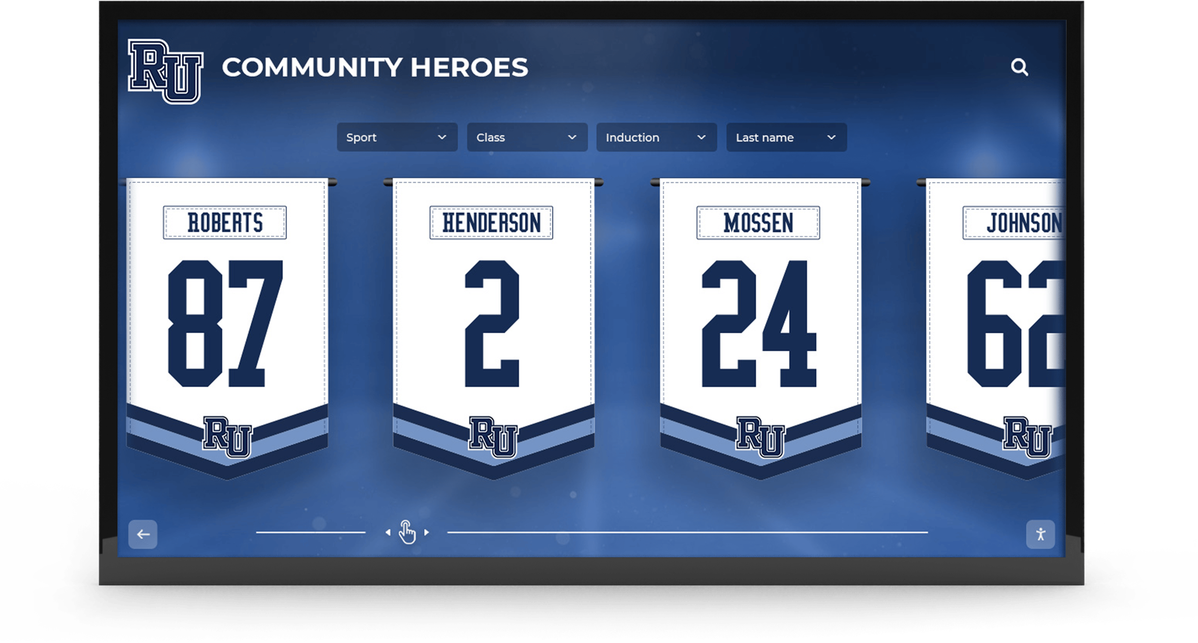
Recognition banners and digital displays that feature athlete jersey numbers across multiple sports depend on color consistency maintained across repeated graphic production cycles throughout the year
How Color Profiles Affect Recognition Displays and Award Programs
Display screens introduce a variable that static print does not: hardware that changes over time. A lobby display calibrated at installation may drift in brightness and color temperature within eighteen months. When school graphics feed into recognition environments — a touchscreen hall of fame, a digital record board, a wall-mounted honor roll — the color profile of the source graphics and the calibration state of the display interact.
School recognition screens operating across multiple campus locations need consistent color management at the graphic source — not only at the display hardware level. Graphics uploaded to display software should use the sRGB color space with correct hex values so the display renders them as intended, even as ambient light conditions and panel brightness vary across locations.
For schools with touchscreen recognition displays, this means coordinating two parallel workflows: the graphics production workflow covered in this checklist and a separate display calibration maintenance schedule. Award programs that appear across multiple formats — coaches awards displayed in the hall of fame alongside trophy case installations and printed programs — gain the most from consistent color profiles because the award appears in multiple contexts that alumni, parents, and current students compare against each other.
Legacy giving programs that tie donor recognition to athletic history also benefit from color accuracy: a donor wall that faithfully renders school colors communicates institutional care that reinforces the giving relationship over time.
Connecting Color Consistency to Broader School Graphic Environments
Color management extends well beyond social media graphics. Athletic color standards ripple through every visual environment the program touches.
Physical hallway environments: Gymnasium design and digital display integration in renovated school facilities often pairs painted murals with digital screen panels. When the mural color matches the digital panel color, the environment feels intentional. When they diverge — because digital graphics use a different hex value than the paint color used in the mural — the inconsistency undermines both.
Sporting event signage: Large-format event graphics — scoreboards, sponsor banners, and school sporting event signage including concession area displays — benefit from CMYK values derived from the same source document as social media hex codes. When print and digital values share the same source Pantone reference, they produce consistent color across media even when using different color spaces.
Long-term archival: Year-over-year recognition content — annual awards, graduating class honors, athletic records — accumulates over time. Schools that do not manage color consistently will find archives that reflect the tools and practices of each year rather than a persistent standard, creating a timeline of brand drift that becomes visible when old content and new content appear side by side on a display wall or digital archive.
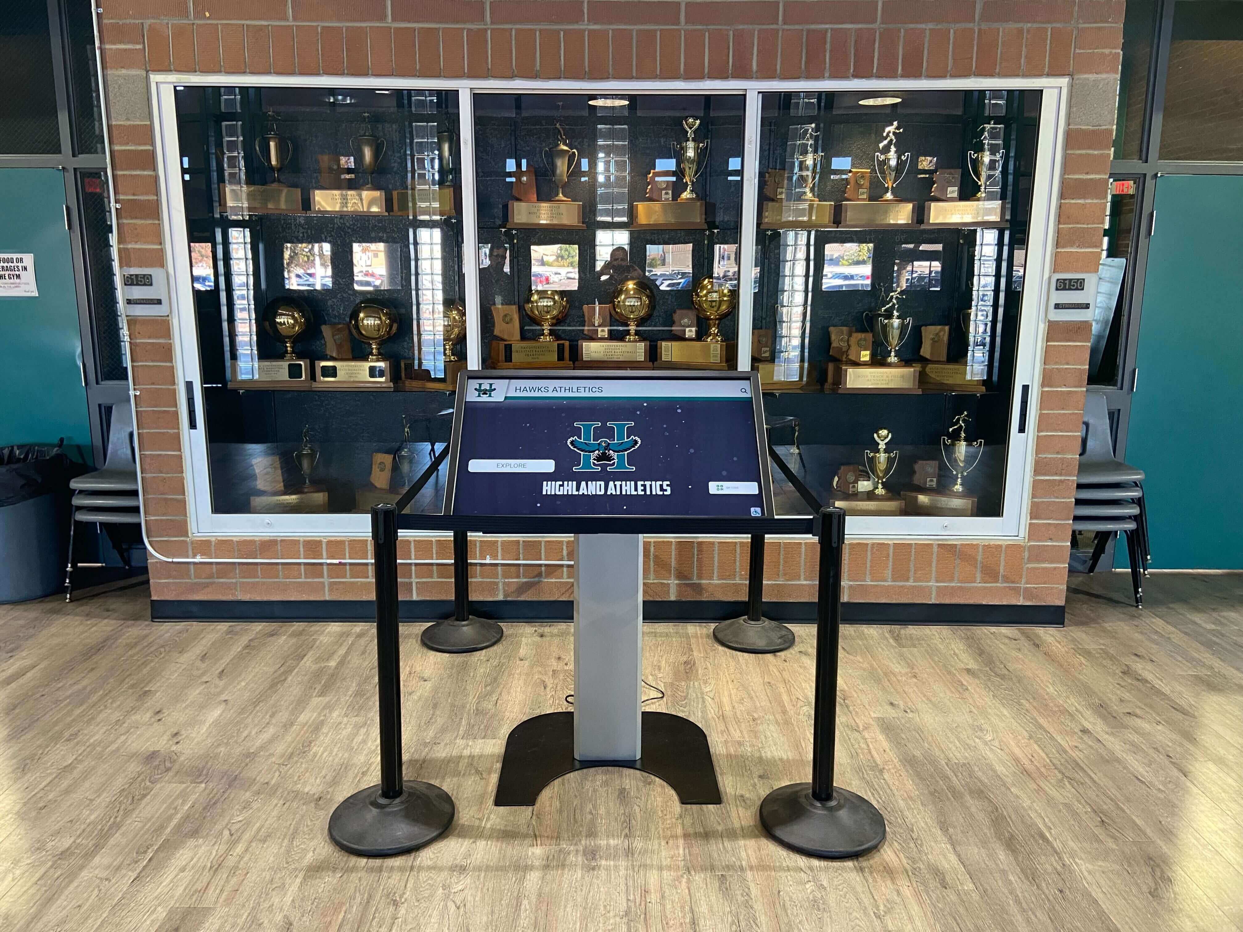
A touchscreen kiosk integrated into a physical trophy case must reproduce school colors consistently year over year — color profile management at the graphic level and calibration at the display level are both required to achieve this
Quick-Reference Checklist Summary
Use this table at the start of each school year to confirm every element of the color profile workflow is in place:
| Checklist Item | Who Owns It | Frequency |
|---|---|---|
| Official color values documented in PMS, CMYK, RGB, and hex | Athletic director or communications lead | One-time, then update when branding changes |
| Color reference document distributed to all staff | Athletic director | Pre-season annually |
| Design tool color palettes configured with official values | Designated graphic lead | Pre-season annually |
| Export profiles set per output type (social, print, display) | Graphic lead | Pre-season annually |
| Templates updated with color-locked elements | Graphic lead | Pre-season annually |
| Season-end audit against color standard | Communications or athletic director | Post-season annually |
| Display calibration log reviewed alongside color audit | IT or AV staff | Post-season annually |
Frequently Asked Questions About School Athletic Graphics Color Profiles
What is a color profile and why does it matter for school athletic graphics?
A color profile is a set of data that describes how colors should be rendered by a specific device or output medium. For school athletic graphics, it matters because the same color value can look different on a phone screen, a lobby display, a printed banner, and a social media post if color profile settings are not configured consistently. A documented color profile setup ensures that your school’s navy looks the same on every graphic your department produces, regardless of who made it or what tool they used.
What color formats should a school document for its athletic brand?
Every school should document its athletic brand colors in four formats: Pantone (PMS) for print matching on fabric and signage, CMYK for full-color print production, RGB for screen and digital display output, and hex codes for web graphics and design software. Having all four formats on file allows the correct value to be used for each output type without manual conversion that can introduce errors.
How can a school maintain color consistency when multiple staff members produce graphics?
The most effective approach is to configure official school colors in the shared design tool — Canva Brand Kit, Adobe shared swatches, or a similar palette feature — so that correct colors are one click away for every user. Combine this with locked color templates for common graphic types and a distributed color reference document. This removes the need for individual staff members to remember or guess color values across different graphic production tasks.
Which color space should school athletic graphics use for social media?
School athletic graphics intended for social media should use the sRGB color space exported as PNG or JPG. Major social platforms convert uploaded images to sRGB, so exporting in sRGB prevents unexpected color shifts during the platform’s own conversion process. Graphics produced in CMYK or wide-gamut color spaces will often appear dull or shifted when uploaded without a proper conversion step.
How often should a school review its athletic graphics color profile setup?
A practical schedule is twice per year: once before the school year begins — to update design tool palettes, redistribute the color reference document, and prepare templates for any new staff — and once at the end of the year to audit graphic output for consistency and correct any drifted templates. Schools that change design platforms should also perform an out-of-cycle review at the time of that transition.
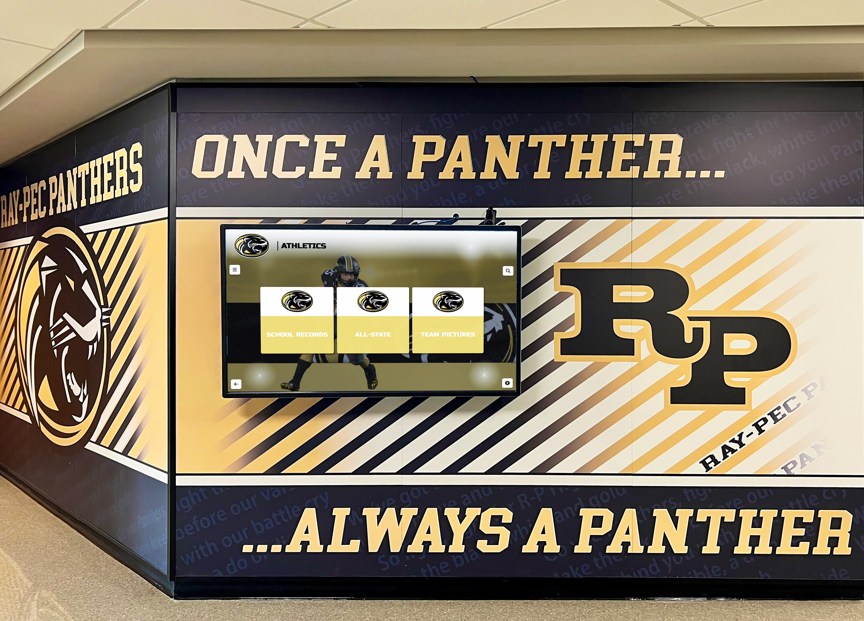
Hallway murals and digital screens that share the same color standard reinforce institutional identity at every point of contact — consistent source graphics and calibrated displays both contribute to this result
A Documented Color Standard Protects Every Graphic Your Program Produces
A school athletic graphics color profile checklist is not a one-time setup task — it is an ongoing operational commitment. Document the official values, configure the tools, lock the templates, set the export profiles, audit the output, and review on a schedule. Each step is manageable on its own. Together they protect the visual integrity of your athletic brand across hundreds of graphics, multiple staff members, and every platform your department publishes to.
Programs that manage color consistently communicate something beyond aesthetics: organizational discipline and pride in identity. That signal is visible to students, parents, alumni, and community members every time they see an on-brand graphic in their feed, walk past a recognition display in your hallway, or sit in a gym whose digital banners and physical murals match.
See How Rocket Alumni Solutions Builds Color-Consistent Athletic Recognition Systems
Rocket Alumni Solutions helps school athletic departments build touchscreen halls of fame, digital record boards, and recognition displays designed to render school colors accurately and stay consistent across years of recognition content and daily display operation.
Get notified when Rocket Graphics opens