Every high school athletic program communicates something the moment a visitor walks into the building. Championship banners hanging in the gymnasium, shield displays lining the corridor, a bold mascot mural stretching across the lobby wall — these elements say something before anyone reads a single name or date. At the center of all of it is the mascot logo: the mark that anchors every uniform, every banner, every recognition panel, and every social media graphic the program will ever produce. Mascot logo design done well doesn’t just look sharp at the moment it’s created; it builds the kind of recognizable identity that alumni still associate with school pride decades after graduation.
This guide covers the full range of mascot logo design approaches for high school athletic teams — from structural formats and mascot style choices to color strategy, typography, and the display environments where athletic logos live every day. Whether an athletic department is building a logo identity from the ground up, refreshing a mark that has drifted inconsistent over the years, or looking for design inspiration before commissioning professional work, these concepts give you a concrete visual framework to start from.

A school athletics hallway lined with shield-format program displays — one of the most common physical environments where mascot logo design directly shapes how an athletic department's identity is perceived by students, visitors, and alumni
Why Mascot Logo Design Is the Foundation of Athletic Team Identity
A school’s mascot logo is doing considerably more work than most athletic directors or coaches recognize when they first commission or inherit one. Think through the full list of contexts where the logo appears: game-day uniforms, warm-up gear, the school’s digital record board, hallway recognition panels, trophy case signage, championship banner headers, senior night posters, sports banquet slideshows, award plaques, and every social media graphic the program posts across an entire season. In each of those contexts, the logo either reinforces program quality or quietly communicates a lack of investment in visual identity.
The logo signals program seriousness. Athletic departments with a polished, consistently applied mascot logo read as better-organized and more accomplished programs — even before the trophies in the case validate it. That perception affects recruiting, community support, and how the department is positioned in budget conversations.
It creates cross-generational continuity. Alumni who graduated five, ten, or twenty years ago should recognize the logo when they come back for homecoming or see a current athlete wearing the team’s warm-up jacket. That recognition is what separates a logo that functions as a symbol of program legacy from one that functions as a seasonal graphic. Interactive recognition displays built around a stable, recognizable mascot logo create alumni connection that programs without consistent branding can never quite replicate.
It anchors every physical display. Hall of fame walls, athletic corridor murals, and trophy case panels all need a visual anchor — an element that immediately tells any visitor which program they’re looking at and signals why it matters. Without a strong mascot logo, even a display full of championship hardware reads as a collection of objects rather than a coherent program legacy.
It creates scale across digital and physical environments. A well-designed mascot logo works at the scale of a Twitter profile icon (200×200 pixels) and at the scale of a gymnasium entrance mural (ten feet wide). That range of scale is what makes a mascot logo different from a one-off graphic: it has to be designed with every application in mind from the beginning.
Mascot Logo Formats: Choosing the Right Structure
The most consequential early decision in any mascot logo design project is format — the underlying structural approach that determines how the logo is composed and where it will work best.
The Shield or Crest Format
The crest is the dominant format in American high school athletic identity. A shield shape filled with the school’s primary color, bearing a central mascot image, surrounded by the school name and program name — it’s the visual vocabulary of athletic tradition, and for good reason: it works.
A well-built athletic crest typically includes:
- Shield field — the background shape establishing primary school color
- Central charge — the mascot in its most recognizable pose (head, full body, or silhouette)
- Banner or ribbon element — carrying the school name, team name, or program motto
- Founding year — optional, but adds weight for programs with long histories
- Outer text ring — school name arcing across the top, team name or conference across the bottom
The crest format works best on large-scale applications: gymnasium banners, hallway panel displays, award plaques, and hall of fame wall installations. At small sizes — embroidered collar details, social media thumbnails — it can read as dense. Programs using a primary crest typically develop a simplified secondary version (often just the mascot head within the shield, without full surrounding text) for compact applications.
The Circular Badge or Roundel
The circular badge — central mascot device surrounded by text arcing around a ring — is the most practically versatile format for athletic programs that need a single mark to cover a wide range of applications from uniform embroidery to digital display graphics.
The circle has no orientation problem: it works horizontally and vertically, in print and on screen, at any rotation. It scales cleanly from large banner format down to a half-inch embossed detail. And it reads as both traditional and modern depending on the typeface and color treatment, giving programs flexibility in their visual tone.
The Wordmark with Mascot Accent
Some programs — particularly those whose school name or mascot name is itself visually distinctive — build their primary logo around typography. A bold, well-designed wordmark in strong school-color type, with the mascot serving as a secondary accent symbol rather than the primary visual element. This approach depends entirely on typography quality: a weak typeface undermines the entire mark, while a strong, distinctive letterform can create an immediately recognizable identity.
The Mascot Primary Mark
For programs where the mascot character or animal has strong enough visual identity, placing the mascot illustration at the center of the logo — larger than any other element, without the surrounding text architecture of a full crest — creates a bold, confident mark that works particularly well on large-format display contexts: gymnasium floors, painted building exteriors, and hallway murals.

A school athletics hall of fame featuring navy and gold shield displays — the consistency of mascot colors across every panel is what makes this the kind of recognition environment that alumni immediately recognize and students aspire to appear in
Mascot Style Choices: What Your Mascot Communicates
The animal, figure, or symbol chosen as the mascot carries symbolic weight that precedes every design decision. Before selecting colors, fonts, or layout formats, schools and design teams need to understand what the mascot communicates on its own.
Predatory Animals: The Competitive Identity Standard
Approximately 40 percent of American high school athletic programs use a predatory animal as their mascot — big cats, birds of prey, bears, wolves — and for understandable reasons. These mascots communicate strength, speed, competitive drive, and territorial pride without requiring any explanation. A panther, an eagle, a tiger: the qualities implied are instantly legible.
Big cats (Lions, Tigers, Panthers, Wildcats, Cougars) offer design flexibility across fierce head treatments, full-body poses, and stylized silhouettes. They work in both modern and traditional crest contexts and reproduce cleanly in embroidery.
Birds of prey (Eagles, Hawks, Falcons) offer strong profile-view design opportunities and translate well to banner-scale environmental displays. The spread-wing pose in particular creates dramatic, symmetrical compositions for hallway murals and gymnasium entrances.
Canines (Bulldogs, Wolves, Huskies) offer distinctive facial character — particularly the bulldog’s unmistakable jowl line — that creates recognizable head marks without requiring complex full-body illustration.
When designing any predatory animal mascot logo, the critical design choice is between a naturalistic rendering and a stylized/graphic rendering. Naturalistic designs communicate authenticity and prestige; stylized designs communicate energy and contemporary visual culture. Most high school programs benefit from landing somewhere between the two: recognizably the animal, but with enough graphic simplification that the logo reads clearly at small sizes and from a distance.
Non-Predatory Animals and Nature Symbols
Cardinals, dolphins, mustangs, rams — non-predatory animal mascots often reflect regional identity or school community values more than raw competitive aggression. They present the same design challenges as predatory animals (naturalistic versus stylized; head versus full body) with the added requirement of finding poses and expressions that communicate energy without predatory threat.
Human Figures: Warriors, Knights, Trojans, Patriots
Human figure mascots — particularly warrior archetypes — communicate honor, tradition, discipline, and community pride. The design challenge with human figure mascots is creating a mark that feels specific to the school rather than generic. A poorly executed Spartan helmet logo could belong to any of a thousand schools; a well-designed one, with careful choices about ornament, color field, and graphical detail, reads as distinctly this school’s.
Schools choosing human figure mascots should approach the design process with attention to historical accuracy and cultural sensitivity — particularly for any mascot that represents or draws from a specific cultural tradition. The design direction should honor rather than caricature.
Mythological and Natural Force Mascots
Dragons, Titans, Phoenix, Cyclones, Thunderhawks — mascots drawn from mythology or natural forces offer the greatest creative latitude in mascot logo design, because there’s no “correct” rendering to conform to. This freedom is also the challenge: without a widely understood visual reference point, the design has to work harder to establish recognition from scratch. Strong typography, distinctive color choices, and a bold central image become even more important when the mascot doesn’t carry the immediate visual vocabulary of an eagle or a bulldog.
Avoiding Generic Clip Art
Regardless of which mascot category applies, the single most important principle in high school mascot logo design is specificity. A mascot that looks like it was chosen from a stock library of athletic clip art communicates that the program didn’t invest in its visual identity. A mascot with genuine design intention — distinctive proportions, specific pose, thoughtful color treatment — communicates the opposite.
Digital record boards and athletic display systems are only as strong as the mascot logo anchoring them. When the logo is generic, every downstream display inherits that weakness.
Color Strategy for Athletic Mascot Logos
Color is the fastest communicator in any mascot logo. A visitor processes color before they parse a mascot shape or read any type — which means the color choices establish the visual tone of the entire identity before anything else registers.
School Colors as the Non-Negotiable Baseline
The athletic team’s mascot logo must use the school’s established primary and secondary colors. This is not a creative constraint; it’s the functional requirement that allows the logo to belong to the broader school identity ecosystem. A football team’s mascot in the wrong shade of blue creates confusion with the swim team’s banner in the hallway, the gymnasium bleacher trim, and the color of every other school-branded element in the building.
Primary color as the dominant field — the background of the shield, the fill of the badge circle, or the dominant treatment in a wordmark. This is the first color signal a viewer receives.
Secondary color for contrast and accent — borders, dividing lines, inner field elements, type treatments that need to contrast with the primary color. The secondary color creates the visual dynamic that prevents the logo from reading as a flat, single-color stamp.
White or neutral for legibility — virtually every athletic color combination needs a third neutral element to ensure type, fine lines, and small details remain legible across all applications. Maintain a white version of the full logo (white elements on the school primary color) and a standard version (colored elements on white) as minimum deliverables.
Metallic Treatments
Gold and silver metallics appear in a large percentage of high school athletic logos — for the associations with championship achievement, and because the school’s secondary color is often gold to begin with. In print and physical production contexts (embossing, metallic vinyl, foil stamping on award plaques), metallic treatments are powerful. In digital contexts, they require careful handling: metallic simulations in digital files can read as muddy or flat on screen.
A practical approach: design the standard version of the logo using a solid yellow-gold or cool gray, and specify the metallic treatment upgrade only for physical production contexts where the effect is achievable and reproducible.
Contrast for Display and Distance
Any mascot logo intended for large-format display — hallway banners, gymnasium murals, digital display screens, recognition panels in the athletics corridor — must be designed for high contrast at distance. The combinations that work:
- Dark navy on white or gold: high contrast, classic athletic aesthetic
- Black on gold or yellow: bold, highly readable at gymnasium scale
- White or light gold on dark field: dramatic, works well in digital display environments
Mid-value color combinations — where the logo and background have similar tonal darkness even if they differ in hue — will fail at distance or in variable lighting conditions.
![]()
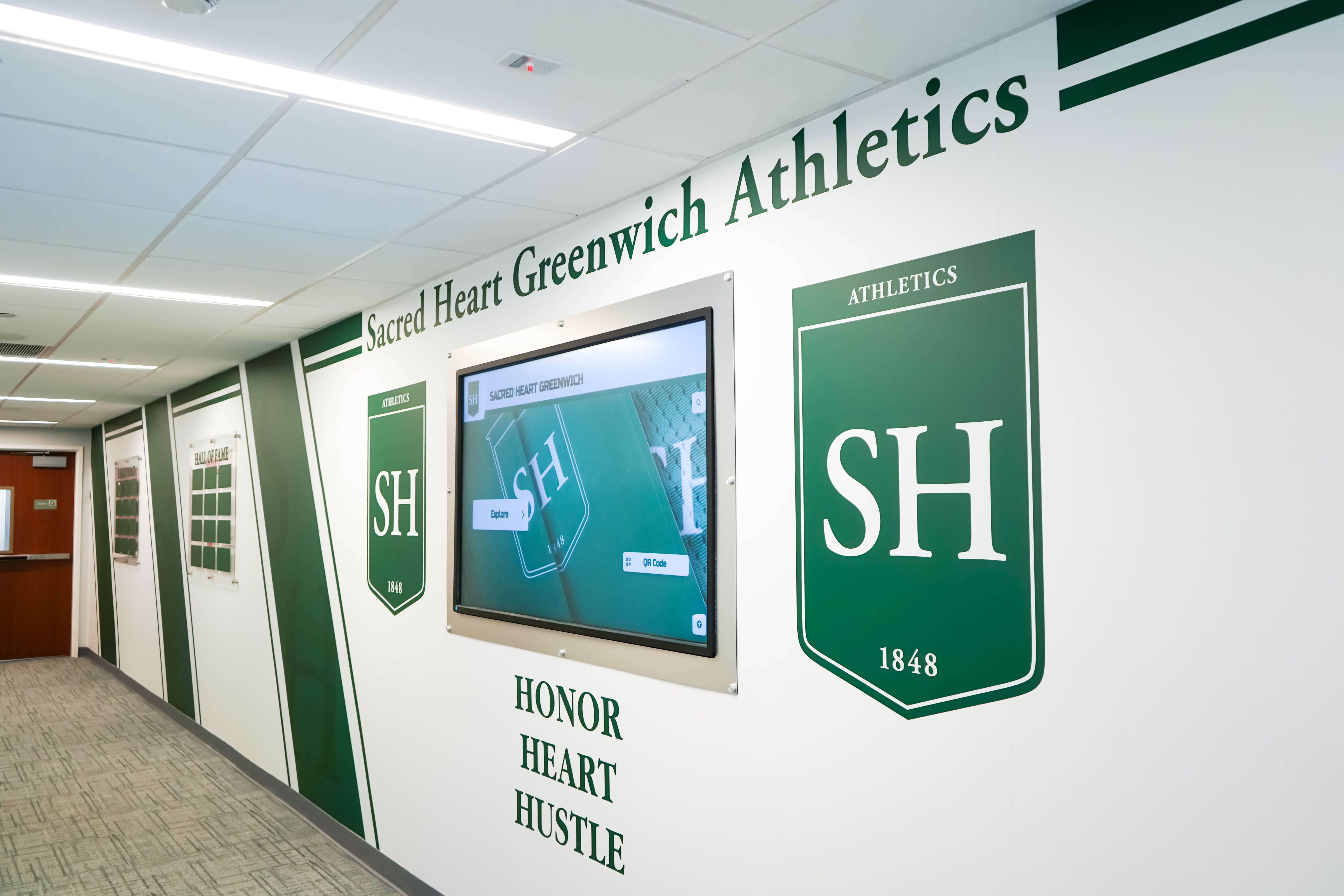
A school athletics hallway featuring the team's mascot logo integrated into recognition panels — demonstrating how consistent mascot logo application across the physical environment creates an identity that alumni recognize and students are proud to be part of
Typography in Mascot Logo Design
Typography is the element of mascot logo design most often handled with the least intentionality — and the one most responsible for the difference between a logo that reads as professional and one that reads as a quick job.
Serif Type for Tradition and Weight
A classic serif — particularly one with strong, consistent stroke weight and well-defined serifs — communicates program history, institutional prestige, and athletic tradition. Serif type pairs naturally with crest and shield formats and reads with authority at banner and hallway display scale. Many of the most recognizable high school athletic identities in the country use some form of block serif for the school name portion of the crest.
Bold Sans-Serif for Contemporary Athletic Identity
Programs building a more contemporary visual identity — one that aligns with the current aesthetic of Nike, Adidas, and major university athletic departments — often choose bold geometric or condensed sans-serif typography. This approach photographs well on digital screens, pairs naturally with modern mascot illustration styles, and scales cleanly across the range of applications from social media to gymnasium entrance signage.
Script and Display Fonts
Script type in athletic logos is relatively rare outside of spirit squad programs (dance teams, cheer squads) because it can undermine the bold, graphic quality that high school athletic identity typically requires. If a school’s program name or motto calls for a script treatment, use it sparingly and only for a secondary text element — never as the primary typographic anchor of the logo.
The Two-Typeface Rule
A mascot logo should use no more than two typeface families. One primary typeface for the program name or school name, one complementary typeface for supporting text elements (sport name, year, motto). Every additional typeface beyond two adds visual complexity without adding clarity or identity value.
Placing Mascot Logos in Athletic Recognition Environments
A mascot logo that exists only on uniforms and social media graphics is missing the most durable recognition context available: the school’s physical and digital recognition environment. Programs that establish mascot logo presence in hallway panels, trophy cases, championship banner displays, and digital recognition screens build program prestige in a way that no seasonal content can replicate.
Hall of Fame Panels and Recognition Walls
Championship banner and recognition display systems consistently use the program’s mascot logo as the primary visual identifier for each section of the recognition environment. When a visitor walks past the athletics corridor and sees a series of hall of fame panels, the mascot logo at the top of each section tells them immediately which program’s legacy they’re looking at before they read a single athlete’s name.
For trophy case integration, the mascot logo should appear at the top center of the program’s dedicated section, displayed at a minimum of eight to ten inches in its primary dimension. A printed background panel in school colors — rather than bare shelf or glass — creates a cohesive display context that treats the trophies as part of an intentional recognition environment rather than a storage arrangement.
Hallway Murals and Large-Format Displays
For programs with dedicated hallway recognition environments, the mascot logo typically anchors the mural composition — appearing at a scale that makes it immediately visible from the end of the hallway, before any surrounding text or imagery is legible. The key design principle at mural scale: bold, simplified, and high-contrast. Fine details that are visible at normal logo size disappear entirely at twenty feet.
Digital Record Boards and Athletic Displays
Digital record boards that display program records, season results, and athlete recognition panels use the mascot logo as the consistent visual anchor across every content state. Whether the screen is showing current season standings, all-time records, or athlete spotlight content, the mascot logo in the corner or header of each content panel ties the display to the program’s identity.
This consistency is what makes the logo valuable in digital display contexts: it doesn’t need to be large on every frame, but it needs to be present and consistent.
Trophy Room and Display Case Integration
Trophy room design for school athletic programs consistently benefits from a clear mascot logo presence at the entrance to the space and as a repeated visual anchor above each program’s dedicated display section. Schools with trophy rooms that lack a clear mascot logo identity often find the space reads as a warehouse of hardware rather than a curated celebration of program achievement.

Wingate athletics hall of fame featuring a bold bulldog mascot in the wall display — mascot logo design of this quality creates immediate program recognition and establishes the visual authority of the athletic department's recognition environment
Digital Display Applications for Mascot Identity
High school athletic programs increasingly operate in both physical and digital recognition environments — and the mascot logo needs to work in both with equal consistency.
Social Media Graphics and Athlete Spotlights
Every social media graphic the athletic department posts is an opportunity to either strengthen or dilute the mascot logo’s recognition value. Graphics created with consistent mascot logo placement — same position, same color treatment, same proportion relative to other design elements — build recognition equity across every post. Graphics where the logo moves around, varies in color, or disappears entirely in favor of other design choices undo that equity.
School branding programs that build strong visual identity treat the mascot logo as a non-negotiable anchor element in every externally facing design piece. This isn’t a creative constraint — it’s the mechanism by which the logo builds the recognition value that makes it meaningful.
Athletic Information Screens and Digital Signage
Touchscreen athletic information displays in school lobbies and athletics hallways need the mascot logo present in the interface design — not just as a splash screen element but as a persistent visual component that anchors every content category within the display system. When a student or visitor touches the screen to view football records, then swings to basketball schedules, then pulls up the swim team’s history, the mascot logo should be the consistent thread connecting all three.
Senior Night and Championship Celebration Displays
Senior recognition events and championship celebration materials represent the highest-visibility production moments for most programs. The mascot logo should anchor every element: the senior night banner behind the recognition moment, the slideshow title card at the start of the season highlights, the physical award plaques distributed at the year-end athletic banquet.
Digital wall of fame systems that integrate the mascot logo as the consistent header element across athlete profiles, championship records, and program history content create recognition environments that feel unified and intentional rather than assembled from disconnected pieces.
Varsity Letter Digitization and Archive Displays
Digitizing varsity letters and historical program records into searchable, displayable formats creates an opportunity to anchor the school’s athletic history under a consistent mascot identity — even across eras where the physical logo may have evolved. A digital archive that presents historical records with a standardized current logo treatment creates continuity between decades that the original physical materials may not have had.

A school hallway mural featuring a bold mascot character alongside integrated athletic records display panels — the combination of physical mascot identity and recognized achievement that gives an athletic program's history a home in the school's everyday environment
File Formats and Technical Specifications
A mascot logo is only as durable as the files in which it’s maintained. The most common cause of logo quality problems in school athletic programs isn’t bad design — it’s poor file management that forces teams to reproduce the logo from progressively degraded source files over time.
The Vector Requirement
The master mascot logo file must be in a vector format: SVG, Adobe Illustrator (AI), or EPS. Vector files describe graphic elements as mathematical shapes rather than pixel grids, which means the logo scales to any size — from the corner of a business card to a ten-foot gymnasium mural — without any quality loss.
If the current mascot logo exists only as a JPEG, PNG, or photo scan, the single most valuable investment the athletic department can make is a one-time professional redraw in vector format. This is not a small expense, but it pays dividends across every subsequent production use.
Standard Export Set
From the master vector file, maintain a standing library of:
- PNG with transparent background — for digital overlays, social media graphics, and any context where the logo appears over another color or image
- SVG — for digital display systems and web applications that support vector rendering
- PDF — for print vendor submissions; preserves vector quality and color profile data
- JPEG on white background — for general document use, email, and contexts that don’t support transparency
Required Color Variants
Every athletic mascot logo needs three color variants prepared before it goes into active use:
- Full-color standard — the primary version used across most applications
- Reversed/white — white or light elements on a dark or transparent background, for use on colored background panels and dark uniform fields
- Single-color black — for grayscale document contexts, embossing, and applications where color printing isn’t available
Having these prepared in advance prevents the improvised, inconsistent variants that get created under deadline pressure when the right file format isn’t at hand.
Common Mascot Logo Design Mistakes to Avoid
Using raster files as the master source. JPEG and PNG files look fine on screen but fail at large production sizes. Every significant production use — banner printing, mural artwork transfer, award plaque engraving — requires a vector source file.
Too much detail in the central mascot image. Fine hair textures, complex shading gradients, and intricate linework that look impressive in a large-screen digital rendering disappear entirely when the logo is embroidered on a uniform collar or displayed at small size on a record board. Test every mascot illustration at quarter-inch scale before finalizing the design.
Inconsistent color values across vendors. Using slightly different shades of the school’s primary color across different print runs, embroidery jobs, and digital productions — because each vendor applied their own color interpretation — creates a logo that looks like it belongs to three different programs. Maintain exact hex values for digital production and Pantone values for print and physical production, and provide these specifications to every vendor explicitly.
Designing only for the current moment. A mascot logo that reflects the design trends of a particular year will feel dated within a decade. The goal is a logo with enough timeless graphic quality that it serves the program for fifteen to twenty years without major revision. Trend-forward design choices that feel exciting in the year of creation often become the most dated elements five years later.
Frequent redesigns. A logo that changes every two or three years never builds the recognition equity that makes a mascot logo valuable. Alumni who graduated before the last redesign don’t recognize the current mark. The visual continuity that allows alumni to connect their school memories to current program identity requires logo stability across a full generation of students.
No planning for the reversed version. Athletics photography frequently captures teams against dark backgrounds — night game shots, gymnasium lighting, competition backdrops. A logo designed only for a light background will disappear in those contexts. Design the white/reversed version simultaneously with the standard version.
Frequently Asked Questions
What makes a strong mascot logo design for a high school athletic team? A strong mascot logo uses school colors as the primary color foundation, presents the mascot in a clear and specific pose that communicates the program’s competitive identity, maintains clean graphic simplicity that reads well at both small (embroidered) and large (banner) scales, and works consistently across both digital and physical production contexts. The logo should look like it was designed specifically for this program — not chosen from a stock clip art library.
What is the best format for a high school athletic mascot logo? The crest or shield format is the most widely used in American high school athletics because it communicates tradition, institutional seriousness, and program achievement. For programs that need more versatility across digital and small-scale applications, a circular badge format derived from the crest core offers cleaner scaling at small sizes. Most programs benefit from having both: a full crest for primary recognition displays and a simplified badge or mascot head mark for compact applications.
How should the mascot logo be used in recognition displays? The mascot logo should anchor every component of the program’s recognition environment — as the visual identifier above each section of the hall of fame wall, as the header element in trophy case displays, as a persistent brand element in digital record boards and athletic information screens, and as the consistent anchor across all social media graphics and slideshow materials. Consistency of logo placement and color treatment across all these contexts is what builds the recognition equity that makes the logo valuable over time.
What file formats does an athletic mascot logo need? The master file must be a vector format (SVG, AI, or EPS) that scales without quality loss. Standard exports should include PNG with transparent background (for digital overlays), SVG for digital display systems, PDF for print vendor submissions, and JPEG on white background for general document use. Maintain full-color standard, reversed/white, and single-color black variants of each file.
How often should a high school athletic mascot logo be redesigned? A well-designed mascot logo should remain stable for at least eight to twelve years — two to three full generations of student athletes. The goal is a logo that alumni recognize when they return for events or see the current team wearing the uniform. Legitimate reasons for redesign include school consolidation requiring a unified identity, a school-wide visual identity update, or discovering the master logo exists only in degraded raster files with no vector source. Cosmetic redesigns driven by a desire to “freshen up” the mark every few years undermine rather than build program identity.
How does the mascot logo fit into a digital recognition system? In a digital recognition system — a touchscreen hall of fame, a digital record board, or a wall of fame display — the mascot logo functions as the persistent visual anchor that ties all content categories together under one program identity. It should appear consistently across athlete profiles, championship records, historical archive content, and program history displays, ensuring that a visitor moving through different content sections always knows which program they’re looking at.
Bring Your Athletic Team's Mascot Identity to Life in a Recognition Display
Rocket Alumni Solutions helps high schools build digital recognition environments — touchscreen halls of fame, digital record boards, and alumni walls — that anchor your mascot logo in a display designed to last. From championship records to athlete profiles and program history, showcase every piece of your athletic department's legacy with the visual identity it deserves.
Explore Recognition Solutions