Every JROTC unit carries a visual identity that reaches far beyond the classroom — showing up on the building lobby wall, the program banner, the cadet’s uniform shoulder, and the recognition display that greets prospective members on their first visit to campus. The logo, crest, or unit emblem a battalion designs is not just a graphic; it is the face of a program that demands discipline, earns respect, and builds leaders year after year. Done well, a JROTC unit logo anchors every display in the school’s recognition environment and makes clear that this program is something worth joining.
This guide covers the design elements that make JROTC unit logos work — from branch-specific color requirements and crest structure to mascot integration, motto placement, and the practical considerations that separate a logo that looks professional on a display wall from one that falls apart when scaled up or placed next to a school mural.
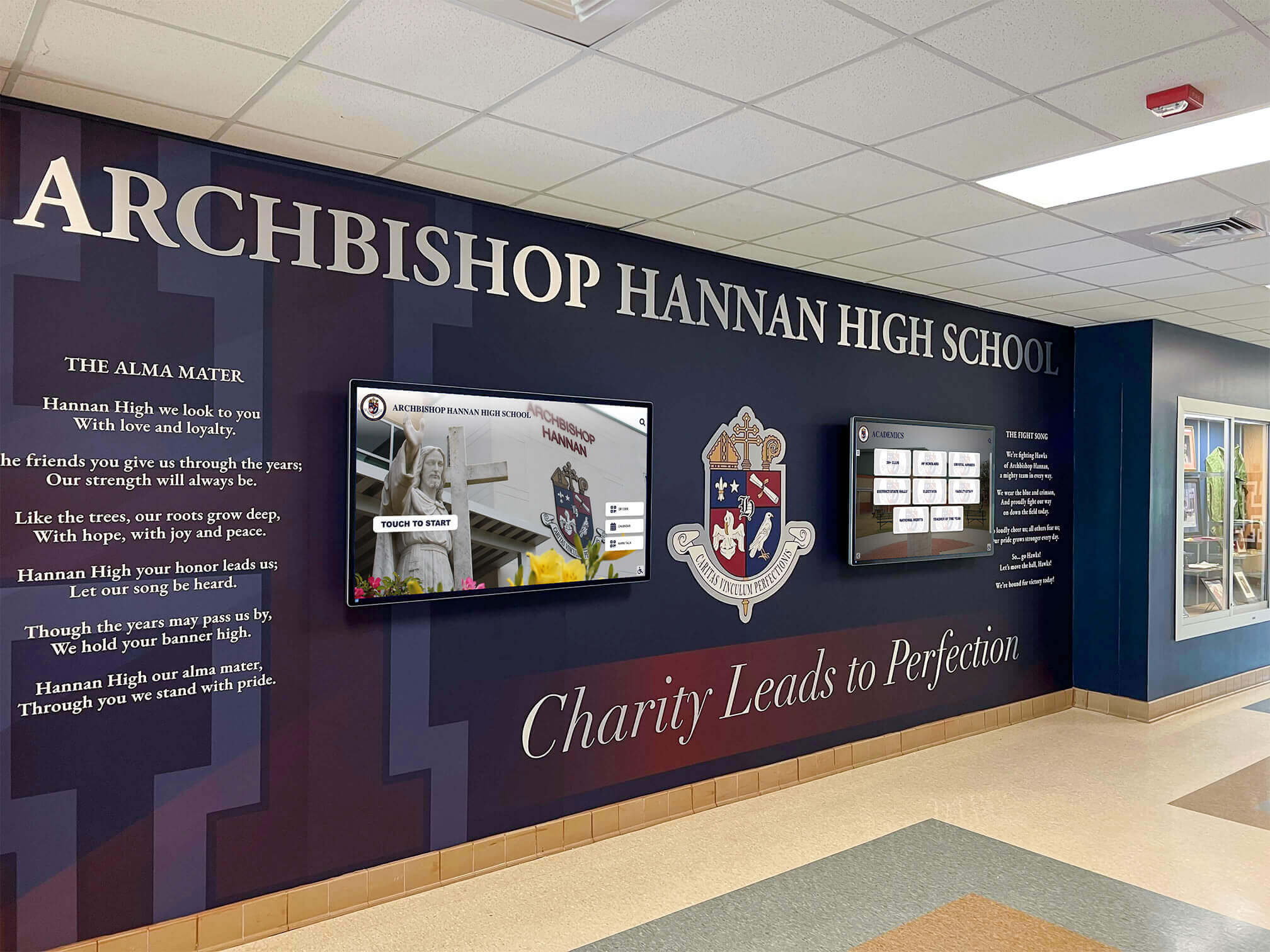
A school lobby featuring an institutional crest alongside integrated digital screens — the kind of branded environment JROTC units can create when logo design and display planning work together
Why JROTC Unit Identity Design Matters
JROTC programs occupy a unique position in the school recognition landscape. Unlike athletics, where team identity centers on the school mascot and colors, or academic honor societies, which inherit their parent organization’s national brand, JROTC battalions have the opportunity — and the responsibility — to develop a distinct unit identity that reflects both their military branch and their school community.
A well-designed JROTC logo accomplishes several things simultaneously:
It communicates branch affiliation. A visitor looking at a recognition display should immediately recognize whether they’re looking at an Army, Navy, Air Force, Marine Corps, or Coast Guard program. Branch-specific design language — color palettes, crest elements, and insignia conventions — sends that signal before a word is read.
It builds unit pride across generations. Cadets who graduate and return to their school five or ten years later should see their unit’s logo and feel the same pull of recognition they felt as battalion commanders. A strong logo creates the visual continuity that makes reunion displays and alumni recognition meaningful.
It legitimizes the program in the school’s visual culture. Schools invest significantly in athletics recognition walls, hall of fame displays, and digital recognition systems. A JROTC unit with a polished, professional logo can take its rightful place in that ecosystem rather than appearing as an afterthought.
It anchors cadet materials across every format. From the guidon to the promotion ceremony backdrop, from the program banner to the certificate issued to a Cadet of the Year honoree — a single, well-designed logo creates cohesion across every touchpoint.
Understanding the Building Blocks of a JROTC Unit Logo
JROTC unit logos vary widely in complexity, from simple typographic treatments combining the school name and branch designation to full heraldic crests with shields, charges, supporters, and motto banners. Understanding the structural options helps instructors and cadets make design decisions that will hold up over years of use.
The Unit Crest
A crest is the most common approach for JROTC unit logos, and for good reason: it borrows directly from military heraldry, which has centuries of tradition behind it. The basic crest structure uses a shield as the primary field, with design elements arranged within or around it according to the visual priority they carry.
For a JROTC unit, the crest typically includes:
- Shield field — the background area that establishes the dominant color palette
- Charge — the central design element placed on the shield; often a mascot, symbol of the school, or branch-related image
- Supporters — optional flanking elements that frame the shield
- Crest element — a device placed above the shield, often a helmet, crown, or mascot head
- Motto banner — a ribbon below the shield carrying the unit’s motto in bold lettering
- Unit designation — the battalion number, school name, or program designation worked into the design
This structure is familiar to military culture and reads as appropriately serious for a JROTC program — exactly the tone that makes cadets and their families take the recognition seriously.
The Roundel Format
The roundel — a circular badge format — is the second most common approach. Like the Civil Air Patrol roundel, it places a central device within a circular field and surrounds it with organization name text arcing around the ring. Roundels are more compact than full crests and work especially well at small sizes — on collar devices, program pins, and digital recognition thumbnails.
The Badge and Patch Format
Many JROTC units design their visual identity around the shoulder sleeve insignia (SSI) patch format used by actual Army and Air Force units. These rectangular or distinctive-shaped patches use bold, simple designs that read clearly even at the two-inch scale of an actual shoulder insignia. The design discipline required by this format — clarity at small size, limited color palette, bold visual hierarchy — often produces logos that scale up to banner and wall display sizes more effectively than more elaborate designs.
Typography-Anchored Marks
Some units, particularly those that want a cleaner, more contemporary visual identity, use a primarily typographic mark: the school name or mascot in strong letterforms paired with the JROTC branch designation and unit number. These marks are easiest to produce in-house and maintain consistency across materials when a full vector design program isn’t available.
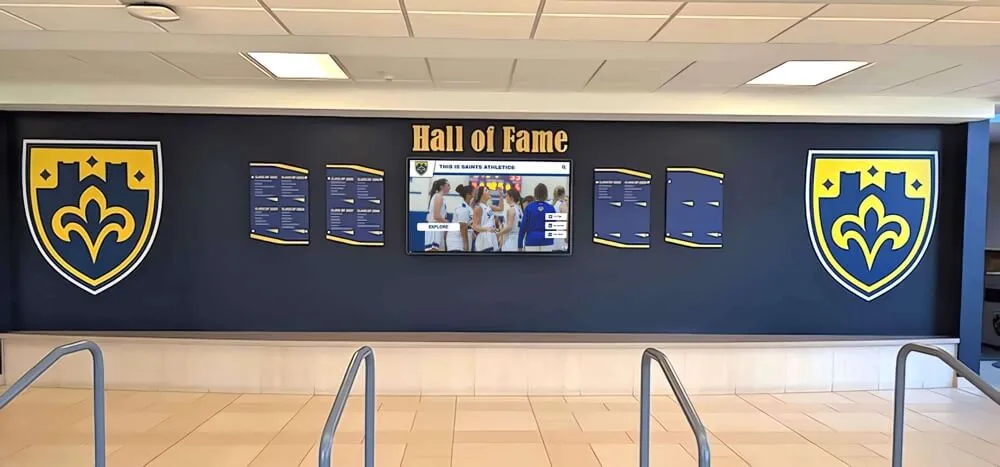
Shield-based recognition panels create visual alignment with JROTC unit crest design traditions, producing cohesive recognition environments when both appear together
Branch-Specific Color Guidance
The single most important design decision a JROTC unit makes is how to use its branch’s official color palette. Each branch has distinct colors associated with its identity, and using those colors correctly — not approximations that drift in the wrong direction — communicates that the program understands and respects military tradition.
Army JROTC
The U.S. Army’s dominant visual identity uses black and Army gold — the specific gold shade that differs from standard yellow and signals military tradition. For general Army JROTC programs, the branch color system also includes unit-specific branch colors: blue for infantry, red for artillery, yellow for armor, and so on. Units should verify which specific branch-color conventions are appropriate for their program through their sponsoring unit and Army Cadet Command guidance.
Design application: Black backgrounds with gold lettering and accents read as unmistakably Army. A crest shield in black with a gold charge — or gold field with black detailing — establishes the palette clearly. Adding the school mascot in the charge position, rendered in the school’s colors, creates a unit-specific identity within the Army framework.
Navy JROTC
The U.S. Navy’s color identity centers on navy blue and gold — a combination that also appears in many school color palettes, which creates natural integration opportunities. The Navy’s specific shade of blue is a deep, saturated navy that projects authority and tradition.
Design application: Navy blue as the dominant background color with gold lettering creates a classic, authoritative aesthetic. The anchor is a natural charge for the shield position. Units integrating a school mascot alongside naval symbolism should maintain the blue-gold hierarchy and position the mascot as the charge rather than competing with branch identity at equal visual weight.
Air Force JROTC
The U.S. Air Force uses ultramarine blue and silver/white as its primary color identity. The Air Force’s distinctive blue is deeper and slightly more vibrant than Navy blue, though the two are often confused in practice. The silver element gives Air Force designs a modern, technical quality distinct from the Army’s gold-forward aesthetic.
Design application: Ultramarine blue fields with silver or white detailing project the precision and technical professionalism associated with aviation. Flight silhouettes — a bird or aircraft in the charge position — serve as natural visual anchors. Units with raptor or bird mascots find that those mascots align especially well with Air Force design language.
Marine Corps JROTC
The USMC’s scarlet and gold palette is one of the most recognizable color combinations in American military culture. Marine Corps design standards favor maximum contrast and visual strength — these are not subtle palettes.
Design application: Scarlet fields with gold lettering, or the reverse, create a visually intense, high-contrast identity. The bold contrast approach, laurel wreath framing, and Latin motto format can all inform unit crest design within Marine JROTC conventions, while staying within the program’s guidelines for use of protected Marine Corps marks.
Coast Guard JROTC
The Coast Guard’s visual identity uses royal blue, red, and white in the stripe configuration familiar from Coast Guard vessels and uniforms. Coast Guard JROTC programs follow the same design principles as other branches: branch colors first, unit identity second.
Design application: The Coast Guard shield and anchor imagery create a natural crest structure. Blue fields with red-and-white accents as supporting elements communicate branch identity clearly while leaving room for school-specific design elements.
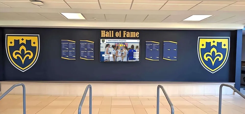
Navy and gold recognition panels create visual alignment with both Navy JROTC and Army JROTC color palettes, offering schools a natural integration point for military program displays alongside athletic recognition
Integrating Your School Mascot
Most JROTC unit logos that succeed over the long term find a way to honor both military identity and school community identity simultaneously. The mascot integration is usually the key to achieving that balance.
Mascots as Charges
The most structurally clean approach is placing the school mascot as the charge within the crest shield. This position gives the mascot visual prominence while keeping it contained within the military crest framework. A bulldog, eagle, panther, or hawk rendered in heraldic style — flat, bold, side-facing — reads as both school identity and military tradition at once.
The key is adapting the mascot’s typical school graphic treatment into a heraldic rendering. A mascot that appears in full cartoon 3D on a sports graphic should be simplified to a flat profile or silhouette for crest use. The simplified version will be far more versatile across display applications and will hold up better at the full range of sizes a JROTC logo must work across — from a collar pin to a six-foot banner.
Mascots as Crest Elements
For units that want to maintain a branch-specific charge in the shield position, the mascot can appear as the crest element above the shield. In heraldic tradition, this is the “top” of the design hierarchy — a place of honor rather than a competing element.
Color Reconciliation
The common design challenge with mascot integration is reconciling the school’s color palette with the branch’s official colors. Some combinations are effortless — an eagle school with Air Force JROTC, or a bulldog school in navy and gold pairing naturally with Navy JROTC. Others require more deliberate handling.
A practical approach: assign the branch colors to the dominant shield field and use the school’s complementary color (or white) as the charge color for the mascot. This maintains branch color authority while the mascot provides school identity, and the contrast between branch field and mascot color becomes a visual strength rather than a design conflict.
Motto Placement and Design
JROTC unit mottos appear on the motto banner — the ribbon element below the shield in a crest design. Several design principles apply consistently:
Keep it short. Military mottos that last are typically three to seven words. Longer mottos become illegible at the display sizes where the logo appears most often. If a unit’s motto is longer than seven words, consider whether a shortened version works for the visual mark.
Use Latin or strong declarative English. Military heraldic tradition favors Latin for formal mottos, but strong English statements work equally well for JROTC unit marks. Whatever language the unit chooses, the tone should be declarative and active.
Use a classic serif typeface. The serif tradition aligns more naturally with heraldic crest aesthetics and military formality. Keep the weight medium-bold so the motto reads at distance without feeling heavy.
Arch with the banner shape. The text should follow the natural curve of the ribbon banner rather than sitting on a flat baseline. Most vector design applications allow curved text paths that create this effect automatically.
Celebrating cadet program achievements and building a recognition culture is a natural extension of strong unit identity design — when the visual environment communicates program quality, the recognition ceremonies that take place within it carry more weight for every cadet in the room.
Designing for the School Recognition Display Environment
A JROTC unit logo that works perfectly on a t-shirt may fail completely when scaled to a 3×5-foot lobby banner or placed next to a school hallway mural. Designing for the recognition display environment requires planning for the specific physical and visual contexts where the logo will appear.
Display Scale Considerations
Recognition displays in school lobbies and hallways create the most demanding scale requirements. A logo element that reads clearly at six inches on a certificate must also work at 24+ inches on a banner panel. The design choices that enable this range:
Limit your palette to 2–3 colors. Complex multi-color designs that require gradient fills or subtle tonal variations lose legibility when printed at large scale on vinyl or fabric banner material. Two strong, high-contrast colors — branch primary and white, or branch primary and gold — reproduce well across every application.
Bold line weights. Thin decorative details that look refined at small sizes become invisible or muddy when reproduced at large scale, especially in print applications where registration isn’t always perfect. Keep line weights at or above 2 points at the intended display size.
Test at display size. Before finalizing a logo design, print or display a mockup at the actual size it will appear in the school’s primary recognition space. Design decisions that seem fine at screen scale reveal their problems when you step back to the 8–10 foot viewing distance a hallway visitor would stand at.
Placement in Wall and Lobby Displays
Digital cadet composite display approaches show how schools organize unit member portraits around a central program identity element — exactly the structure where a strong JROTC unit logo serves as the visual anchor for the entire display.
When placing a JROTC unit logo in a physical wall display:
- Position the logo at the top center as the primary visual anchor
- Establish clear space equal to at least the logo’s width on all sides before any text or portrait content begins
- Scale the logo to at least 12 inches in its primary dimension for wall-mounted displays so it reads at typical hallway viewing distances
- Use a consistent field color behind the logo that matches the display’s background material
Integration with Digital Screens
Schools increasingly combine physical recognition elements — printed banner panels, trophy cases, and plaques — with integrated digital screens that cycle through cadet portraits, achievement records, and program history. The JROTC unit logo should appear in its official colors and proportions on both the physical and digital components of any display system.
Touchscreen systems that combine recognition, yearbook, and trophy case content allow JROTC programs to present a searchable archive of unit history — past commanders, competitive drill results, award recipients — with the unit logo appearing as the consistent identifier across every screen state.
Back-to-school recognition display planning is a natural moment for JROTC units to establish or refresh their recognition environment at the start of each academic year — updating cadet officer boards, adding new achievement records, and ensuring the unit logo is displayed correctly across all physical and digital touchpoints.
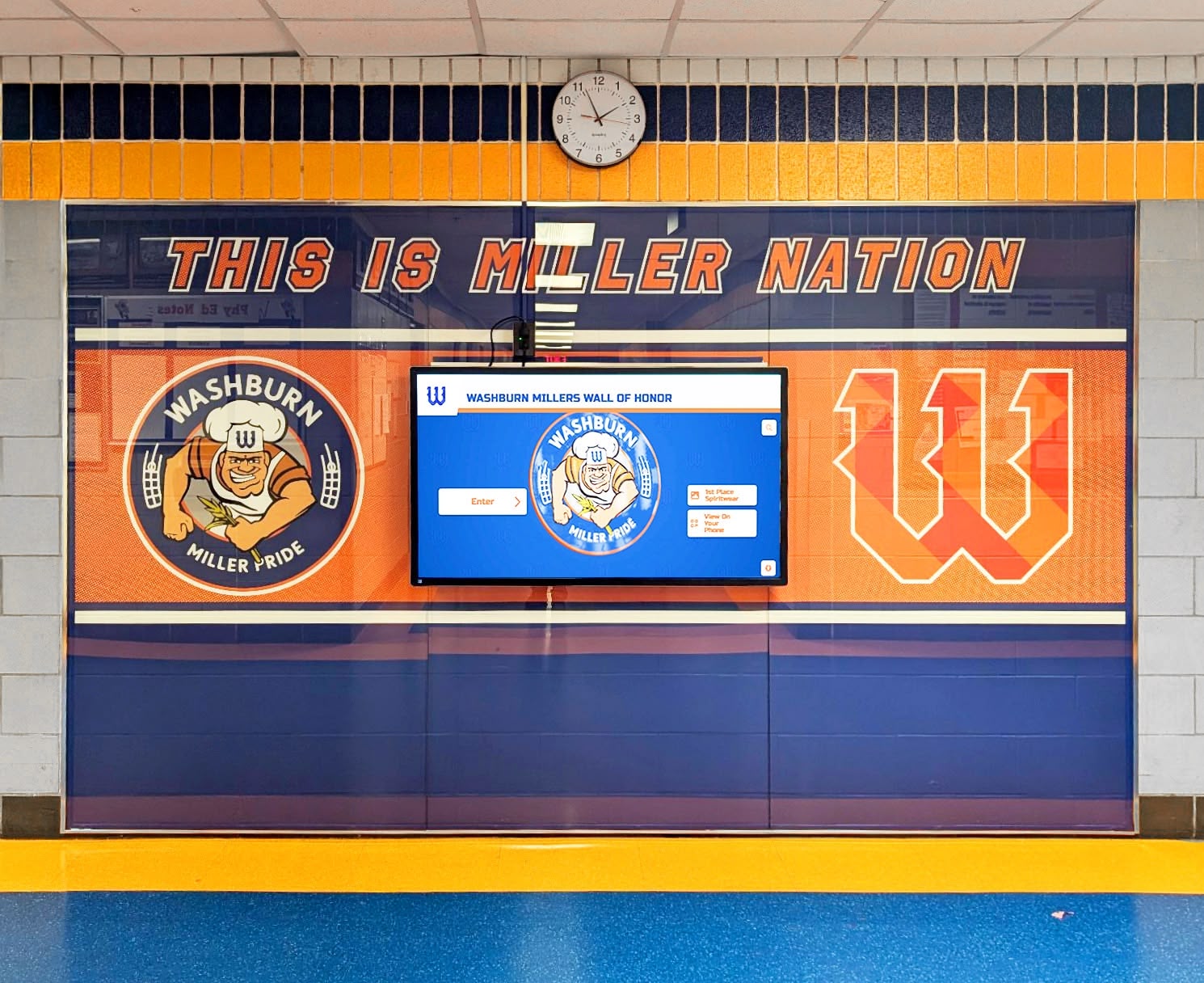
Wall of honor displays with integrated digital screens give JROTC programs the ability to show both permanent physical recognition and regularly updated digital content in the same visual environment
File Formats and Technical Requirements
The technical foundation of a durable JROTC unit logo is the file format it’s stored and delivered in. This determines whether the logo holds up across every application from digital screens to vinyl banners.
Vector First
The JROTC unit logo should be created in and stored as a vector file — SVG, AI (Adobe Illustrator), or EPS format. Vector graphics describe shapes mathematically rather than as pixel grids, which means they scale to any size without quality loss. The same file that produces a crisp 1-inch certificate header also produces a crisp 6-foot banner panel.
If the unit’s current logo exists only as a JPEG or PNG scan of a hand-drawn design, the first step in any logo improvement project is having a graphic designer re-create it in vector format. This one-time investment enables years of high-quality reproduction across every application.
Required Export Formats
Once the master vector file exists, maintain a library of derivative exports for different use cases:
- SVG — For web and digital screen applications; fully scalable in any browser
- PDF — For print vendor submissions; preserves vector quality and color profiles
- PNG (transparent background) — For digital presentations, overlays, and screen graphics
- JPEG (white background) — For email, basic document insertion, and applications that don’t support transparency
Keep the master vector file separate from exported derivative files and never use a derivative export as the source for further editing.
Color Profiles
Maintain two color versions of the logo:
- CMYK for print applications (banners, certificates, plaques)
- RGB/hex for digital applications (screens, websites, social media)
The same color specified in CMYK and RGB can appear slightly different depending on the application — understanding which version belongs in which context prevents the color-shift surprises that make recognition materials look inconsistent when placed side by side.
Using the Logo Across Recognition Materials
A well-designed JROTC unit logo creates visual coherence across every material the program produces. Here is how that coherence plays out across the most common recognition applications.
Cadet Officer Boards
The cadet officer board — typically a framed display listing current unit officers with their rank insignia and portrait photos — is the most frequently viewed recognition display in the JROTC meeting space. The unit logo should anchor the header of the board in its full-color version, with the current academic year and unit designation in clean type below.
Academic recognition program structures for schools provide transferable organizational frameworks — the same visual hierarchy that structures academic honor society officer rosters works equally well for JROTC cadet officer boards, giving viewers a clear path from program identity to the individual leaders it has produced.
Promotion and Award Certificates
The unit logo should appear on every certificate the program issues — promotion documents, Cadet of the Year awards, drill team recognition, and program completion certificates. For milestones that mark significant achievement (battalion commander promotion, unit distinguished service award), use the full-color crest version at 2–3 inches in the upper center position with generous clear space.
Unit Banners
The primary unit banner — typically a 3×6 or 4×8-foot vinyl or fabric banner for the meeting room wall — is the logo’s most prominent permanent application. A strong banner layout:
- Logo in the upper center at maximum practical size (typically occupying 30–40% of the banner’s vertical space when clear space requirements are maintained)
- Unit designation in bold type below at a size readable from 20 feet
- School name in slightly smaller type
- Optional space at the base for year-by-year achievement plaques or strips added over time
How schools organize program memorabilia and award displays offers strategies that adapt well to JROTC unit banner and trophy case design — especially the principle of building accumulative recognition into the display structure from the beginning, so adding new achievement records doesn’t require redesigning the entire display.
Guidon and Flag Applications
Many JROTC units carry guidons — small unit flags — in drill formations and at ceremony events. The logo mark typically appears on the guidon in a simplified, high-contrast version optimized for the 12×18-inch flag format and for visibility at parade distances. This is one of the cases where the simplified logo variant proves its value: a full detailed crest doesn’t reproduce well on a sewn guidon, but a strong simplified version does.
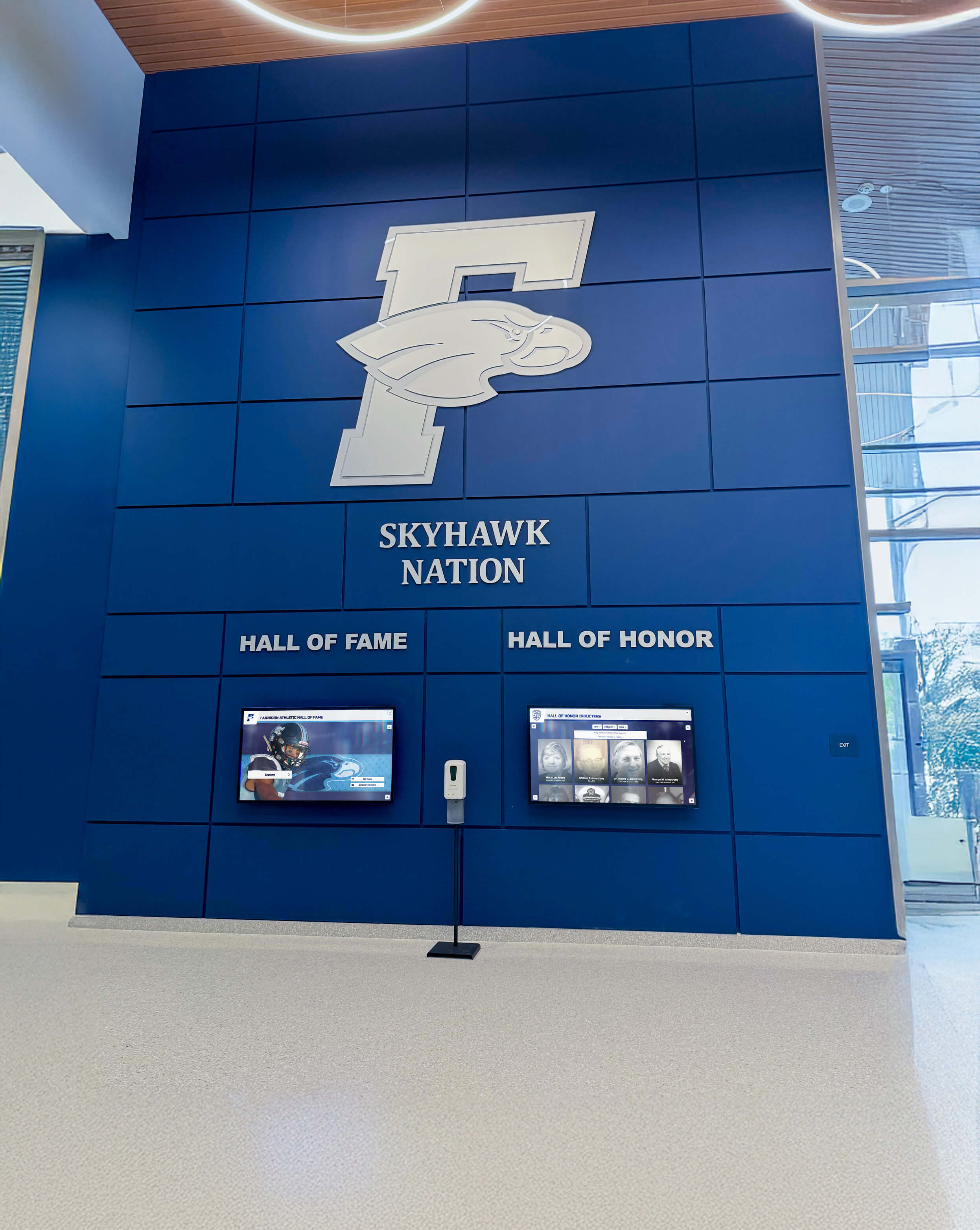
Blue-dominant recognition environments in school lobbies create natural visual alignment for Navy and Air Force JROTC programs, while also accommodating Army and Marine programs in properly branded displays
Building a Multi-Year Unit History Display
The most powerful application of a JROTC unit logo is as the anchor for a multi-year history display that tracks the unit’s achievements, commanders, and honored cadets across every year of the program’s existence.
Why History Displays Matter for Recruitment
Prospective cadets — incoming freshmen deciding whether to join JROTC — respond to evidence of program prestige. A recognition wall showing years of unit commanders, competitive drill results, awarded cadets, and program milestones communicates in seconds what a brochure cannot: this program has a history, produces leaders, and takes its achievements seriously.
Interactive achievement history displays extend this effect by making the unit’s history searchable and explorable rather than requiring visitors to read every panel in sequence. A prospective cadet who can search for cadets from their neighborhood, browse competitive drill results from specific years, or explore what past commanders went on to do will spend significantly more time engaging with the program’s story.
Digital vs. Physical History Formats
Physical recognition walls — printed panels, portrait grids, engraved plaques — create permanence and gravitas. A wall that has been accumulating portrait plaques for fifteen years communicates longevity that a digital display cannot quite replicate in a visitor’s emotional response. Physical materials age into authority.
Digital displays complement physical walls in two important ways: they can include far more information than physical space allows, and they can be updated immediately when new achievements occur rather than waiting for a print production cycle. The unit logo should appear consistently and correctly in both formats.
Digital preservation and yearbook design for school programs offers a model for how schools manage the visual history of programs across multiple years — particularly the challenge of maintaining design consistency as the display grows and new content is added by different people over time. The solution is always the same: a strong, consistently applied logo as the visual anchor that doesn’t change even as the content around it does.
Honoring Distinguished Cadets
Most JROTC programs produce cadets who go on to notable achievement — military service, officer commissioning, distinguished community careers. A unit display that tracks these outcomes, organized around the unit logo as the identifying header, creates a powerful multi-generational narrative.
Interactive kiosk demonstrations for school events and community outreach show how schools use touchscreen displays at open house events, parent nights, and recruiting events to let families explore program history — exactly the context where a well-organized JROTC achievement display, anchored by the unit logo, tells the program’s story most effectively.
This is the type of institutional recognition system that Rocket Alumni Solutions builds for schools — connecting physical recognition environments to digital archives that keep the unit’s story accessible, searchable, and updated year after year.
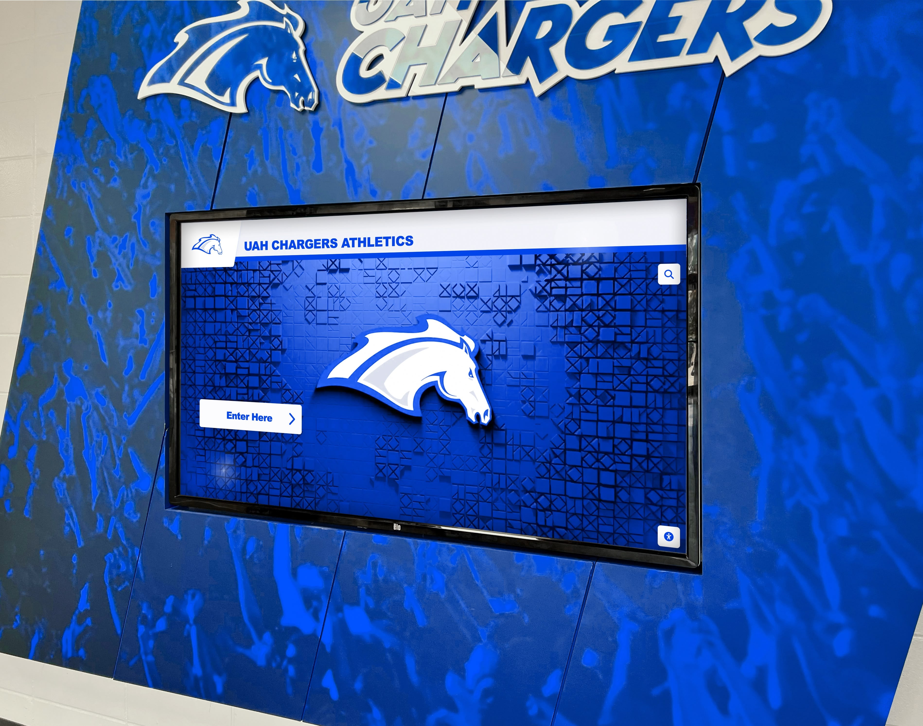
Digital recognition screens integrated into school walls provide JROTC programs a platform for displaying cadet achievement records, unit history, and program highlights to the full school community
Common JROTC Logo Design Mistakes
Even well-intentioned unit design projects produce results that undermine program credibility. Here are the most common mistakes and how to avoid them.
Mistake: Using the active-duty branch emblem as the unit logo Many JROTC programs display the official branch emblem as their unit logo. These are protected marks with specific usage rules and do not convey unit identity — every Army JROTC program in the country could display the same emblem. A unit crest provides branch identity through its color palette and design language while adding the unique elements that make this battalion, at this school, identifiable.
Mistake: Designing only in raster format (JPEG or PNG) Starting a logo design in Photoshop or equivalent raster tools locks the design to a specific resolution. When the banner vendor asks for a print-ready file, a low-resolution raster logo produces a blurry result. Always design unit logos in vector-first applications.
Mistake: Too many design elements The impulse to include every meaningful symbol — the branch device, the mascot, the state outline, the school year, the founding date, and the unit motto — results in a design so complex that nothing reads clearly. A logo that tries to say everything communicates nothing. Charge plus shield plus motto is enough structure for a highly effective crest.
Mistake: Off-palette branch colors Using a blue that reads as “close enough” to Army blue or Navy blue looks wrong to anyone familiar with military color standards. The branch color palette should be exact — use the correct Pantone values or their hex equivalents confirmed through official branch sources.
Mistake: No logo file management system Units that treat their logo as a one-time creation without maintaining organized files often find themselves using lower-quality versions over time as the master file gets lost and progressively lower-quality exports are used as sources for new exports. Maintain a named, organized logo file library and designate who is responsible for maintaining it across leadership transitions.
Mistake: Not planning for dark backgrounds A logo designed on a white background may become invisible when placed on the dark navy or black background of a ceremony backdrop or digital display. Design a reversed or white version alongside the standard version so the logo is always legible regardless of the background it encounters.
FAQ
Do JROTC units own their unit crest design? JROTC unit crests are designed and used within each branch’s guidelines for the program. The unit crest reflects the school community’s identity alongside branch affiliation. Units should consult their sponsoring command and branch-specific JROTC regulations for guidance on crest design approval processes.
Can a JROTC unit use official branch symbols like the Eagle Globe and Anchor in its logo? Official military emblems — including the Army seal, the Marine Corps Eagle Globe and Anchor, and similar protected marks — have specific usage regulations. JROTC units should consult their branch’s JROTC command and the appropriate service branch’s heraldry office for guidance on what elements may be incorporated into unit crests and under what conditions.
What colors should an Army JROTC logo use? Army JROTC programs typically work from the Army’s black and gold palette as their foundation, with branch-specific accent colors for programs associated with particular Army specialties. Exact color values should be confirmed through Army JROTC command guidance and official branch color specifications rather than approximated from external sources.
How do I get a JROTC unit logo professionally designed? Options include working with a graphic design student or class at the school (a strong experiential learning project), contracting with a professional logo designer, or collaborating with the school’s art department. The key requirement is that the final deliverable be in vector format (AI, EPS, or SVG) and include color-correct versions in both CMYK (for print) and RGB/hex (for digital applications).
What size should a JROTC unit logo be on a recognition wall display? For wall-mounted displays in school hallways and lobbies, the logo should appear at a minimum of 12 inches in its primary dimension to read clearly at the 8–10 foot viewing distance typical of passing hallway traffic. For close-up displays in JROTC meeting rooms, a 6–8-inch application is sufficient. Always maintain the required clear space — no other graphic elements within approximately the logo’s width on all sides.
Can the JROTC unit logo be used on social media? Yes — with the correct file variant. Use the PNG export with a transparent background for overlays, or the JPEG with an appropriate background for standard social media posts. Ensure the version used maintains the correct branch colors and proportions. Social media thumbnails at small sizes may require the simplified logo variant rather than the full detailed crest.
How often should a JROTC unit redesign its logo? A well-designed unit logo should remain consistent for a generation of cadets (four years or more) rather than changing with each new battalion commander. Design updates are warranted when the logo exists only in poor file formats, when the program has changed branches, or when the school has significantly updated its own visual identity. Stability and consistency are features of a strong program identity.
Build a Recognition Display That Honors Your JROTC Unit's Legacy
Rocket Alumni Solutions helps schools create digital recognition systems that showcase JROTC cadet achievement, unit history, and program milestones alongside athletics and academics — searchable, updateable, and designed to reflect the identity your unit has built year after year.
Get notified when Rocket Graphics opens