A dance team logo is rarely the first thing a school thinks about when building a spirit program — but it’s often the element that determines how seriously the program is taken by the rest of the school community. Walk into any gymnasium, student union lobby, or athletics hallway and you’ll notice which programs have invested in their visual identity: a sharp crest on the banner backdrop, a clean wordmark on the warm-up jacket, a polished badge used consistently across social media graphics and digital displays. For dance teams competing at UDA and NDA national championships or simply representing school spirit at Friday night pep rallies and homecoming halftime shows, that visual coherence doesn’t happen by accident. It starts with a dance team logo designed to last.
This guide covers the full range of logo design approaches for school dance teams and spirit squads — from structural formats and color palette strategies to mascot integration, typography choices, and practical display applications. Whether your team is building a visual identity from scratch or refreshing one that has drifted out of alignment with your school’s brand, these design ideas give you a concrete starting point.
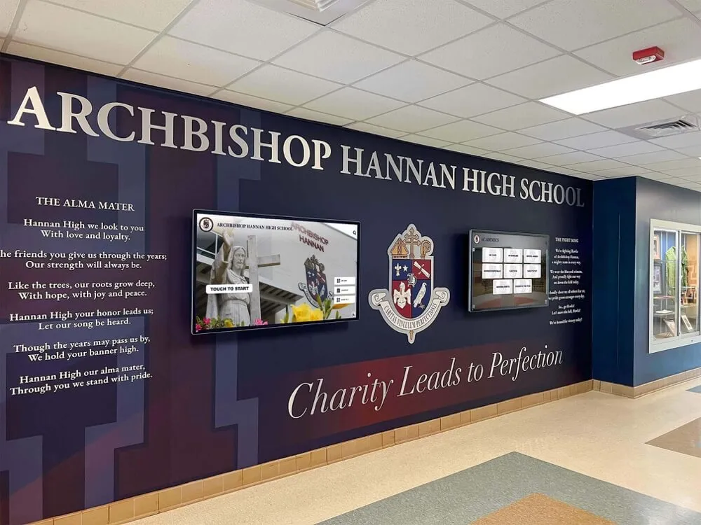
A school hallway featuring an institutional crest alongside integrated digital screens — the cohesive visual environment that results when a program's logo is designed with both physical and digital display applications in mind
Why Your Dance Team Logo Shapes Program Identity
A dance team’s logo is doing more work than most coaches or directors realize. It appears on uniforms and warm-ups, banners and backdrops, the website header and every social media post, the end-of-season award plaques and the trophy case display in the school hallway. Every time the logo appears in a new context, it is either reinforcing program quality or silently undermining it.
The logo communicates program seriousness. A dance team with a polished, professionally designed identity reads differently than one using a clip-art silhouette or an inconsistently applied school mascot. That perception matters for recruitment, community support, and how the team is treated within the school’s broader athletic and extracurricular ecosystem.
It creates visual continuity across generations. Alumni who graduated three or ten years ago should recognize the team’s logo when they see it on a current recruitment flyer or the school’s recognition wall. That continuity is what transforms a logo into a symbol of program tradition rather than just a graphic.
It anchors every recognition display. Well-designed sports hall of fame and recognition displays always have a clear visual anchor — a dominant element that tells you immediately what program you’re looking at and why it matters. For dance teams, that anchor is the logo. Without it, even a wall full of trophies and championship photos reads as a collection of artifacts rather than a coherent legacy.
It enables consistent competition representation. Dance teams competing at regional and national events are judged not only on performance but on the overall impression they project — and that includes the visual presentation of their warm-up gear, coach’s clipboard, backdrop banners, and social media presence heading into the competition. A strong logo ties all of that together.
Dance Team Logo Formats: A Visual Overview
The most important early decision in any dance team logo project is which structural format serves the program’s identity goals. Each format has distinct visual characteristics, application strengths, and design challenges.
The Crest or Shield Format
The crest format — a shaped shield or heraldic device containing the team’s central symbol — communicates tradition, achievement, and institutional seriousness. It’s the format most associated with school programs that have built multi-year legacies and want a logo that reflects that longevity.
For dance teams, a crest typically includes:
- Shield field — the background area establishing the dominant color palette (almost always school colors)
- Central charge — the primary design element inside the shield; often a stylized dancer silhouette, a relevant symbol, or the school mascot in a dancing or movement-oriented pose
- Banner or ribbon element — carrying the team name, school name, or motto
- Year of founding — optional, but powerful for programs with long histories
- Surrounding text — school name, team name, and optional tagline arcing around or framing the crest
Crests work best on banner backdrops, trophy case displays, and any application where the logo has room to breathe and be seen at appropriate scale. They can feel heavy at very small sizes — on social media profile icons or embroidered uniform details — so programs using a crest format should also develop a simplified variant for compact applications.
The Circular Badge Format
The circular badge (sometimes called a roundel) places the central device inside a circle and surrounds it with the team and school name in text arcing around the ring. This format is highly versatile: it reads clearly at both large (banner) and small (Instagram profile icon) sizes, reproduces well in single-color embroidery, and feels both modern and timeless depending on the typeface and color choices.
Circular badges are the workhorse format for dance team logos because they require no orientation decision (they work the same way regardless of placement context) and they scale down without losing essential design elements.
The Wordmark with Accent Symbol
A wordmark-dominant logo places the team name in strong, well-chosen typography as the primary visual element, with a smaller symbol — a star, crown, silhouette, or mascot — serving as a secondary accent. This approach works especially well for teams whose name is itself distinctive and memorable: the letters do the identity work, and the symbol adds personality without competing.
Wordmarks are the easiest approach to maintain consistency across materials because they don’t require precise color matching of complex graphic elements. However, they depend heavily on typography quality — a poorly chosen or inconsistently applied typeface undermines the entire mark.
The Monogram Lockup
Monogram logos use the team’s initials — typically the school initials combined with “Dance” — in a stylized, interlocking, or designed letterform treatment. Monograms work particularly well for programs that need a compact mark for use on uniforms, bags, and accessories where a full badge or crest would be too complex at the required size.
The Dancer Silhouette Mark
A dancer silhouette — a recognizable human form in an iconic dance pose (arabesque, jazz split, leap, or contemporary extension) — creates immediate visual communication of what the program is. The challenge with silhouette marks is avoiding generic clip-art. The silhouette needs to be designed with enough visual strength and specificity that it doesn’t look like it could belong to any team; it should feel like it belongs to this team.
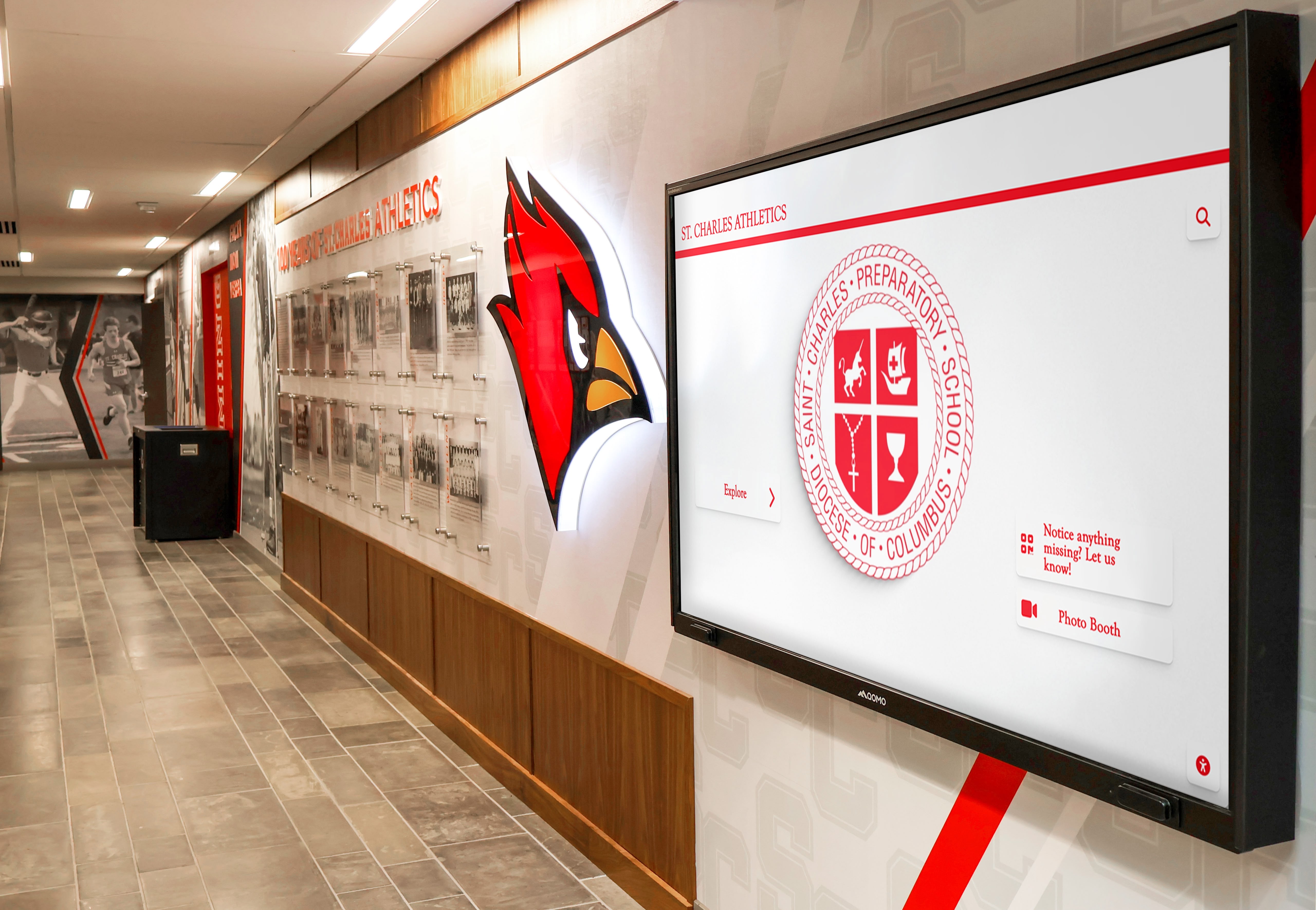
When a school's mascot identity is strong, it creates natural alignment between dance team logo design and the broader athletic recognition environment — as seen in this hallway display integrating mascot imagery with digital recognition panels
Color Palette Strategy for Dance Team Logos
Color is the fastest communicator in any logo. A viewer processes color before they read type or recognize symbols — which means your team’s color choices establish the emotional tone of the logo before anything else registers.
Lead with School Colors
The baseline approach for any school spirit squad logo is school colors first. The dance team’s logo should be immediately recognizable as belonging to the same school family as the football team’s jersey, the soccer banner in the hallway, and the track and field display in the athletics corridor. Departing from school colors creates confusion and weakens the team’s identity connection to the broader school community.
Primary school color as the dominant field — Use the primary school color as the background field for the shield, badge circle, or dominant text treatment. This establishes the most immediate color signal.
Secondary school color for accent and detail — Use the secondary color for text, borders, dividing lines, and secondary design elements. This creates visual contrast while keeping the palette cohesive.
White or light neutral for legibility — Most school color combinations need a third element — typically white, cream, or light gray — to ensure text and fine details remain legible across all applications. A solid white version of the logo (for use on color backgrounds) and a reversed version (white elements on a color field) should be part of every logo’s standard deliverable set.
Adding Metallic Accents
Many dance teams incorporate metallic gold or silver into their visual identity — both for the associations with championship achievement and for the literal sparkle that aligns with performance aesthetics. Metallic accents work well in printed applications (foil stamping on certificates, metallic vinyl on banners) but require careful management in digital contexts where metallic simulation can look flat or muddy.
A practical approach: design the logo using a standard yellow-gold or cool gray for digital applications, then specify the metallic upgrade for premium physical production contexts where the effect is achievable.
High Contrast for Display Readability
Any logo intended for display on a large gymnasium banner, a digital recognition screen, or a competition backdrop must be designed for high contrast. The critical pairs:
- Dark navy or maroon on white: high contrast, excellent readability at distance
- Black on gold or yellow: high contrast, classic sports identity aesthetic
- White or light gold on dark field: high contrast with dramatic visual effect
Avoid mid-value combinations where the logo and background have similar tonal value — even if the hue difference seems clear on screen, the combination becomes hard to read at distance or in varying lighting conditions.
Integrating Your School Mascot
For most school dance teams, the mascot is the most powerful element available for creating visual identity alignment with the broader school community. A dance team that incorporates the school mascot into its logo immediately communicates school pride and signals that the program is a central part of — not separate from — the school’s athletic identity.
Adapting the Mascot for Dance Identity
The key challenge with mascot integration is adapting the school’s standard mascot graphic to feel appropriate for a dance team rather than simply copying the same image used by the football team or basketball program. This doesn’t mean softening or feminizing the mascot — it means finding the intersection between the mascot’s established personality and the energy and precision of competitive dance.
Options that work well:
- The mascot in a dance or movement pose — a panther mid-leap, an eagle with wings spread in a dramatic extension, a hawk in a tight turn
- The mascot holding or interacting with a dance symbol — a star, a ribbon, a trophy, or a competition medal
- The mascot silhouette in dynamic pose — simplified to the most recognizable elements and placed as the central charge in a crest or badge
- The mascot head in a bold heraldic rendering — as used in most school athletic crests, maintaining the recognizable identity marker without requiring a full-body illustration
Spirit squad recognition programs that build visual coherence between the team’s logo, competition display, and school recognition environment create the kind of sustained identity that prospective members and families respond to — it signals a serious, well-organized program.
When the Mascot Doesn’t Translate
Some school mascots — particularly abstract concepts, objects, or symbolic figures — don’t adapt naturally to dance team logo applications. In these cases, a wordmark approach using the school name and “Dance” in strongly designed typography, with the mascot appearing as a secondary element rather than the primary visual anchor, often produces a cleaner result.
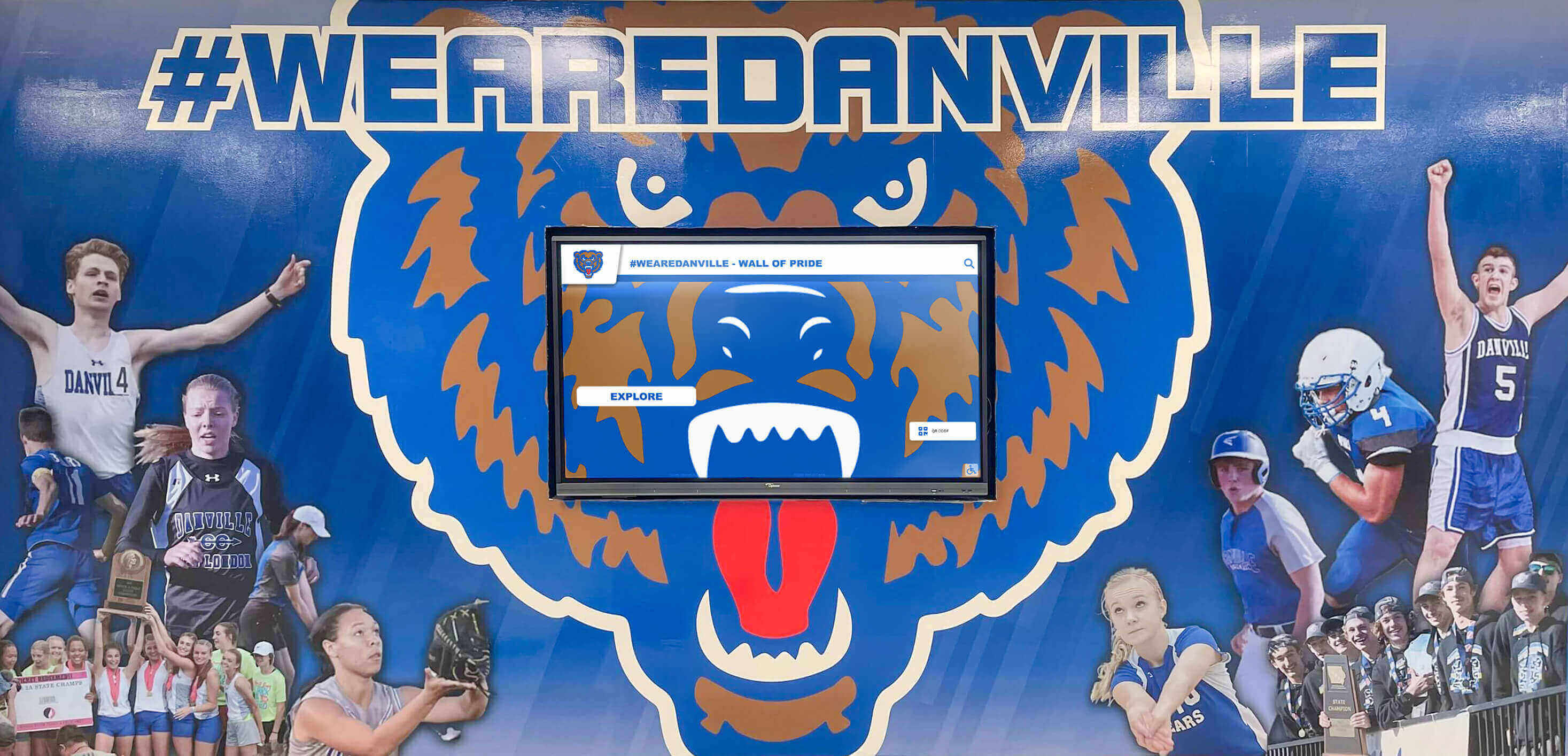
A bold mascot logo in the hallway mural format, paired with an integrated digital screen, creates a year-round visual presence for school programs — a combination dance teams can use to anchor their identity in the school's physical environment
Typography: The Design Element Most Often Underestimated
Typography choices can make or break a dance team logo — yet it’s the element most often handled with the least intentionality. Common mistakes: defaulting to whatever font looks “dance-like” at first glance (often an overly decorative script), or using a system font that lacks visual character.
Script Fonts: Use Deliberately, Not Habitually
Script or handwritten fonts feel natural for dance team logos because they suggest movement, flow, and artistry. The risk is that they can read as low-effort or dated if they’re not chosen carefully — many scripts that were popular in design trends from a decade ago now signal “this logo was made in a hurry.”
If using a script, choose one with enough weight and specificity to stand out from generic alternatives. The script should be used for the team name only, with the school name and any supporting text in a complementary clean serif or sans-serif that provides contrast and legibility.
Serif Fonts for Tradition and Authority
A classic serif typeface — particularly one with strong letterforms and consistent weight — communicates program history and institutional seriousness. Serif type pairs well with crest and badge formats and reads with authority on large-format display applications.
Bold Sans-Serif for Modern Programs
Programs that want a contemporary, athletic visual identity often choose bold geometric sans-serif typography. This approach aligns well with the aesthetic of modern competitive dance performance costumes and competition environments and photographs well on digital display screens and social media graphics.
The Rule of Two Typefaces
A dance team logo should not use more than two typeface families. One primary typeface for the team name, one complementary typeface for supporting text elements (school name, tagline, year). Every additional typeface beyond two increases visual complexity without adding identity value.
Placing Your Dance Team Logo in School Recognition Displays
A dance team logo that exists only on social media graphics and warm-up jackets is missing the most powerful recognition context available: the school’s physical recognition environment. Dance programs that establish a presence in hallway displays, trophy cases, and digital recognition screens build program prestige in a way that no digital marketing can replicate.
Trophy Case and Display Case Integration
Well-designed high school trophy case areas consistently use program logos as the visual anchors for individual case sections — identifying each program’s trophies and awards before a visitor reads any specific text. A dance team with a distinctive, well-designed logo can claim a clearly defined section of the trophy case that communicates program identity from across the hallway.
For maximum impact in trophy case displays:
- Display the logo at the top center of the team’s designated section at a minimum of 8–10 inches in its primary dimension
- Use a printed background panel in school colors rather than leaving trophies against a bare shelf or glass background
- Include the competition level and year for each major trophy so the display communicates achievement context, not just hardware
Hallway Banners and Wall Displays
Banner applications represent the dance team logo at its largest and most public scale. The design principles that matter most at banner scale:
Bold and simple. At 3×6 or 4×8 feet, fine details disappear. The logo version used on a banner should be the simplified or full-color clean variant — not a version with thin lines, subtle gradients, or text smaller than two inches at display size.
Test at viewing distance. A banner design that looks balanced on a 27-inch monitor may be illegible from the 15-foot viewing distance of a hallway visitor. Print or display a full-scale mockup and evaluate it from the expected viewing distance before committing to production.
Replacing expensive physical gym banners with digital display alternatives is an option many schools are exploring — particularly for programs that want to update recognition content more frequently than a vinyl production cycle allows. Digital displays allow the dance team logo to appear in its full-color version as a consistent anchor while the surrounding content (performance photos, competition results, team rosters) is updated throughout the season.
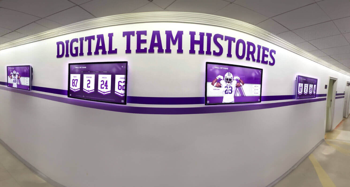
Digital hallway displays for program histories allow dance teams to showcase competition results, team photos, and achievement records across multiple years — with the team logo serving as the consistent visual anchor across every content state
Digital Display Applications for Dance Team Identity
Dance teams that compete at major events have natural opportunities to build a digital recognition presence that extends the logo’s reach far beyond the school hallways.
UDA and NDA Championship Recognition
National championship competition display approaches demonstrate how schools build recognition systems that document competition history, placement records, and team achievements from major events. For dance programs, a digital recognition system that shows decade-over-decade competition results anchored by the team’s logo creates a visual legacy that physical trophies alone cannot communicate.
Homecoming and Pep Rally Backdrops
Homecoming traditions and spirit events are the highest-visibility performance moments for most school dance teams. A backdrop banner featuring the team’s logo behind the halftime or homecoming performance creates branded visual documentation for every photo and video taken at the event — which then lives permanently in school archives, social media, and community memory.
End-of-Season Recognition and Athletic Banquets
Athletic banquet planning for dance programs consistently benefits from using the team logo as the visual anchor for the event’s physical and projected materials — the podium banner, the slideshow title card, the award plaques, and the printed program. When every element of the banquet visual environment uses the same logo at consistent proportions and color values, the event projects the professionalism that season-long achievement deserves.
Sports banquet slideshows that begin with a full-screen logo slide — clean, well-rendered, on a matching color background — set the visual tone for everything that follows and signal to families and school administrators that this program takes its presentation as seriously as its performance.
Senior Night and Celebration Displays
Senior night celebration planning provides a transferable framework for dance programs: the team logo should anchor the senior recognition banner, the program for the event, and any digital display content shown during the ceremony. For seniors who will graduate remembering the season, a visual environment where the logo is consistently and beautifully applied creates the kind of recognition moment worth remembering.
Digitizing Team History for Long-Term Recognition
Digitizing varsity letters and program history allows schools to preserve decade-long records of dance team membership, competition results, and notable achievements in an accessible, searchable format. When this archive is organized under the team’s logo as the consistent visual identifier, it creates a program history display that current team members, alumni, and community members can explore and connect with.
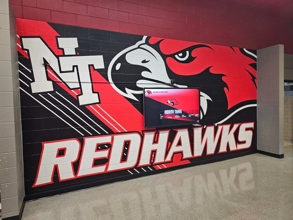
A school hallway mural featuring a bold mascot logo integrated with a digital screen — the physical-digital combination that gives dance programs year-round recognition presence in the school's most visible spaces
File Formats and Technical Requirements
A dance team logo is only as durable as the files it’s maintained in. The most common source of logo quality problems in school programs isn’t bad design — it’s poor file management that forces teams to reproduce the logo from increasingly degraded source files over time.
Always Start with Vector
The logo must be created in a vector file format — SVG, Adobe Illustrator (AI), or EPS. Vector files describe graphic shapes as mathematical objects rather than pixel grids, which means they scale to any size — from a quarter-inch collar emblem to a six-foot backdrop banner — without any loss of quality.
If the team’s current logo exists only as a JPEG, PNG, or photo scan, the most important improvement to make is a one-time investment in having a designer re-create it in vector format. This single step enables every other quality improvement.
Required Export Set
Once the master vector file is in place, maintain a library of standard exports:
- PNG with transparent background — for digital overlays, social media graphics, and web use
- SVG — for web applications and digital screens that support vector rendering
- PDF — for print vendor submissions; preserves vector quality and color profiles
- JPEG with white background — for email, basic document insertion, and contexts that don’t support transparency
Color Variants to Maintain
Every dance team logo should have three color variants prepared:
- Full-color standard — the primary version used across most applications
- Reversed/white — white or light elements on a dark or transparent background, for use on colored backgrounds
- Single-color black — for contexts where color printing isn’t available (documents, faxes, embossed plaques)
Having these variants prepared in advance prevents the improvised, inconsistent versions that get produced under deadline pressure when the right file isn’t available.
Common Dance Team Logo Mistakes to Avoid
Using a raster file as the master logo. JPEG and PNG exports from design applications look fine on a screen but produce blurry or pixelated results when scaled up for banner production. The master logo must be in vector format.
Too many design elements. The impulse to include the team name, school name, mascot, a dancer silhouette, stars, and a motto all in the same mark produces a logo that communicates nothing clearly. A crest with one strong central image, team name, and school name is sufficient. Add more only if each element carries genuine visual necessity.
Inconsistent color application. Using slightly different shades of the school’s primary color across different applications — because the designer guessed at the hex value, or because different vendors calibrated their equipment differently — creates a logo that looks like it belongs to multiple different teams. Maintain exact hex values for digital and Pantone values for print, and provide these specifications to every vendor.
Designing only for screen. A logo that looks clean on a 4K monitor may be illegible when embroidered on a warm-up jacket or printed on a large banner. Every design decision must be evaluated at the full range of sizes and production methods the logo will encounter.
Not planning for the reversed version. Dance performance photos are frequently taken against dark or colored backgrounds. A logo designed only on a white background will disappear in those contexts. Design the reversed (white or light) version alongside the standard version before the logo is finalized.
Logo instability — changing it every season. A logo that changes every two to four years never builds the recognition value of a stable program identity. Minor refinements are acceptable; wholesale redesigns should be reserved for significant program transitions (new school mascot, school rebranding, merger of programs). The goal is a logo that alumni recognize decades later.
FAQ
What should a dance team logo include? At minimum, a dance team logo should include the team name, school name or initials, and a primary visual element (mascot, dancer silhouette, or distinctive symbol). The most effective logos also include a clear color identity that aligns with school colors and a format (crest, badge, or wordmark) that scales well across the range of applications — from uniform embroidery to gymnasium banners and digital display screens.
What is the best format for a dance team logo — crest or badge? Both work well for different program personalities. Crest formats project tradition and achievement; they’re best for programs with long competition histories and a formal recognition culture. Circular badge formats are more versatile and scale better to small sizes like social media profile icons and collar devices. Programs that want maximum flexibility often develop a full crest for primary display applications and a simplified badge derived from it for compact uses.
How do I incorporate my school mascot into our dance team logo? The most effective approach is adapting the school mascot into a dynamic or dance-specific pose — a leap, extension, or movement that communicates performance energy rather than the static side-profile often used in athletic crests. Place the adapted mascot as the central charge within a crest or badge format, with the team and school name in supporting text. The mascot should feel like it belongs specifically to the dance team rather than being the same graphic used by every other school program.
What file formats do I need for a dance team logo? You need the master design in a vector format (SVG, AI, or EPS) that can scale to any size without quality loss. From this, export: a PNG with transparent background for digital and web use, a PDF for print vendors, and a JPEG with white background for general document use. Maintain full-color, reversed (white), and single-color black variants of each.
How often should a dance team logo be redesigned? A well-designed logo should remain consistent for at least four to six years — a full generation of team members. The goal is for alumni to recognize the logo when they return for events or see it on social media, which requires stability. Redesigns make sense when the logo exists only in degraded file formats, when the school has significantly updated its overall visual identity, or when the program has undergone a structural change. Cosmetic updates to “refresh” the logo every season undermine rather than build program identity.
Build a Recognition Display That Honors Your Dance Team's Legacy
Rocket Alumni Solutions helps schools create digital recognition systems that showcase dance team achievement, competition history, and program milestones alongside athletics and academics — searchable, updateable, and designed to reflect the identity your team has built year after year.
Get notified when Rocket Graphics opens