Every Civil Air Patrol cadet squadron operates under the same official roundel — the distinctive red-and-blue propeller emblem that the organization has carried since its earliest years as the Air Force’s auxiliary. But within the CAP brand framework, individual squadrons have meaningful room to develop unit-specific visual identity: the graphics, crests, banner layouts, and design language that make Composite Squadron 42 at a high school in Virginia instantly distinguishable from Composite Squadron 114 at a school in Arizona. A well-designed civil air patrol unit logo does not compete with the official emblem — it complements it, adding the local personality, school connection, and unit history that the national mark cannot convey on its own.
This guide covers the design principles, structural elements, brand compliance considerations, and display applications that define effective CAP squadron unit logos. Whether your squadron is designing a unit identity from scratch, modernizing an identity that has drifted into inconsistency, or building recognition displays that honor your cadet program’s history, these principles provide a concrete framework for making design decisions that hold up over time.
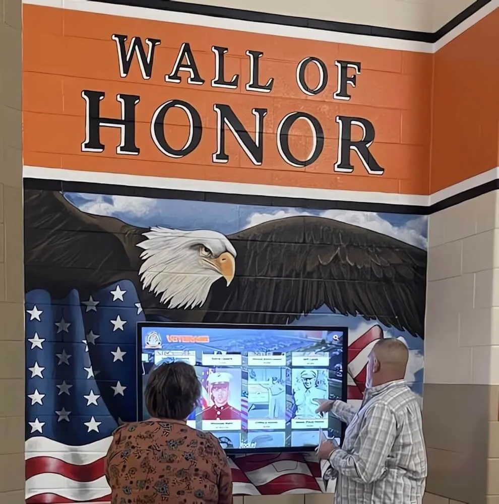
A wall of honor featuring eagle imagery, a flag display, and interactive recognition technology — the kind of institutional environment where a distinctive CAP unit logo creates lasting squadron presence for cadets and visitors alike
The Role of Unit-Specific Identity Within the CAP Brand Framework
The Civil Air Patrol national emblem is a protected mark with specific usage rules that all squadrons must follow: no color modifications, no distortion, no incorporating the roundel into custom designs. This might seem to leave little room for unit identity — but the constraint is actually an asset.
Because the official CAP roundel is fixed and consistent, the unit-specific design elements surrounding it carry all the visual work of squadron differentiation. The roundel communicates organizational affiliation; everything else communicates unit character. A squadron that understands this distinction can develop a rich visual identity without ever touching the protected emblem.
Unit identity elements that exist alongside — never inside or overlapping — the official CAP emblem include:
- Squadron crest or patch design — a unit-specific heraldic device used on squadron banners, certificates, and recognition materials
- Squadron color accent palette — complementary colors drawn from the school’s palette that appear in banner borders, background fields, and framing elements
- Unit designation typography — the squadron number, charter designation, and school name in a defined typographic treatment
- Motto or tagline — a unit-specific phrase used consistently across materials
- Mascot or regional design element — an optional visual anchor tied to the school’s mascot or the local community’s character
These elements, when designed with discipline and applied consistently, create a unit identity that cadets and community members associate with your specific squadron — independent of the dozens of other squadrons using the same national emblem.
Core Elements of a CAP Squadron Unit Logo
Squadron Patch and Crest Design
The most common approach to CAP unit logo design is a secondary crest or patch that functions as a unit-specific identifier separate from the official emblem. Unlike JROTC unit crests, which may appear in place of the national emblem on certain materials, CAP squadron crests always exist in a secondary position relative to the official roundel — they are the squadron’s personality layer, not its primary brand mark.
Effective CAP squadron crests typically use a shield, circular badge, or patch shape as their format. Within that shape, the most powerful design choices include:
A central charge tied to the school’s identity. The mascot — an eagle, hawk, bulldog, panther, or similar figure — placed in a heraldic or bold illustrative style at the center of the crest creates an immediate visual connection between the CAP program and the broader school community. Visitors who recognize the school mascot instantly understand the geographic and institutional context of the squadron.
Color fields in CAP palette and school palette. A shield with a red or Air Force blue field (drawing from the official CAP color palette) and the mascot rendered in the school’s secondary color creates a visual bridge between the national organization and the local institution.
Unit designation text. The squadron number, charter designation, and school name in clean, legible typography positioned within or below the crest shape identifies the unit precisely for anyone familiar with CAP’s unit numbering system.
Motto banner. A ribbon element below the shield carrying the unit’s motto — whether in Latin or strong declarative English — adds the kind of institutional gravitas that communicates program seriousness to cadets, families, and visitors.
Integrating School Identity
The strongest CAP unit logos are those that genuinely merge two identities — the national CAP organization and the local school community — into a visual statement that belongs to neither completely but represents both clearly.
The most structurally sound approach to school integration is the mascot as charge: the school’s mascot rendered in a bold, heraldic style placed at the center of the unit crest, surrounded by color fields drawn from the intersection of CAP’s official palette and the school’s colors. A school with an eagle mascot and blue-and-gold colors working with a CAP squadron has perhaps the most natural alignment possible — the eagle reads as both school identity and aviation heritage simultaneously.
For schools whose mascot or colors don’t align so naturally with CAP’s red, white, and blue, the solution is clear visual hierarchy: CAP red or Air Force blue as the dominant background color, with school colors appearing in the mascot rendering, border accents, and framing elements. The CAP color authority is maintained; the school identity is present without competing.
Unit Name, Number, and Motto
CAP composite squadrons operate under specific charter numbers and names — “Composite Squadron 241” or “Cadet Squadron 88” — that identify them precisely within the national organization’s structure. These designations should appear in every unit logo application in full, not abbreviated to the point of ambiguity.
Effective placement: the unit number in bold sans-serif type directly below the crest, with the squadron name and school name in slightly lighter-weight type beneath. This stacked arrangement gives viewers the information hierarchy they need — unit identifier first, full context below.
For mottos, three to seven words in bold classical serif type creates the right tone for a military-adjacent youth program. The motto should appear in the crest’s ribbon banner at a size readable from 10–12 feet, which is the typical viewing distance for a meeting room banner.
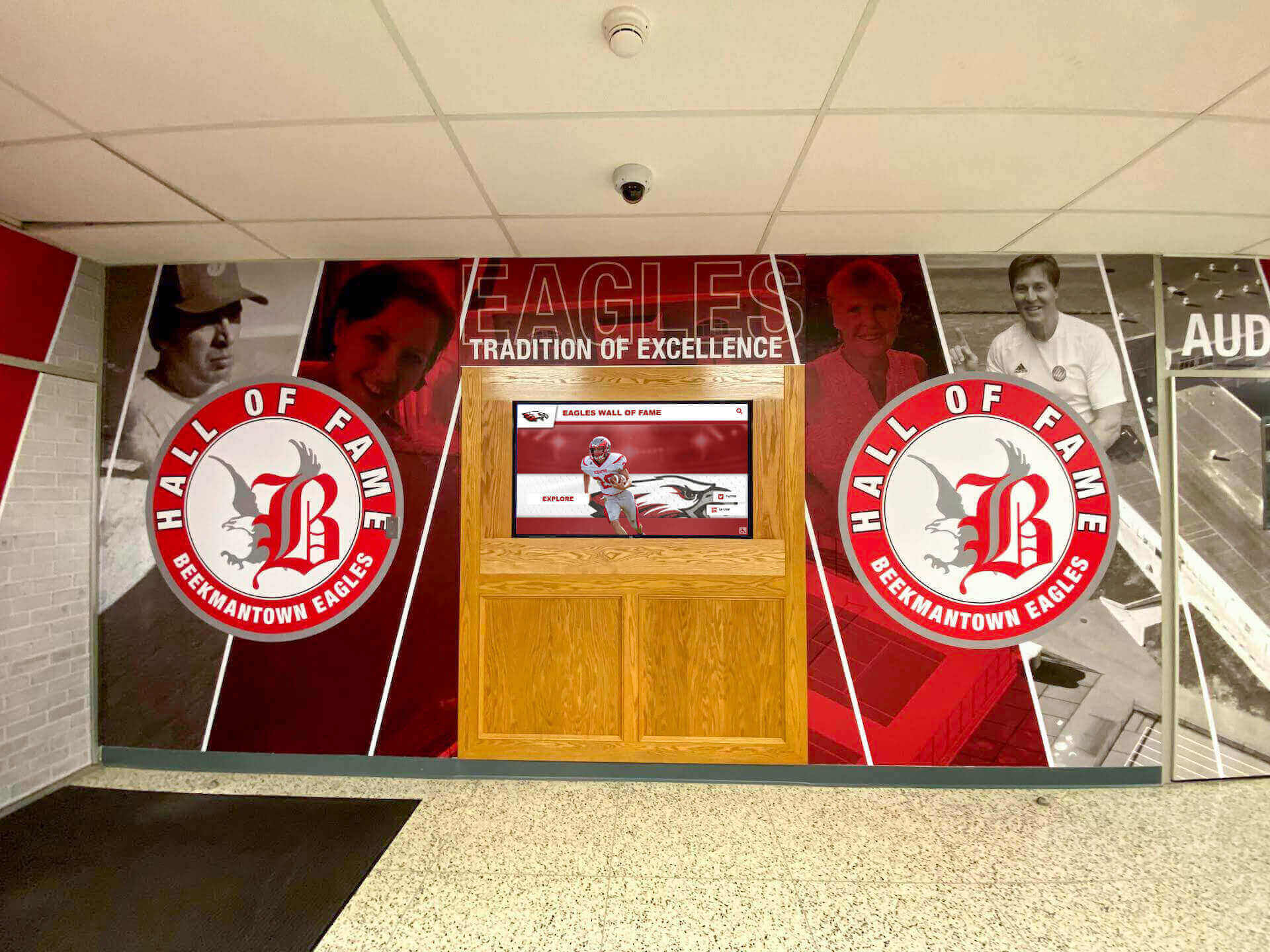
A school lobby hall of fame mural anchored by the Eagles mascot identity — the format CAP squadrons can use to create a recognition presence that connects unit branding to the broader school community's visual environment
Color Strategy for CAP Unit Logos
Color is the fastest visual communicator in any identity system. For CAP unit logos, the color strategy must serve two constraints simultaneously: respecting the official CAP palette in the roundel and building a complementary unit identity color system that reads distinctly for the specific squadron.
Foundation in CAP colors. Any CAP unit design should include at least one of the official CAP colors — red, white, or Air Force blue — as a dominant element in the unit crest or banner background. This creates visual continuity between the unit identity and the official emblem even when the two are viewed separately.
School colors as accent. The school’s primary color works best as the color of the central charge (typically the mascot) within the crest, where it provides contrast against the CAP-colored background field. The school’s secondary color can appear in border treatments, motto banner backgrounds, and framing elements in banner designs.
White for legibility. Nearly every effective CAP unit design relies on white as a legibility element — white text on deep color fields, white outlines around charged elements, and white negative space within the crest structure. White is also the required background color for official CAP emblem applications, so ensuring the unit crest design also works clearly on white backgrounds creates natural compatibility.
Single-color and reversed versions. Every unit logo should have a prepared reversed version (white or light elements on dark field) for use on dark banner backgrounds, digital display slides with deep color fields, and embroidery on dark uniform accessories. A single-color version — typically in Air Force blue or black — handles applications where full-color reproduction isn’t available.
CAP Brand Compliance When Adding Unit Identity
The non-negotiable boundary in CAP squadron logo design is the integrity of the official national emblem. No unit design element should appear inside, overlapping with, or immediately adjacent to the protected roundel in a way that compromises its clear space or visual isolation. This constraint is the operating principle for all CAP branding: the roundel is inviolable; the surrounding design is the unit’s canvas.
Practical compliance principles for CAP unit logo design:
Separate elements, clear hierarchy. The official CAP roundel appears as the primary visual anchor in any layout. The unit crest appears as a secondary element — typically positioned below the roundel with clear visual separation, or placed in an adjacent position with defined boundaries. The viewer should understand at a glance that these are two distinct elements, one national and one unit-specific.
Never modify the official roundel. The roundel’s colors, proportions, text, and internal design are protected. Adding the squadron number inside the roundel circle, changing the background color to match school colors, or placing the unit motto over the roundel text are all clear violations of CAP brand standards.
Approved addition positions. Squadron name, charter number, and school name may appear as separate text elements positioned below or beside the official roundel — never inside it or overlaid on it. These additions are clearly labeled as additions rather than modifications.
Follow CAP national brand resources. CAP’s national headquarters maintains brand guidelines and authorized files through its member portal at gocivilairpatrol.com. Squadrons should use authorized vector files for the official roundel and design all unit identity elements in alignment with those guidelines.
Applying the Squadron Logo Across Materials
Meeting Room Banner and Officer Board
The squadron meeting room is the most important visual environment for daily cadet identity reinforcement. The primary banner — typically a 3×6-foot or 4×8-foot vinyl or fabric panel for the meeting room wall — carries the fullest expression of the unit’s visual identity: the official CAP roundel as the primary mark at the top, the unit crest below as the secondary identifier, and the squadron name and school affiliation in bold type.
The cadet officer board — displaying current unit officers with rank insignia and portrait photos — should carry the unit logo in its header. Student leadership recognition programs consistently show that when leadership roles are paired with strong visual identity at the display level, cadets and students respond to their positions with greater formality and program investment.
Certificates and Award Documents
CAP squadrons issue certificates across a wide range of milestone events: promotion documents, encampment completion certificates, aerospace education achievements, emergency services participation recognitions, and the major named award certificates (Mitchell, Earhart, Spaatz). The unit crest should appear alongside the official CAP roundel on every certificate, with clear visual hierarchy maintained: roundel as primary mark, unit crest as secondary identifier.
For the highest-tier achievement certificates — particularly the Spaatz Award, which fewer than one percent of program participants earn — the certificate design should scale in formality to match the significance. These documents become permanent records in the cadet’s portfolio; they deserve the same care that any institution would give to its most prestigious recognition materials.
Event and Ceremony Materials
CAP squadrons host several recurring annual events — change of command ceremonies, promotion milestones, encampment send-offs, annual reviews, and community service recognition events — each requiring branded visual materials. Step-and-repeat backdrop banners, podium signage, and ceremony stage treatment all benefit from consistent application of the unit’s visual identity.
The backdrop banner serves a specific function in these contexts: it appears as the background in every formal photograph taken at the event, meaning it will be a permanent visual reference in the squadron’s archive and in CAP wing communications for years. A unit crest and official roundel properly positioned on a backdrop banner produce professional results that reflect well on cadets, on the program, and on the school.
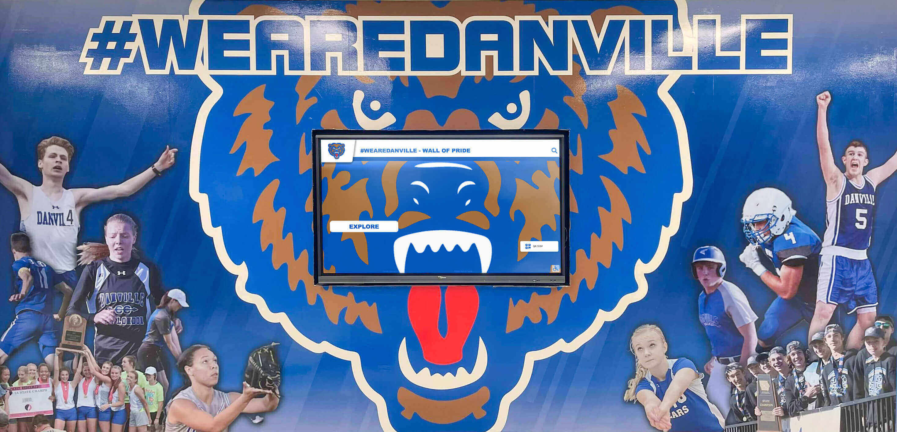
A school athletics mural featuring the mascot logo integrated with a digital display — the visual model for how CAP squadron crests and school identity can work together in a cohesive recognition environment
Placing CAP Unit Logos in School Recognition Environments
The most lasting recognition context available to any school program is the physical recognition environment: hallways, lobbies, trophy cases, and dedicated program spaces that every student, family member, and visitor encounters throughout the school year. CAP squadrons that establish a visual presence in these environments build program prestige in a way that meeting room displays and social media alone cannot replicate.
Lobby and Hallway Displays
A hallway or lobby display anchored by the squadron’s unit logo and official emblem creates daily visibility for the program among the full student population. School lobby design principles consistently show that programs with a permanent, polished presence in high-traffic entry spaces create stronger recruiting pipelines and broader community support than programs confined to interior spaces.
For hallway display applications, the unit logo should appear at a minimum of 12 inches in its primary dimension on any wall-mounted panel — large enough to read clearly at the 8–10-foot viewing distance of typical hallway traffic.
Trophy Case Integration
CAP squadrons that have accumulated competitive drill results, encampment excellence awards, aerospace education recognitions, and wing-level achievement records deserve organized, professionally presented trophy case displays. Modern digital trophy case solutions allow programs to display the unit logo alongside achievement records, competition photos, and cadet portrait histories in a format that scales as the program grows without requiring an entirely new physical display every few years.
The unit logo at the top of the squadron’s trophy case section — whether physical or digital — establishes program identity for any visitor before they read a single award label or certificate date.
Multi-Year Achievement Records
The most powerful application of a CAP unit logo is as the consistent visual anchor for a multi-year history display that documents the squadron’s evolution — past commanders by year, Spaatz and Earhart Award recipients, encampment attendees, emergency services missions, and competitive achievements going back to the unit’s founding.
Guides to displaying school program history comprehensively demonstrate how organizing this kind of longitudinal recognition around a consistent visual anchor — the unit logo — transforms a collection of individual awards and photos into a coherent program narrative that motivates current cadets and honors program alumni.
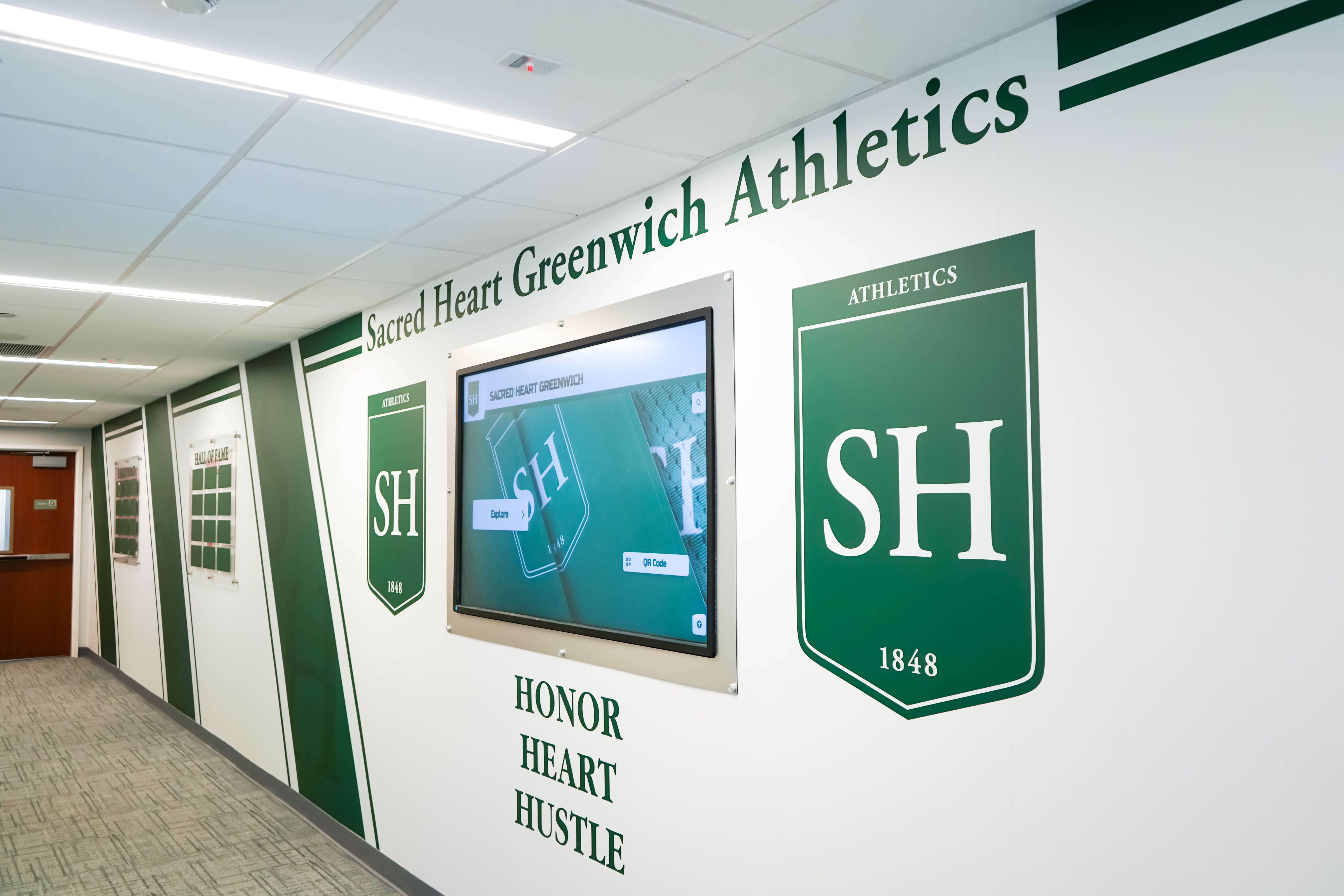
Shield-format recognition panels in a school athletics hallway — the heraldic visual language that CAP squadron unit crests share with broader school recognition environments, creating natural integration opportunities
Digital Display Applications for CAP Squadron Identity
Schools increasingly combine physical recognition elements with integrated digital displays that cycle through cadet portraits, achievement records, and program history. CAP squadrons that secure access to school digital display systems have a powerful tool for building program visibility throughout the campus.
School Digital Signage Systems
School digital signage programs increasingly include youth program content alongside athletics and academics. A CAP squadron with access to school hallway digital displays can cycle content featuring the unit logo alongside promoted cadet portraits, upcoming encampment dates, and recent achievement records — reaching the full student population during passing periods and lunch.
The unit logo must be prepared in digital-optimized formats for these applications: RGB color values confirmed against screen calibration, SVG or high-resolution PNG files used rather than low-resolution JPEGs, and clear space maintained in the slide layout so the logo never crowds against text or photographic content.
Interactive Touchscreen Recognition Systems
Schools that have deployed interactive touchscreen kiosks in lobby areas create an opportunity for CAP squadrons to present a searchable archive of unit history. Designing effective touchscreen hall of fame displays requires the same visual hierarchy principles that govern physical recognition walls: a consistent logo as the identifier for the program section, clear typography for names and achievement dates, and a layout that scales from the overview level to individual cadet profiles without losing legibility or program identity.
For a CAP squadron, a touchscreen system could allow visitors to browse past cadet commanders by year, search for graduates by name, explore encampment photos organized by season, and view the progression of achievement milestones across the unit’s history — all anchored by the unit logo as the consistent program identifier.
Recognizing Alumni and Long-Term Program Contributors
Alumni recognition systems for schools provide a structural model for CAP squadrons that want to track what their graduates go on to accomplish. Former cadets who commissioned as military officers, who work in aviation or aerospace, or who continue serving their communities in emergency services or public safety roles represent the program’s long-term impact. A recognition system that tracks and displays these outcomes — organized under the unit logo as the visual identifier — creates the kind of multi-generational narrative that motivates current cadets in a way that competition trophies alone cannot.
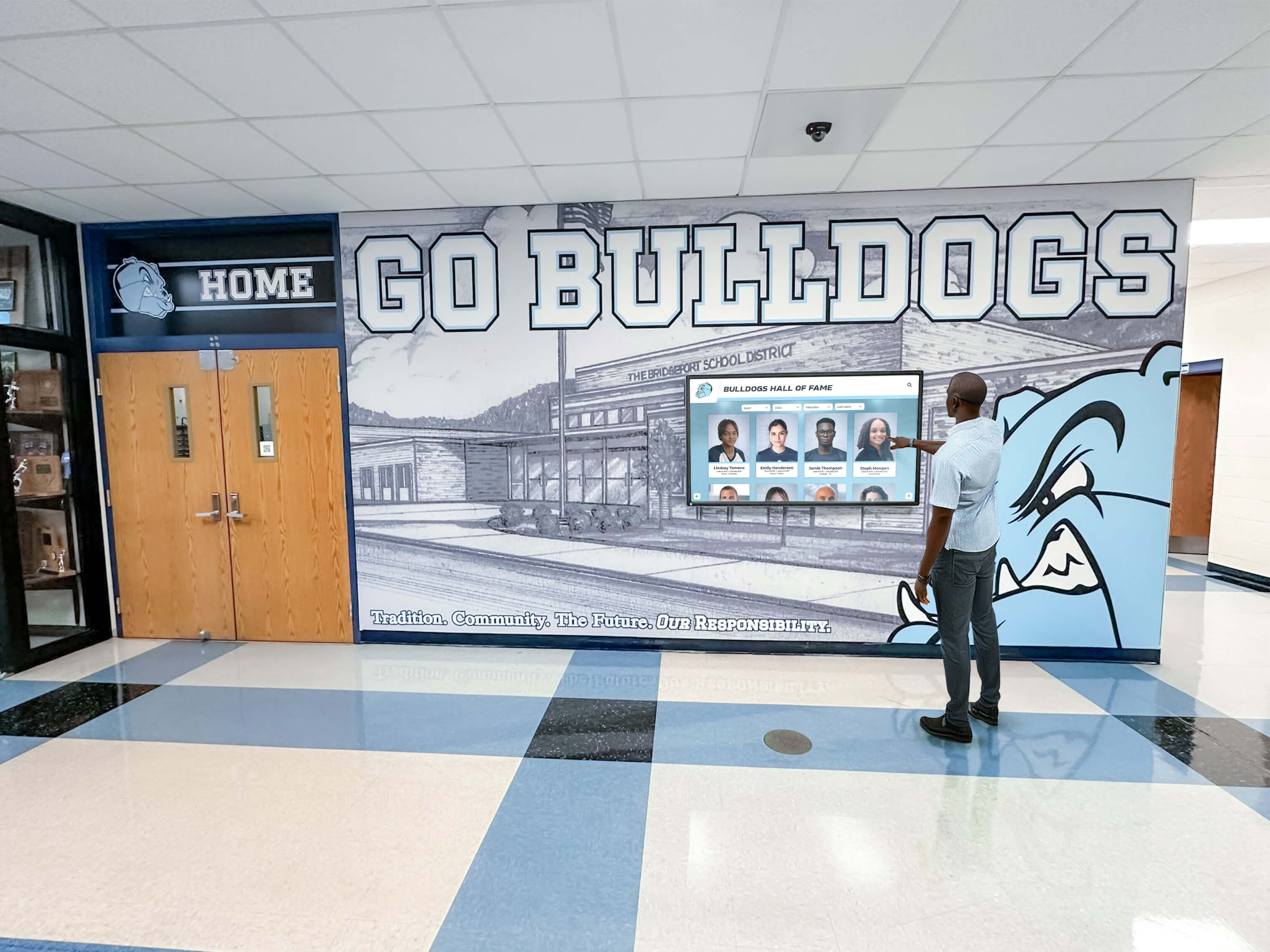
An interactive hall of fame recognition screen in a school hallway — CAP squadrons with access to these systems can present searchable unit history, cadet officer records, and achievement milestones anchored by the squadron's distinctive unit logo
File Format and Technical Requirements
A well-designed civil air patrol unit logo is only as durable as the files used to maintain and reproduce it. The most common source of quality degradation in school program logos isn’t poor design — it’s inadequate file management that forces successive cadets or advisors to reproduce materials from increasingly degraded sources.
Vector-First Design
The unit crest must be created in and stored as a vector file — SVG, Adobe Illustrator (AI), or EPS format. Vector graphics are defined mathematically rather than as pixel grids, which means they scale from a one-inch collar device to a six-foot banner panel without any quality loss. A vector file that exists and is maintained is the difference between a program that produces consistent, professional materials across every application and one that produces blurry, inconsistent reproductions decade after decade.
If the squadron’s current unit identity exists only as a JPEG or PNG — or worse, as a hand-drawn design that was photographed but never digitized properly — the first priority is a one-time investment in having a designer re-create the mark in vector format.
Required Export Files
From the vector master, maintain a library of derivative exports:
- SVG — for web applications and digital displays that support vector rendering
- PNG with transparent background — for digital overlays, presentation templates, and social media graphics
- PDF — for print vendor submissions; preserves vector quality and embedded color profiles
- JPEG with white background — for email, document insertion, and contexts that don’t support transparency
Color Variant Library
Every unit logo should have three color variants prepared:
- Full-color standard — the primary version for most applications
- Reversed/white — white or light elements on dark background, for dark banner fields and ceremony backdrops
- Single-color Air Force blue or black — for applications where color printing isn’t available
Custom hall of fame signage design guides consistently note that programs that maintain organized logo file libraries with named versions, clear version history, and designated custodianship produce far more consistent recognition materials over time than programs that treat the logo as an incidental resource rather than a managed asset.
Common CAP Unit Logo Design Mistakes to Avoid
Modifying the official CAP roundel for unit identity. Adding the squadron number inside the roundel, recoloring the emblem in school colors, or incorporating school mascot elements into the protected mark violates CAP brand standards and undermines the professional credibility the emblem is meant to convey.
Designing only for screen. A unit crest that looks balanced on a monitor may be illegible when embroidered on a warm-up jacket or printed on a vinyl banner. Every design decision should be evaluated at the actual production scale and method the logo will encounter.
Too many elements in the unit crest. The impulse to include the official roundel, a mascot, the school name, the unit number, a motto, a founding date, and a regional symbol in a single unit crest produces a mark that communicates nothing clearly. A mascot charge within a colored shield, a clear unit designation, and a motto banner are sufficient for a highly effective crest.
Using a downloaded web image as the unit logo source. JPEGs and low-resolution PNGs found through web image searches are not adequate sources for print or display production. The master logo must always be in vector format from an authorized source.
Inconsistent application across materials. Using a different color variant, size, or version of the unit logo on different materials — some with the crest, some without; some with the roundel, some without — means the unit never builds the recognition equity of a consistently applied identity. Establish clear standards for which version applies to each material type and maintain them across leadership transitions.
Not preparing for dark backgrounds. Ceremony photos, digital display slides, and dark banner applications will make a logo designed only on white backgrounds disappear. The reversed version must be designed alongside the standard version before the identity is finalized.
No file custodianship plan. Units that treat logo files as informal resources lose quality over time as leadership turns over and successive cadets use progressively degraded versions. Designate a file location, a custodian (typically the senior member advisor), and a handoff protocol that transfers logo files cleanly to each new unit commander.
FAQ
What is a civil air patrol unit logo versus the official CAP emblem? The official Civil Air Patrol emblem — the red-and-blue roundel with the tri-blade propeller — is the protected national mark belonging to the organization. A civil air patrol unit logo is the squadron-specific design identity that individual cadet units develop to identify their particular squadron, typically including a unit crest, color palette drawn from CAP and school colors, unit number typography, and a motto. The unit logo complements the official emblem without modifying or replacing it.
Can a CAP squadron modify the official CAP emblem for its unit design? No. The official CAP roundel must appear in its authorized colors, proportions, and design without modification. Squadron-specific identity elements — unit crests, mascots, mottos, school colors — appear as separate design components alongside the official emblem, never incorporated into the protected mark itself. CAP national headquarters provides brand guidelines through the member portal at gocivilairpatrol.com.
What file formats does a CAP unit crest need? The master unit crest must be created and stored in vector format — SVG, AI (Adobe Illustrator), or EPS. From this master, maintain derivative exports: PNG with transparent background for digital use, PDF for print vendors, and JPEG with white background for documents and email. Keep full-color, reversed (white), and single-color variants for each of these formats.
How large should a CAP unit logo appear on a school hallway display? For wall-mounted hallway displays, the unit logo should appear at a minimum of 12 inches in its primary dimension to read clearly at the 8–10-foot viewing distance of typical hallway traffic. For meeting room officer boards and close-range displays, 6–8 inches is sufficient. Always maintain clear space — no other graphic elements within approximately the logo’s own width on all sides.
How do CAP squadron logos appear on digital recognition systems? In digital recognition displays, the unit logo serves as the consistent program header across all content states — cadet portraits, achievement records, competition results, and historical photos. The logo appears in its full-color standard version on light backgrounds or the reversed version on dark fields, at a size sufficient for legibility on the display’s resolution. Use PNG or SVG file formats for screen applications rather than JPEG to preserve edge quality.
Build a Recognition Display That Honors Your CAP Squadron's Identity
Rocket Alumni Solutions helps schools create digital recognition systems that showcase Civil Air Patrol cadet achievements, unit history, and program milestones alongside athletics and academics — searchable, updatable, and designed to reflect the identity your squadron has built year after year.
Get notified when Rocket Graphics opens