The Civil Air Patrol logo is one of the most distinctive marks in American youth programs — a bold roundel pairing a tri-blade propeller with the organization’s name in clean block lettering, anchored in CAP’s signature red, white, and blue. For the more than 26,000 cadets enrolled in CAP squadrons at high schools and community units across the country, this emblem is the visual cornerstone of their uniform, their ceremony backdrops, their banners, and their hallway recognition displays. Used correctly, the CAP logo communicates institutional seriousness, organizational pride, and a clear connection to the U.S. Air Force mission that CAP has supported since 1941. Used carelessly — stretched, recolored, pixelated, or crowded — it undermines the professional credibility that every cadet works to earn.
This guide covers everything schools and squadrons need to know: the history behind the Civil Air Patrol logo, the official variants and color specifications, CAP’s brand usage guidelines, and practical design advice for the banners, recognition boards, certificates, and digital displays where the logo appears most often.

Schools with CAP cadet squadrons integrate program emblems into hallway murals and digital displays that build identity for the entire student body
Civil Air Patrol: Background and Mission
Civil Air Patrol was chartered by Congress on July 1, 1946, but its roots go back to December 1, 1941 — just six days before Pearl Harbor — when the organization was established as a civilian volunteer corps to support homeland defense. Today, CAP serves as the official auxiliary of the United States Air Force and carries three congressionally mandated missions: emergency services (including search and rescue), aerospace education, and the cadet program.
The cadet program is CAP’s most visible presence in schools. Cadet squadrons operate in high schools and community settings in all 50 states, the District of Columbia, Puerto Rico, and overseas. The program serves cadets from age 12 through 20, offering structured achievement through activities that range from aerospace education and leadership training to drill and ceremony, fitness challenges, and powered flight scholarships. As of recent program data, CAP operates more than 1,100 cadet squadrons nationwide.
For high schools hosting cadet squadrons, the Civil Air Patrol logo appears on everything from the cadet’s shoulder sleeve insignia and beret flash to the squadron’s meeting room banner, the school hallway recognition board, and any event materials that communicate the program’s identity to the broader campus community.
History of the Civil Air Patrol Logo
CAP’s visual identity has evolved alongside the organization itself, but several design elements have remained constant throughout its history.
The Roundel Origin
The Civil Air Patrol roundel — the circular disc that forms the foundation of the modern logo — draws directly from military aviation tradition. Roundels have identified military aircraft since World War I, and CAP’s adoption of the format in its early decades placed the organization visually within the broader tradition of American air power. The original 1941–1946 era CAP insignia were simpler, often text-heavy marks adapted for wartime use on aircraft and uniforms.
As CAP formalized its role as an Air Force auxiliary after World War II, its visual identity became more structured. The tri-blade propeller — representing aviation, the organization’s founding environment — emerged as the central symbol, surrounded by the red roundel that signals both aviation authority and patriotic identity.
Modern Logo Development
The contemporary Civil Air Patrol logo standardized the relationship between the propeller device, the surrounding roundel ring, and the organizational name text. Key decisions in the logo’s evolution include:
- Fixing the propeller at three blades, representing CAP’s three core missions
- Standardizing the color palette around red, white, and Air Force blue
- Establishing the full lockup with “CIVIL AIR PATROL” on the upper arc and “UNITED STATES OF AMERICA” on the lower arc
This configuration gives the logo its authoritative, official quality. The circular format reads at a distance — on vehicle decals, aircraft tail markings, and building signage — while remaining legible at small sizes on collar devices and ribbons.

Schools use banner displays and recognition walls to celebrate program identity — a natural fit for cadet squadrons whose members serve the community through emergency services and aerospace education
Official Civil Air Patrol Logo Variants
CAP maintains several official logo configurations that serve different applications. Squadrons should understand which variant is appropriate for each use case.
Primary Full-Color Roundel
The standard Civil Air Patrol emblem is the full-color version: a red disc background with a white outer ring, featuring the white propeller device at center and the organization name in white block lettering arcing around the circle. This is the authoritative version for formal applications — uniform insignia, official documents, ceremony backdrops, and primary squadron banners.
One-Color Versions
For applications where full color reproduction is not practical — embossed letterheads, single-color print runs, engraved awards — CAP provides approved single-color versions of the emblem. These use either solid black, solid white, or the official red as the single color, depending on background contrast requirements. One-color versions maintain the propeller, ring, and text layout while eliminating the color differential between elements.
Reversed/Negative Version
The reversed version presents the emblem as white on a dark background (dark blue, black, or dark red). This is the appropriate choice for dark-background banner applications, digital display slides with deep color fields, and embroidery on dark-colored uniform accessories.
Wordmark and Text-Only Applications
For applications where the full roundel is too visually complex at very small sizes — fine print, watermarks, certain digital badge uses — CAP’s style resources include guidance on text-based applications using the organization name in its official typeface. Squadrons should obtain the specific files for this variant through CAP national headquarters’ brand resources.
Cadet Squadron Identity Additions
Squadrons operating at schools may add squadron-specific identity elements — the squadron name, squadron number, and school name — in approved configurations alongside the emblem. These additions appear below or beside the roundel as separate text elements and must never be incorporated into or overlaid on the emblem itself.
CAP Official Color Palette
Civil Air Patrol’s color palette draws directly from U.S. Air Force branding tradition, which reflects the organization’s role as the Air Force’s official auxiliary.
Primary Colors
CAP Red — The dominant color in the roundel background. This is a bright, saturated red that reads as patriotic and authoritative. In practice, it approximates Pantone 186 C (the Air Force’s official red specification), though squadrons should verify current color standards through CAP’s brand resources. For digital applications, the hex value approximates #C8102E, but always confirm through official materials.
Air Force Blue — Used in supporting design elements, text applications, and complementary color fields on squadron materials. The Air Force’s official blue is a deep, distinct shade that reads as both professional and distinctly military. It approximates Pantone 289 C in print applications.
White — Provides the contrast within the roundel itself (propeller, text, outer ring) and serves as the background color for most document applications. Clean white is essential for legibility of the roundel’s internal elements.
Secondary Applications
Squadron-created materials may incorporate the school’s own colors in secondary positions — banner backgrounds, certificate borders, and framing elements — as long as the CAP emblem itself appears in its official color palette. The emblem should never be recolored to match a school’s colors.
Civil Air Patrol Logo Usage Guidelines
CAP national headquarters provides brand standards that govern how the emblem may be used. Squadrons operating at schools should follow these guidelines for all materials that carry the CAP mark.
Required Practices
Maintain proportional scaling. The CAP emblem should always be reproduced at its original proportions. When resizing for banners, certificates, or digital graphics, scale by percentage — never stretch or compress the mark to fit an awkward space. All professional design software offers “constrain proportions” scaling that prevents distortion.
Protect clear space. Establish a clear space zone around the emblem — a buffer free of other text, graphics, and design elements. A practical rule of thumb is a clear space equal to the width of the propeller’s outermost blade tip on all sides. This isolation keeps the mark visually distinct and legible.
Use vector files for print. Print applications — banners, certificates, event programs, recognition plaques — require vector format files (SVG or EPS) to maintain sharp, clean edges at any size. Raster files (JPEG, PNG) sourced from websites will pixelate when scaled up, producing blurry reproduction that conflicts with the professional standards CAP’s brand represents. Squadrons should obtain authorized vector files through CAP’s official member resources.
Apply the correct variant for each background. Use the full-color version on white and light backgrounds. Use the reversed version on dark backgrounds. Never place the full-color emblem on a red background where the disc disappears into the field.
What to Avoid
Never recolor the emblem. Applying school colors, gradient fills, or custom color treatments to the CAP roundel violates brand standards. The emblem communicates affiliation with a nationally recognized organization — its value comes from consistency across every squadron in the country.
Never add effects. Drop shadows, glow effects, bevels, and outlines alter the mark’s clean, authoritative appearance. The emblem should always appear flat and crisp.
Never alter the text. The organization name arcing around the roundel is part of the protected mark. Changing the font, removing text elements, or rearranging the layout is not permitted.
Never crowd the emblem. Placing other logos, text, or graphics within the clear space zone creates visual clutter that undermines the emblem’s authority. Squadron materials should organize their layout so the CAP emblem has room to breathe.
Never use low-resolution images. A JPEG found via a web image search is almost certainly too low-resolution for print applications and may contain incorrect color values. Always use authorized files obtained through official channels.

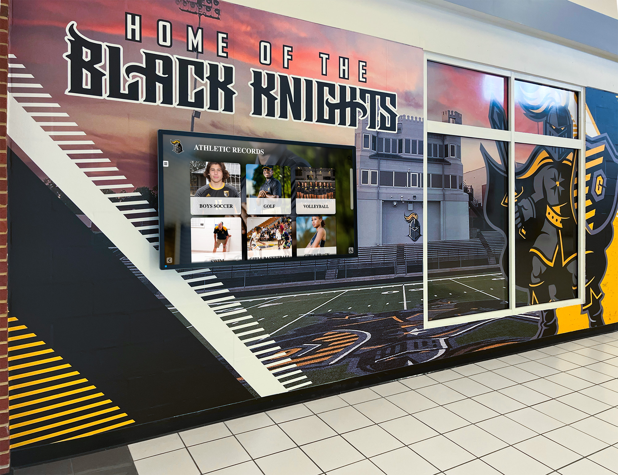
Interactive digital kiosks give CAP cadet squadrons a powerful tool for displaying program history, achievement records, and cadet officer profiles in an engaging, updateable format
Where Schools Display the Civil Air Patrol Logo
Cadet squadrons operating at high schools create visual touchpoints throughout the school environment. Each location has its own practical requirements for logo reproduction and display.
Squadron Meeting Room
The primary CAP space in a school is typically the meeting room or classroom where the cadet squadron assembles. Essential displays for this space include:
Squadron banner — The primary branded anchor for the room. A professionally produced squadron banner displays the full-color CAP roundel prominently at the top, with the squadron name and school name in clean type below. Standard banner sizes for wall mounting run from 2×4 feet to 3×6 feet. Retractable banners (33"×80") work well for events where portability matters.
Cadet officer board — A visual listing of current cadet officers with their rank insignia and names, often incorporating the CAP emblem in the header design. This serves both as a reference for cadets and as a recognition display visible to visiting parents and community members.
Achievement wall — A dedicated section tracking squadron competitive results, encampment completions, solo flight achievements, and national recognition. The CAP emblem should anchor this display with clear space protecting it from surrounding content.
Mission board — Many squadrons maintain a display tracking active emergency services participation, community service hours, and aerospace education milestones alongside the CAP roundel.
School Hallway and Lobby Displays
Squadrons that secure hallway or lobby display space benefit significantly from the broader visibility it provides. When other students, faculty, and visitors encounter CAP recognition boards during normal school traffic, it builds program awareness and supports recruitment.
Welcoming institutional foyer design principles consistently demonstrate that public-facing displays create program prestige that closed-door meeting rooms cannot. A hallway display featuring cadet officer portraits in uniform, competitive achievements, and the CAP emblem properly displayed tells a compelling story to every student who passes.
Wall of fame design templates for school programs provide structured layout approaches — organized visual hierarchy, professional brand application, and clear thematic focus — that create environments signaling program quality before a word is spoken.
Event and Ceremony Backdrops
CAP squadrons host several annual events where visual environment matters:
- Change of command ceremonies (when new cadet commanders take leadership)
- Promotion ceremonies
- Achievement milestone recognitions (solo flight, encampment completions)
- Annual review (inspection by CAP regional or wing staff)
- Community service award presentations
For each event, a branded backdrop — step-and-repeat banner, podium signage, or ceremony stage treatment — reinforces the formal character of the occasion. The backdrop serves as the photograph background for portraits that appear in squadron records, school publications, and CAP wing communications.
Academic achievement award programs in high school offer transferable design thinking for CAP cadet recognition — rotating recognition formats, portrait-centered layouts, and achievement-anchored content translate naturally from academic honor programs to military cadet program displays.
Design Tips for CAP Squadron Materials
Certificates and Award Documents
CAP squadrons issue certificates for a wide range of milestones: promotion to each cadet grade, encampment completion, aerospace education achievement, flight scholarships, solo and powered flight certificates, and community service recognition. The quality of these documents signals how seriously the squadron takes its own achievements.
Certificate design principles for CAP:
- Position the full-color CAP roundel at the top center with clear space protecting all sides
- Use Air Force blue for borders, decorative rules, and header elements to tie the document to CAP’s color identity
- Select a serif typeface for the recipient name — these read as more ceremonial than sans-serif
- Keep the background clean and white or very light gray for legibility
- Include the squadron name, charter number, date, and authorizing cadet commander signature with room to breathe
- For achievement certificates tied to national programs (Mitchell, Earhart, Spaatz), the design should scale in formality to match the significance of the milestone
The Spaatz Award — CAP’s highest cadet achievement, earned by roughly 1% of program participants — warrants the most elaborate certificate treatment. The Mitchell Award (first major cadet milestone) is often the first formal certificate many cadets receive and sets the standard for subsequent recognition.
Squadron Banners
The right banner design balances CAP’s national brand identity with squadron-specific character without becoming cluttered or competing with itself visually.
Effective squadron banner layouts:
- CAP roundel in the upper center or upper left as the primary visual anchor
- Squadron name in bold type below at a size readable from 15+ feet
- School name in slightly smaller text
- Red, white, and blue color palette for backgrounds and borders
- Minimal additional content — blank space at the base for adding competitive year plaques over time is preferable to crowding the banner with too many elements initially
For large ceremony banners, vertical retractable formats (33"×80") work best. For permanent meeting room walls, horizontal vinyl banners (typically 3×6 or 4×8 feet) provide more surface area for recognition content alongside the primary CAP emblem.
Recognition Boards and Plaques
Squadrons that maintain physical recognition boards — framed portraits of cadet officers, engraved plaques for award recipients, photo collages of encampment and competition teams — should organize these elements around the CAP emblem as a consistent header that unifies the display.
Championship banner display strategies offer design principles — color discipline, hierarchical arrangement, and long-term flexibility — that transfer well to CAP squadron recognition walls.
Social Media and Digital Graphics
CAP squadrons maintain active social presences for recruiting cadets, communicating with families, and sharing program achievements. Digital graphics for social media should follow the same logo guidelines as print materials: correct clear space, official colors, proper variant selection.
Digital displays for student organization awards create opportunities for CAP squadrons to extend their visual identity beyond the meeting room and into the broader school communication environment — promoting encampment dates, recognizing promoted cadets, and building program awareness among the student population.

Blue-themed recognition walls create natural visual alignment with Civil Air Patrol's Air Force blue color identity, producing cohesive branded environments for cadet display spaces
Digital Display Opportunities for CAP Squadrons
Schools increasingly deploy digital signage and interactive displays throughout their facilities — in lobbies, hallways, cafeterias, and common areas. CAP squadrons that gain access to these systems have a powerful visibility tool.
Hallway Recognition Screens
A school hallway digital display cycling through CAP content — promoted cadet portraits, competitive achievements, upcoming events, encampment photos — reaches the full student population during passing periods and lunch. Because digital screens allow rapid content updates, squadrons can recognize newly promoted cadets within days of their ceremony rather than waiting for physical boards to be updated.
Touchscreen displays in school gym lobbies and trophy rooms provide a useful framework for evaluating the right display hardware and software configuration for hallway recognition content, including the content management workflows that make regular updates sustainable for squadron staff.
Interactive Cadet History Kiosks
Schools with interactive touchscreen kiosks in lobby areas can feature CAP squadron history — searchable records of past cadet commanders, Spaatz and Earhart Award recipients, encampment attendance, and squadron competitive results going back decades. This kind of searchable archive transforms squadron history from a binder on a shelf into a living institutional record accessible to current cadets and visitors.
Comprehensive interactive touchscreen kiosk software guide demonstrates how touchscreen technology changes the relationship between school visitors and recognition content — passive glancing at a static board becomes active exploration of program history.
Touchscreen recognition displays in high school lobbies offer an approach that CAP squadrons can adapt for honoring cadets who go on to military service, veterans who mentor the program, and former cadets who have served the community in emergency services roles — connecting the squadron’s present to its legacy.
Classroom Display Screens
Squadrons with dedicated meeting rooms can turn a classroom TV or monitor into a rotating recognition and information display during non-class hours. A branded slide cycling through the CAP roundel, promoted cadets, and upcoming events reinforces squadron identity for every visitor and reminds cadets throughout the meeting period of what the organization represents.
Why interactive recognition systems outperform static digital signage includes seasonal strategies that CAP squadrons can adapt for new cadet orientation — making the meeting room an environment that communicates program values from the first day of school.

Interactive hallway displays allow cadets and prospective members to explore squadron history, achievement milestones, and program identity at their own pace
Connecting CAP Branding to School Recognition Culture
CAP cadet squadrons exist within a broader school recognition ecosystem that includes athletics, academics, arts, and other student organizations. Squadrons that design their materials with awareness of this larger context create cohesive additions to the school’s visual environment rather than isolated islands.
Coordinating with School Graphic Standards
Most schools have official colors, logos, and graphic standards that govern school-wide materials. CAP squadrons should design their displays to coexist with those standards — typically by leading with the CAP emblem’s official red, white, and blue while incorporating the school name and school logo in secondary positions. The national CAP brand and the school’s local identity can coexist when clear visual hierarchy governs the layout.
A practical approach: use the school’s primary color as a banner background, position the CAP roundel prominently with its full clear space, and use the school name in a clean sans-serif below. This gives the display both the national CAP brand authority and local school identity without either overwhelming the other.
Building a Multi-Year Achievement Record
CAP offers a structured achievement ladder with named milestones — Curry, Wright Brothers, Goddard, Eaker, Mitchell, Earhart, and Spaatz Awards at the cadet level — that create natural recognition events spaced throughout a cadet’s career. Schools with strong JROTC or CAP programs often find that multi-year recognition displays, tracking which cadets reached which milestones in which years, create an institutional record that inspires current cadets and honors program alumni.
Digital trophy case systems for schools offer structural models for organizing this kind of longitudinal recognition — a format that works especially well for CAP programs with decades of history at a single school.
Honoring the Spaatz Award
The General Carl A. Spaatz Award is CAP’s highest cadet honor, requiring years of sustained excellence across every dimension of the program. Cadets who earn the Spaatz Award deserve permanent, prominent recognition in the school’s physical spaces — not just a certificate filed in a folder.
Recognition solutions that honor multi-year contributors build the kind of institutional memory that motivates current program participants and communicates program quality to external observers — exactly the role a well-designed Spaatz Award display serves.
This kind of lasting institutional record is what Rocket Alumni Solutions supports through digital recognition systems that schools use to honor cadet achievement, program milestones, and student leadership alongside athletic and academic recognition — searchable, updatable, and visually coordinated with program branding.
Common Civil Air Patrol Logo Mistakes and How to Fix Them
Even well-intentioned squadrons make avoidable design errors when producing their own materials. Here are the most common issues and their corrections.
Mistake: Using a low-resolution JPEG or PNG from a web image search Fix: Obtain authorized vector files (SVG or EPS) through CAP’s official member resources. Web images are typically too low-resolution for print and may have incorrect colors. A blurry CAP emblem on a ceremony backdrop undermines the professionalism cadets have worked to project.
Mistake: Placing the emblem directly on a busy or patterned background Fix: Create a white or solid-color container behind the roundel, or use the reversed (white) version on dark solid backgrounds. Never place the standard full-color roundel on a red background or a photograph without a contrasting container.
Mistake: Recoloring the roundel to match school colors Fix: The CAP roundel must appear in its official colors in all applications. School colors belong in the surrounding design elements — banner backgrounds, borders, framing — not inside the protected mark itself.
Mistake: Stretching the emblem to fill a non-proportional space Fix: Always scale proportionally. Adjust the surrounding layout to accommodate the emblem’s natural proportions rather than forcing the mark to fit an incompatible space.
Mistake: Adding the squadron name inside the roundel Fix: Squadron identity elements — name, charter number, school name — appear separately from the emblem, typically below it with clear visual separation. They are never incorporated into the roundel itself.
Mistake: No clear space around the emblem Fix: In design software, create a guide or margin around the roundel that defines the clear space zone. Ensure no other graphic elements cross that boundary before finalizing any layout.
Mistake: Inconsistent use of different logo variants across materials Fix: Establish a standard for which variant (full-color, reversed, one-color) applies to each type of material the squadron produces. Consistency across banners, certificates, and digital materials reinforces brand coherence.

Recognition walls organized around a consistent program emblem — like the CAP roundel — create a unified visual environment that reinforces organizational identity for every visitor
FAQ
Where do I get the official Civil Air Patrol logo files? Official CAP logo files are available to members through CAP’s national headquarters resources at gocivilairpatrol.com. Authorized vector files and brand guidelines are accessible through the member portal. Squadrons should use only authorized files, not images sourced from web searches.
What are Civil Air Patrol’s official logo colors? CAP’s roundel uses red, white, and Air Force blue as its primary color palette. The specific Pantone values are aligned with U.S. Air Force branding standards. Squadrons should reference the current brand guide through official CAP resources for authoritative color specifications, as exact values can be updated.
Can CAP cadet squadrons modify the logo for their squadron? No. The official CAP emblem should not be modified, recolored, or altered in any way. Squadron identity elements — name, charter number, school affiliation — must appear separately from the protected mark. Composite logos that incorporate both the CAP roundel and school logos should maintain clear visual separation between the two marks.
What file format should I use when submitting the CAP logo to a printer? Provide vector files (EPS or SVG) whenever possible. If a vendor requires raster formats, use PNG at the highest available resolution (300 DPI minimum at the intended print size). Never submit JPEG files sourced from websites, which are typically too low-resolution for quality print reproduction.
Can I use the CAP logo on squadron merchandise? CAP squadrons may use the official emblem on squadron merchandise in accordance with CAP brand standards and any applicable national guidelines for merchandise applications. The emblem must appear in its official colors and proportions without modification. Squadrons should review current CAP brand policy for merchandise-specific requirements.
How does the CAP emblem differ from the Air Force symbol? The CAP roundel — the red disc with propeller and organization text — is specific to Civil Air Patrol and distinct from the U.S. Air Force symbol (a stylized star with a horizontal bar). CAP’s emblem is its own protected mark identifying the organization and its members, not a replication of Air Force insignia.
What is the significance of the three-blade propeller in the CAP logo? The tri-blade propeller is CAP’s central symbol, representing aviation — the environment in which the organization was founded and continues to operate. Each blade is also widely associated with CAP’s three core missions: emergency services, aerospace education, and the cadet program. The propeller within the roundel creates the emblem’s instantly recognizable circular structure.
Display Your CAP Squadron's Achievements with Professional Recognition Systems
Rocket Alumni Solutions helps schools create digital recognition displays that celebrate cadet achievements, showcase program history, and honor the leadership milestones your cadets have earned — from lobby kiosks to hallway murals designed to showcase your squadron's identity for years to come.
Explore Recognition Solutions