Championship banner spot color setup is the process of defining school brand colors as named Pantone (PMS) or spot ink values inside a banner design file so every print vendor, in every production run, reproduces the exact ink the school’s brand identity specifies — not a press operator’s best approximation of what “royal blue” or “cardinal red” might mean on that vendor’s equipment. When spot colors are declared correctly in the source file, the ink mixed for the school’s championship banner in 2026 is chemically identical to the ink on the banner printed in 2018, regardless of which vendor produced either run.
This guide covers how to set up spot colors for championship banner artwork, which design applications support the workflow, how to communicate color specifications to a print vendor, and how the same color data serves digital recognition displays so school branding is consistent from the gymnasium wall to the lobby touchscreen.
According to Pantone LLC, the Pantone Matching System (PMS) is used by more than 10 million designers and producers worldwide to specify and match colors reliably across substrates and production environments. For K-12 athletic programs, that system’s value is straightforward: a PMS color number is an unambiguous ink specification that removes color interpretation from every vendor interaction.
Why Spot Color Matters for School Championship Banners
School athletic programs deal with a specific color accuracy problem that most commercial print jobs do not: the same color must reproduce correctly across decades of materials produced by different vendors in different years, and it must match colors already installed in the school — painted walls, embroidered uniforms, printed programs, and physical banners that have been hanging in the gymnasium since before the current athletic director was hired.
Process color printing (CMYK) approximates colors by mixing percentages of cyan, magenta, yellow, and black dots. Two different press operators using slightly different CMYK values for “school green” will produce two noticeably different shades on the finished banner. On a championship banner that hangs beside banners from previous seasons, that color drift is visible to every athlete, student, and visitor who sees the display.
Spot color printing avoids that drift by mixing a dedicated ink formulated to a precise standard. When the school specifies PMS 286 C for its blue, every vendor who receives that specification applies the same Pantone formula — the resulting ink is the same color regardless of which press produced it.
For school athletic programs building interactive hall-of-fame displays alongside physical championship banners, color consistency across both channels is equally important. A PMS specification established for printed banners gives the digital team a defined color value — translatable to an sRGB or hex equivalent — that anchors screen-displayed recognition graphics to the same brand reference.
The Pantone Matching System: What School Staff Need to Know
The Pantone Matching System assigns each formulated ink a unique reference number. Most school and collegiate brand identity guides specify colors in three formats simultaneously:
- PMS (Pantone Matching System): The reference number for spot ink printing. Examples: PMS 286 C (coated stock), PMS 286 U (uncoated stock), PMS 286 CP (coated paper).
- CMYK: The process-color equivalent for four-color offset or digital printing that cannot use spot inks.
- RGB / Hex: The screen-display equivalent for web, social media, and digital signage.
When a school’s official brand guide does not specify a PMS number — common for smaller districts or programs that have never formally documented their brand standards — the athletic director or communications director can identify the closest Pantone equivalent using a physical Pantone Color Bridge fan deck or the Pantone Color Finder at pantone.com. The physical fan deck is the more reliable reference because screen calibration varies between monitors; the printed fan deck shows the actual ink result.
The suffix after the PMS number matters. A “C” suffix (coated) designates the color as mixed and printed on coated paper stock; a “U” suffix (uncoated) applies to uncoated paper. Championship banner vinyl and fabric substrates do not map precisely to either, so the vendor should confirm which Pantone formulation they reference on the substrate they will print. Most large-format vinyl banner vendors work from the PMS coated (C) reference; confirm before submitting artwork.
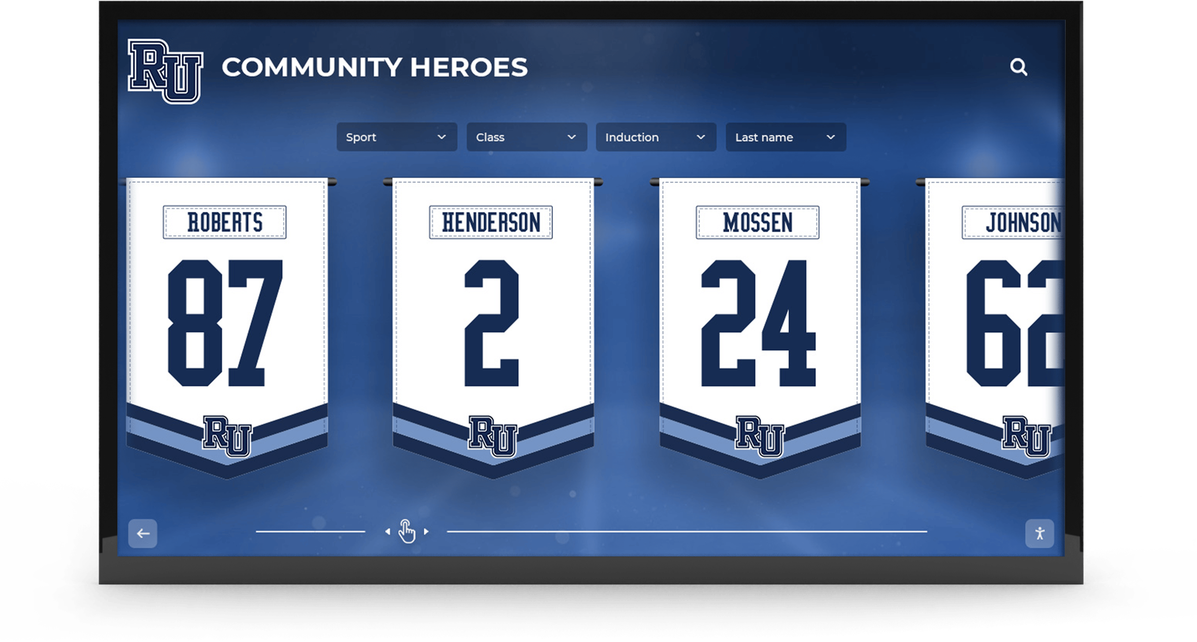
Championship banner color accuracy depends on spot color declarations in the source artwork file — a PMS number communicated at design time is the only specification a vendor can mix to exactly
Setting Up Spot Colors in Adobe Illustrator
Adobe Illustrator is the most widely used vector design application for championship banner artwork production. Spot color setup in Illustrator requires four steps: opening the Swatches panel, creating a new swatch defined as a spot color, assigning that swatch to every relevant element in the artwork, and verifying the separation before export.
Step 1: Create a Spot Color Swatch
- Open the Swatches panel (Window > Swatches).
- Click the Swatch Libraries menu (bookshelf icon at the bottom of the panel) and navigate to Color Books > PANTONE+ Solid Coated (or the appropriate book for your substrate).
- Search for the school’s PMS number. Click the swatch to add it to the document’s Swatch panel.
- Double-click the newly added swatch to open its options. Confirm that Color Type is set to Spot Color — indicated by the triangle in the corner of the swatch preview. If the swatch appears as a Process Color, change the type to Spot Color and click OK.
Alternatively, create a custom spot color swatch:
- In the Swatches panel, click the New Swatch icon.
- In the New Swatch dialog, set Color Type to Spot Color and Color Mode to PANTONE+ or the appropriate color book.
- Enter the PMS number in the name field and adjust the CMYK preview values to match the brand guide’s CMYK equivalent (used for on-screen preview only; the spot ink specification is what the vendor prints).
Step 2: Apply the Spot Color Swatch to Banner Elements
Select every element that should print in the school’s spot color — mascot fills, border stripes, background fields, and text objects. Apply the spot color swatch from the Swatches panel to the fill and stroke of each element.
Do not use “similar” swatches. A school whose brand color is PMS 286 C must apply the PMS 286 C swatch to every relevant element — not a CMYK mix that approximates PMS 286 C, not a global color that was not explicitly defined as a spot. Inconsistency at this step is the most common source of unexpected color separations at the vendor.
Step 3: Verify Color Separations
Before export, verify that the file will separate as intended at the print vendor:
- Go to Window > Separations Preview.
- Click the Overprint Preview checkbox to enable separation mode.
- Toggle each color plate off and on. The document should show only the intended plates: typically two or three spot colors for a two- or three-color championship banner, plus black for text.
- If unexpected CMYK plates appear alongside spot plates, locate the elements generating those plates and replace their fill or stroke with the correct spot color swatch.
Step 4: Export as PDF/X-1a with Spot Colors Preserved
- Go to File > Save a Copy > Adobe PDF.
- In the PDF export dialog, select the PDF/X-1a preset.
- Under Output, confirm that Color Conversion is set to No Conversion — this preserves spot color designations in the PDF rather than converting them to CMYK.
- Under Advanced > Ink Manager, confirm that every PMS swatch appears in the ink list and is marked as a Spot ink, not a Process ink.
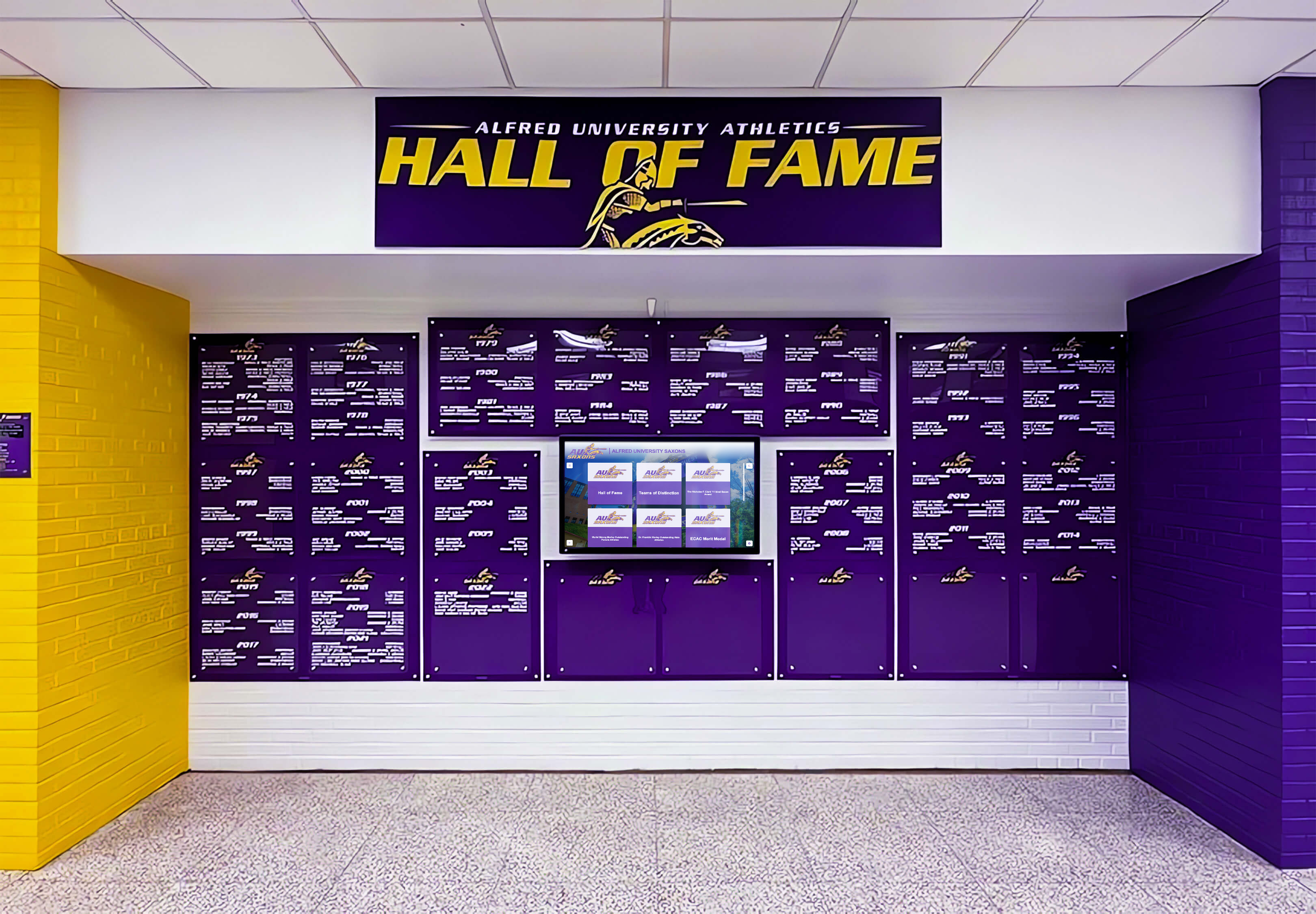
Athletics facilities with defined school brand colors depend on PMS-referenced spot color setup to maintain visual consistency across printed banners, recognition displays, and signage produced by different vendors over years
Setting Up Spot Colors in Adobe InDesign
InDesign’s spot color workflow parallels Illustrator’s, with a few application-specific steps that affect how artwork packages for vendor delivery.
- Open the Swatches panel (Window > Color > Swatches).
- Click the New Color Swatch option from the panel menu.
- In the New Color Swatch dialog, set Color Type to Spot and Color Mode to PANTONE+ Solid Coated (or the appropriate book).
- Select the school’s PMS number from the color picker. Click Add, then Done.
- Apply the swatch to all text, shape, and graphic frames intended to print in the school’s brand color.
Before vendor submission, run File > Package to surface any color issues:
- In the Package Summary, review the Inks section. Spot color inks appear separately from process inks. Every expected PMS color should appear in the Inks list.
- Any imported Illustrator or placed vector graphic that contains spot colors from a different Pantone book (e.g., PANTONE+ Solid Uncoated) will appear as a separate ink. Reconcile these to a single reference before sending files to the vendor.
- Export the packaged document as a PDF/X-4 file. Under Output > Color, set Color Conversion to No Conversion to preserve spot designations.
For school recognition programs building banner artwork that will also feed new building touchscreen displays, saving the InDesign source file with live spot colors intact — rather than flattening or rasterizing before export — preserves the color data that digital teams need to derive accurate sRGB display values.
Communicating Spot Color Specifications to Your Print Vendor
Establishing spot colors in the source file is necessary but not sufficient. The vendor must also understand that the file contains spot colors and that they should print as spot inks — not be converted to CMYK at their preflight stage.
Send a print specification sheet alongside every banner artwork file that contains spot colors. A minimum spec sheet for championship banner spot color orders includes:
| Specification | Value Example | Notes |
|---|---|---|
| Spot color 1 | PMS 286 C | Include full Pantone reference with suffix |
| Spot color 2 | PMS 116 C | One row per spot ink in the file |
| Black | Process black (K100) | Note if black is process or a spot |
| Substrate | 13 oz. vinyl banner, coated face | Substrate affects which Pantone book applies |
| Finish | Matte laminate | Finish alters perceived color — specify if relevant |
| Total ink count | 3 colors (2 spot + black) | Prevents unexpected 4-color quoting |
| Overprints | None | Note any intentional trapping or overprint settings |
| Proof required | Yes — physical strike-off before production | Always request a physical proof for spot color banner orders |
The physical proof step — a strike-off or color match proof printed on the production substrate — is the only reliable verification that the vendor’s spot ink formula matches the school’s PMS standard before full production begins. Digital proofs (PDF soft proofs or inkjet proofs) simulate spot colors on CMYK output and are not equivalent to the final spot ink. For championship banner orders, always require a physical proof approved against a Pantone fan deck before the full print run proceeds.
Athletic programs that include recognition elements for coaches — including coach gifts and appreciation materials produced alongside championship banners — benefit from documenting color specifications for all recognition outputs together so that every vendor delivering materials for the same program works from the same PMS reference. A unified color specification reduces the visual inconsistency that occurs when coach recognition pieces are produced by a different vendor than the banners, without a shared color reference connecting both orders.
Verifying Spot Color Accuracy in Proofs
When a physical proof arrives from the vendor, verify it against three references — not against a screen display, which cannot accurately simulate spot ink on banner substrate.
Reference 1: Pantone fan deck. Hold the fan deck’s PMS chip directly against the proof under consistent lighting. The most accurate comparison uses D50 or D65 standardized light (the standard for graphic arts color comparison). Fluorescent office lighting and natural daylight produce different apparent colors for the same ink. If the school facilities team has a light box or color evaluation booth, use it; if not, evaluate the proof in consistent indirect daylight at a window — not direct sunlight.
Reference 2: Existing installed materials. Hold the proof against an installed banner, a printed game program, or an embroidered uniform already approved by the school. Match to the most recently approved reference material. Over time, existing installed banners may have faded, which makes them unreliable as color references; prefer the most recently produced approved piece.
Reference 3: School brand guide color values. Confirm the proof’s general hue, saturation, and value align with the CMYK and RGB equivalents in the brand guide. If the spot ink appears noticeably more saturated than the brand guide’s CMYK approximation, that is expected — spot inks are often more saturated than CMYK simulations of the same color. The PMS fan deck comparison is authoritative; CMYK comparison is secondary.
Document the proof approval in writing: the date, the name of the staff member who approved, the PMS reference used for comparison, and any color notes. This approval record belongs in the banner production file alongside the artwork source and data source, not in an email thread that may not be accessible when the banner is reordered in a future year.
For athletic recognition programs that also manage art program displays and gallery recognition, the same structured approval workflow — physical proof, standard reference, documented sign-off — maintains the visual quality across all school recognition materials, not just championship banners.
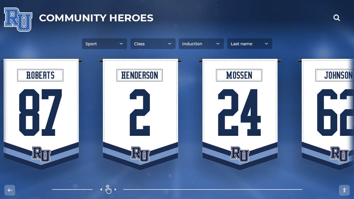
Large-format recognition banners installed in school lobbies and gymnasiums may hang for decades — verified spot color setup at production time ensures the colors remain accurate to the school's brand identity for the life of the banner
Converting Process Colors to Spot Colors in Existing Artwork
Many schools have championship banner artwork files that were set up using CMYK process colors rather than spot colors — often because a freelance designer or student built the initial layout without access to the school’s formal brand guide. Before that artwork goes back to print for a new championship year, it must be updated to use correct spot color references.
In Adobe Illustrator:
- Open the Swatches panel and identify swatches that approximate the school’s colors but are defined as Process colors.
- For each incorrect process swatch, double-click to open its options and change Color Type from Process Color to Spot Color. Note: this keeps the same CMYK screen preview but marks the ink as a spot designation in separations.
- The more reliable approach: add the correct PMS swatch from the Pantone library (as described above), select all elements currently using the approximate process swatch, and use Edit > Find/Replace or select-same-fill to replace those fills with the correct spot color swatch.
- Run Separations Preview to confirm only the intended spot plates appear.
In Adobe InDesign:
- Open the Swatches panel and identify any process swatches that should be spot inks.
- Double-click the swatch, change its type to Spot, and update its name to match the PMS reference.
- Use Edit > Find/Change > Object to globally replace any process color fills with the correct Pantone swatch across all frames in the document.
For art files built in applications that do not support spot color designations — Microsoft PowerPoint, Google Slides, Canva — the reliable solution is to export the layout as a vector PDF or SVG and re-import it into Illustrator or InDesign, where spot color swatches can be applied to the imported paths. Canva’s PDF Print export may preserve color values numerically, but Canva does not support Pantone spot color designations — files from Canva always require a step in a professional design application before vendor submission for spot color banner production.
School programs preparing recognition materials for different sports simultaneously — including programs that manage football program graphics and helmet award recognition alongside championship banners — benefit from a single master swatch library that contains the school’s PMS colors in a shared format all contributors can import, ensuring every recognition output references the same spot color definitions from the start rather than requiring after-the-fact conversion.
A unified recognition platform handles color consistency from banner artwork through digital display, and Rocket Graphics will bring the same school colors to your weekly posts. Get notified when it opens.
Spot Color Setup and Digital Recognition Systems
Championship banner spot colors established for print production also serve digital recognition workflows — but require one translation step. Spot inks do not have direct digital equivalents; instead, they translate to sRGB or hex values that the digital system uses for display.
The Pantone website and the Pantone Connect application publish sRGB and hex approximations for each PMS color. These approximations are as accurate as sRGB allows, but sRGB is a smaller color space than many Pantone inks, which means some spot colors — particularly highly saturated Pantone reds, oranges, and greens — cannot be exactly reproduced on a standard sRGB display. The digital value is the closest achievable approximation, not an identical match.
Schools operating K-12 touchscreen displays for athletic recognition should document both the PMS specification (for print) and the derived sRGB/hex value (for digital) in the school’s brand guide, clearly labeling which value applies to which output channel. Applying the print PMS-derived hex value to a screen display and applying the screen hex value to a print order are both correct only for their respective channels; using a print-derived hex for digital and a screen-derived hex for print produces the most consistent results.
For schools with interactive hall-of-fame kiosks and touchscreen recognition displays, maintaining a digital color palette that is referenced to the PMS specification — rather than defined independently — ensures that every recognition display in the building reflects the same brand standards as the printed banners on the gymnasium wall.
Athletic departments that manage recognition programs for multiple sports — maintaining consistent branding across basketball program displays and championship banners from other sports simultaneously — benefit especially from a documented spot-color-to-digital translation table, since each sport’s recognition materials may be produced by different staff members, vendors, or designers who each need access to the same color reference.
For programs tracking tournament and competitive records across multiple recognition channels, the same color consistency principles that govern championship banners apply to every recognition output — whether a tournament winners board or a permanently installed corridor display.
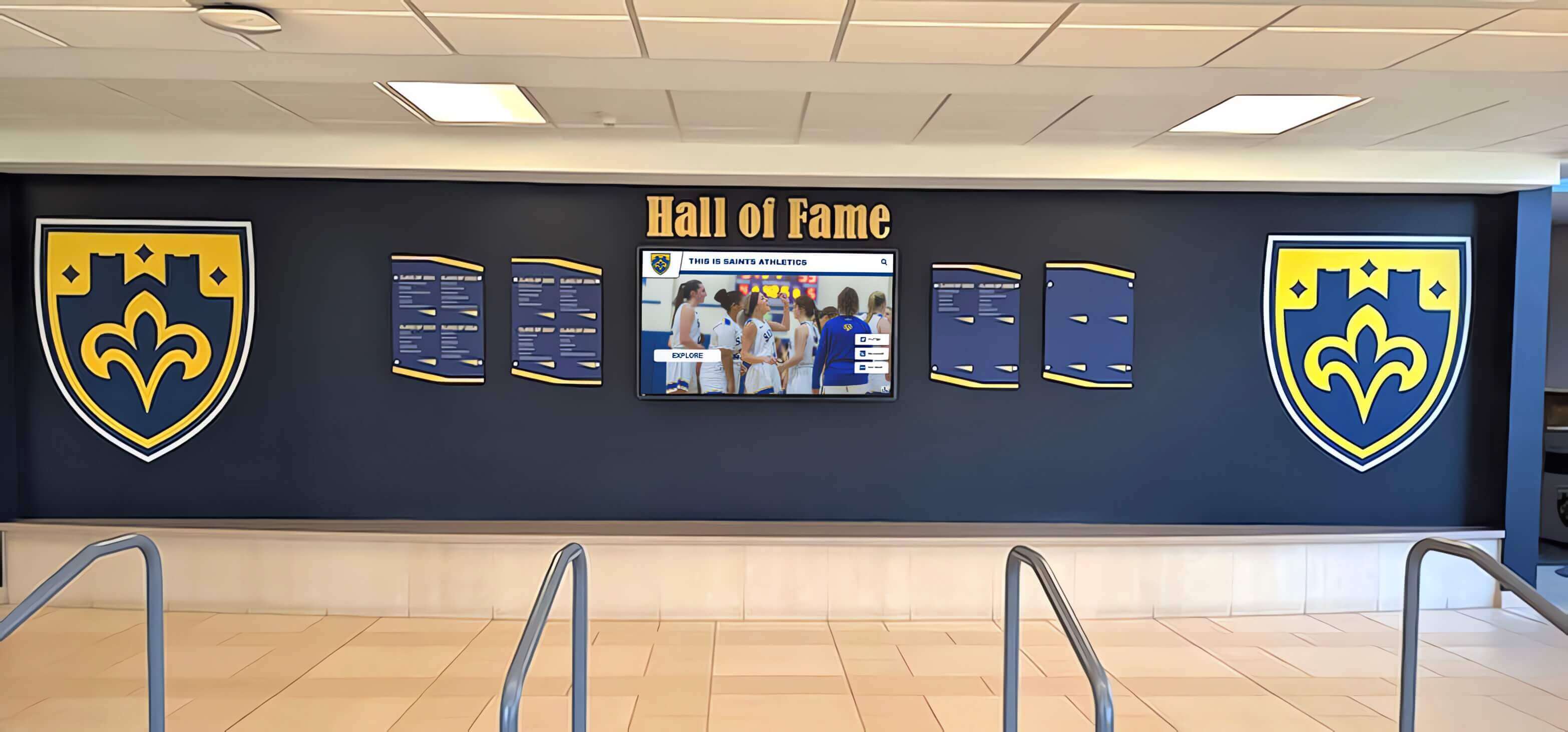
Recognition environments that mix physical and digital display elements require a documented color specification that translates accurately between print and screen — spot color setup is the foundation of that documentation
Building a School Color Specification Record
The most durable outcome of a championship banner spot color setup project is a written color specification record that every future designer, vendor, and IT staff member can access without reinventing the reference.
A complete school color specification record for athletic recognition programs contains:
For each official school color:
- Pantone PMS number (coated and uncoated variants)
- CMYK breakdown (as published in the brand guide or confirmed with the vendor)
- RGB / hex value (derived from Pantone’s published approximation)
- Application notes: which color is primary, which is secondary or accent, and which elements each color applies to (backgrounds, borders, text, mascot fills)
- Substrate notes: whether the PMS coated or uncoated reference applies to the school’s primary banner substrate
Production history:
- Vendor name and date for each banner order that used spot color production
- Proof approval records (who approved, which PMS fan deck was used for comparison, date)
- Any documented color discrepancy and how it was resolved
This record should live in the athletic department’s shared drive alongside the banner artwork source files — not in a personal folder that becomes inaccessible when a staff member leaves. A color specification record treated as institutional property, not individual knowledge, means the school’s brand colors survive staff transitions without requiring a vendor call to reconstruct the specification from a photograph of an old banner.
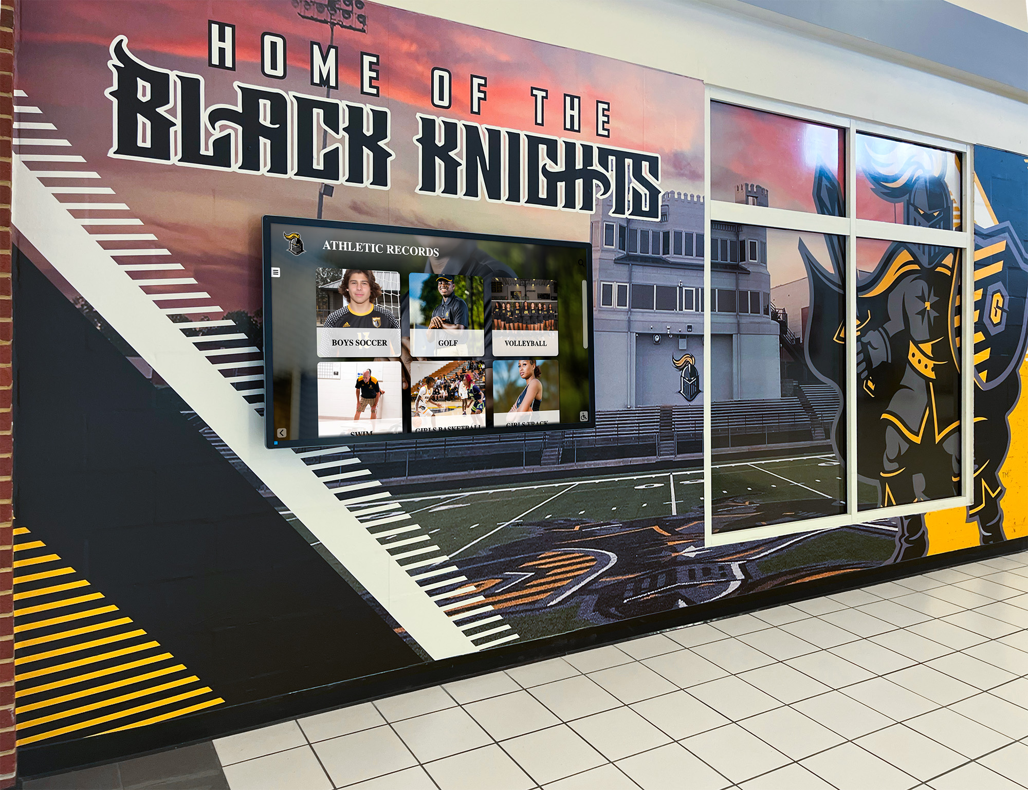
Championship recognition programs that span physical banners, painted murals, and digital corridor displays depend on a written color specification that connects every output to the same PMS reference
Frequently Asked Questions About Championship Banner Spot Color Setup
What is championship banner spot color setup?
Championship banner spot color setup is the process of defining school brand colors as named Pantone (PMS) spot ink values inside the banner design file before sending it to a print vendor. Unlike CMYK process color printing, spot color printing uses a dedicated ink mixed to a precise Pantone formula — ensuring the school’s championship banners reproduce the exact same color across every print run and every vendor, regardless of how many years apart those runs occur.
Why can’t I just use CMYK colors on my championship banner?
CMYK process color printing approximates colors by mixing percentages of cyan, magenta, yellow, and black dots, and two different press operators using slightly different CMYK values for the same school color will produce noticeably different shades. When championship banners from different years hang side by side in a gymnasium, that color drift is visible. Spot color printing uses a single dedicated ink mixed to the Pantone formula, which produces the same color regardless of which vendor produced the banner.
How do I find my school’s official Pantone color number?
Start with your school or district’s official brand identity guide — most formally documented programs specify PMS numbers alongside CMYK and RGB equivalents. If no brand guide exists, contact your school district’s communications or marketing office. As a last resort, a graphic designer with a Pantone Color Bridge fan deck can identify the closest PMS match by comparing fan deck chips against an existing approved printed piece.
Does spot color setup affect digital recognition displays?
Spot color inks require conversion to sRGB or hex values for screen use. Pantone publishes sRGB and hex approximations for each PMS color, and these values should be documented alongside the PMS specification in the school’s color record so digital teams use the same reference as print vendors. Some highly saturated Pantone inks cannot be exactly reproduced within sRGB, so the digital value is the closest achievable approximation.
What file format should I use for spot color championship banner artwork?
PDF/X-1a is the preferred format. When exporting from Adobe Illustrator or InDesign, set Color Conversion to No Conversion to preserve spot color designations rather than converting them to CMYK. After export, verify in Adobe Acrobat that each PMS color appears as a spot ink plate. Send the PDF alongside a print specification sheet that lists each PMS number, the expected ink count, the substrate, and a requirement for a physical proof before production begins.
Connect Championship Banner Branding to a Unified Digital Recognition Program
Rocket Alumni Solutions helps school athletic departments build recognition programs where the color standards established for printed championship banners carry through to interactive digital displays, touchscreen hall-of-fame kiosks, and corridor recognition screens — keeping every output visually consistent with the school's brand identity.
Get notified when Rocket Graphics opens