Championship banner rich black setup is the process of defining the CMYK formula used for deep dark backgrounds in banner artwork so the finished result looks visually dense rather than a slightly grayish K-only black — without allowing the extra ink channels in that formula to bleed into adjacent school color zones and produce muddy, off-brand results at the boundary. The direct answer: use a moderate rich black formula of 40C / 30M / 30Y / 100K (200% total area coverage) for championship banner backgrounds, apply it as a named CMYK swatch that is explicitly separate from every school color swatch in the design file, and maintain a minimum 3 mm gap between the rich black zone and any adjacent school color element before submitting the artwork to a commercial print vendor.
This guide explains why K100 alone produces thin-looking results on large banner backgrounds, which CMYK formulas are appropriate for banner substrates versus which formulas are dangerous, and how to protect school colors from the ink bleed risk that rich black creates. It is written for school administrators, athletic directors, and recognition-program staff who review and approve championship banner artwork before it goes to a commercial print vendor.

School athletic programs with defined brand colors rely on championship banner artwork that isolates rich black backgrounds from adjacent school color zones — ink bleed at that boundary produces muddy results that alter the appearance of colors the school has maintained for decades
Why Pure K100 Looks Thin on Large Championship Banner Backgrounds
A single ink channel produces pure black (100% K, zero contribution from cyan, magenta, or yellow). On small type set against white paper, 100% K delivers a clean, dense result. On a large-format vinyl championship banner with a dark background spanning several square feet, 100% K alone looks lighter and less saturated in person than it does on screen — a visual limitation of the substrate and viewing distance, not a printing error.
The underlying reason is ink density per unit area. On large-format print substrates like vinyl, the dot pattern at standard resolution creates a background that has substantial ink coverage but lacks the full visual density that a multi-channel mix provides. Black ink without support from other channels loses apparent depth at banner-scale viewing distances. The result is a dark gray-brown background where a dense, rich black was intended.
Rich black addresses this by adding small amounts of cyan, magenta, and yellow ink beneath the 100% K channel. The combined channels raise visual density and produce a black that reads as deep and rich at viewing distance rather than thin. That depth is the correct use case for rich black. The problem arises when the CMYK percentages in that formula are set too high, or when the rich black zone in the artwork is not properly isolated from school color elements — because the excess ink bleeds across adjacent color zones and mixes with school colors that were specified precisely.
How Rich Black Bleeds Into School Colors
Understanding the mechanics of ink bleed prevents the error before it reaches the vendor. On vinyl and fabric banner substrates, ink spreads slightly as it dries — a physical phenomenon sometimes called dot gain or mechanical bleed. That spread is typically a fraction of a millimeter, but when a rich black background containing 40% cyan sits immediately adjacent to a school yellow (0% cyan), the boundary between those two elements will show a narrow zone where the cyan component of the rich black has bled into the yellow zone.
Cyan and yellow produce green. A school color specified as a clean, saturated yellow will display a greenish cast at the boundary edge where the rich black’s cyan component has bled into it. Depending on the school’s exact color specification and the vendor’s substrate, that cast can range from barely visible to clearly visible at normal banner-viewing distance.
The same interaction occurs with other color combinations. A school’s cardinal red adjacent to a rich black background with a magenta component will show a slightly purple edge at the boundary. A royal blue school color adjacent to a rich black with a cyan component will deepen toward a muddier, less saturated blue at the boundary.
Three factors control the severity of ink bleed at the rich black boundary:
- Total Area Coverage (TAC) of the rich black formula. Higher total ink percentages create more bleed potential. A formula with 240% TAC (60C / 40M / 40Y / 100K) bleeds more than one with 200% TAC (40C / 30M / 30Y / 100K).
- Substrate ink absorption. Vinyl banner substrates vary in their ink absorption rate. A substrate with lower absorption holds ink at the surface longer, increasing bleed spread.
- Gap between the rich black zone and the school color zone. Even 2–3 mm of separation prevents bleed from reaching the school color area; no gap at all guarantees it does reach.
Standard Rich Black Formulas for Championship Banners
Not all rich black formulas are appropriate for championship banner production. The table below shows the most commonly referenced CMYK combinations, their TAC, and their suitability for large-format banner substrates.
| Formula Name | CMYK Values | TAC | Banner Suitability | Notes |
|---|---|---|---|---|
| K100 only | 0C / 0M / 0Y / 100K | 100% | Acceptable, limited depth | Thin appearance at large scale; no bleed risk |
| Moderate rich black | 30C / 30M / 30Y / 100K | 190% | Recommended | Adequate visual density; low bleed risk |
| Standard rich black | 40C / 30M / 30Y / 100K | 200% | Recommended | Good visual depth; manageable bleed with 3 mm gap |
| Cool rich black | 60C / 40M / 40Y / 100K | 240% | Use with caution | Deeper black; higher bleed risk; requires 5 mm gap minimum |
| Registration black | 100C / 100M / 100Y / 100K | 400% | Not recommended | Ink overload on vinyl; pooling, wrinkling, and drying failures |
For most championship banner backgrounds, the 40C / 30M / 30Y / 100K formula produces sufficient visual depth without creating an unmanageable bleed risk at school color boundaries. If the vendor specifies a maximum TAC for their substrate — which is common practice among large-format print vendors — use the highest formula that stays within their stated limit.
Registration black (400% TAC) is dangerous on any large-format vinyl or fabric banner substrate. Ink pooling, extended drying time, physical wrinkling, and color contamination of adjacent elements are all documented failure modes for this formula on banner materials. Registration black is designed for press-registration verification, not for production color. It should never appear as a banner background formula.
Championship Banner Rich Black Setup in Adobe Illustrator
Step 1: Create a Named Rich Black Swatch
- Open the Swatches panel (Window > Swatches).
- Click the New Swatch icon at the bottom of the panel.
- In the New Swatch dialog, name the swatch exactly: Rich Black (40/30/30/100) — the values in the name prevent confusion when files are shared with the vendor or other staff members.
- Set Color Type to Process Color and Color Mode to CMYK.
- Enter: C: 40, M: 30, Y: 30, K: 100. Click OK.
- The new swatch appears in the Swatches panel. Apply it only to banner background fill elements — never to text, mascot graphics, or school-branded decorative elements.
Step 2: Create Separate School Color Swatches
For each school color, create a separate swatch with a clearly labeled name:
- Add swatches for each school color following a naming convention that includes the CMYK values: Eagles Gold (0/25/100/0) or Panthers Red (0/95/85/0) — explicit values in the name prevent accidental substitution.
- If the school uses Pantone spot colors, add each as a Spot Color swatch as described in the championship banner spot color setup guide rather than mixing spot and process colors in the same file.
Keeping school color swatches named and visually distinct from the rich black swatch prevents accidental application of one to elements intended for the other.
Step 3: Separate Background and School Color Layers
- Create two layers in the Illustrator file: Background (for rich black fills) and School Colors (for mascot graphics, text, and school-branded decorative elements).
- Apply the Rich Black swatch only to elements on the Background layer.
- Apply school color swatches only to elements on the School Colors layer.
- With layer separation in place, Overprint Preview mode — described in the championship banner overprint preview checklist — will clearly display any ink interaction at layer boundaries.
Step 4: Verify the Gap Between Rich Black and School Color Zones
- Switch to View > Overprint Preview to simulate ink interaction at the boundary between rich black and school color areas.
- Select the edge of any school color element that is nearest to the rich black background.
- Use the Transform panel to confirm the gap between that element’s edge and the rich black background edge is at least 3 mm (for the 40/30/30/100 formula) or 5 mm (for the 60/40/40/100 formula).
- If the gap is insufficient, expand the school color element inward or shift it away from the background boundary. Do not reduce the rich black background dimensions unless the vendor’s specification requires it.
Step 5: Run Separations Preview Before Export
- Open Window > Separations Preview.
- Toggle each CMYK plate on and off. Confirm that:
- The rich black formula contributes to all four plates (C, M, Y, K).
- School color elements contribute only to their intended plates.
- No school color element overlaps the rich black zone in a way that would produce unexpected color mixing on any plate.
- Export as PDF/X-1a or PDF/X-4 with Color Conversion set to No Conversion.
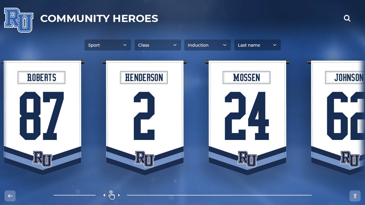
Large recognition banners with dark background zones require a rich black CMYK formula calibrated to the banner substrate — and a defined gap between the dark background and every school color element to prevent ink bleed at the boundary
Championship Banner Rich Black Setup in Adobe InDesign
InDesign’s workflow for rich black setup follows the same logic as Illustrator but uses InDesign’s document tools for color management and verification.
Create Rich Black as a CMYK Process Swatch
- Open the Swatches panel (Window > Color > Swatches).
- From the panel menu, select New Color Swatch.
- Name the swatch Rich Black (40/30/30/100). Set Color Type to Process and Color Mode to CMYK.
- Enter the values: C: 40, M: 30, Y: 30, K: 100. Click Add, then Done.
- Apply the swatch to background frames only. Do not apply it to text frames or graphic frames that contain school-colored elements.
Verify Ink Totals Using Output Preview
- Navigate to Window > Output > Separations Preview.
- Set the preview to Separations mode.
- Toggle each plate to verify that background frames using the rich black formula show contributions on all four plates, and that school color frames do not overlap with rich black plate contributions.
- Check the Ink Limit indicator to confirm the rich black formula stays within the vendor’s TAC specification. If the vendor specifies a maximum TAC of 220%, the 40/30/30/100 formula (200% TAC) is within spec; the 60/40/40/100 formula (240% TAC) is not.
Confirm Gap Requirements Using the Transform Panel
- Select two adjacent objects — the rich black background frame and the nearest school color frame — and use the Transform panel to calculate the distance between their edges.
- If the gap is less than the required minimum for the formula in use, use Object > Transform > Move to shift the school color element inward from the background boundary.
- InDesign’s Preflight panel (Window > Output > Preflight) does not directly flag ink bleed risks at color boundaries, but the separations preview and manual gap check accomplish the same result. The championship banner PDF/X preflight checklist covers the remaining preflight steps required before final vendor submission.
The Rich Black Setup Checklist
Use this table during file review before submitting any championship banner that includes a dark background to a commercial print vendor.
| Check Item | Application | Method | Pass Criteria | Priority |
|---|---|---|---|---|
| Rich black formula TAC confirmed against vendor spec | Illustrator / InDesign | Sum CMYK values; compare to vendor maximum | Formula TAC ≤ vendor-specified maximum | Required |
| No registration black (400% TAC) used | Illustrator / InDesign | Separations Preview; check plate values | No element uses 100C / 100M / 100Y / 100K | Required |
| Rich black swatch named and separate from school color swatches | Illustrator / InDesign | Review Swatches panel | Separate named swatches for rich black and each school color | Required |
| Background and school color elements on separate layers | Illustrator | Layers panel | Background layer holds rich black fills only | Recommended |
| Minimum 3 mm gap between rich black and school color elements | Illustrator / InDesign | Transform panel measurement | Gap ≥ 3 mm (200% TAC formula) or ≥ 5 mm (240% TAC formula) | Required |
| Separations Preview confirms no cross-plate contamination | Illustrator / InDesign | Separations Preview | School colors contribute to correct plates only | Required |
| Overprint Preview confirms no rich black overprinting school colors | Acrobat / Illustrator / InDesign | Overprint Preview mode | No school color element shifts at boundary in Overprint Preview | Required |
| PDF/X export with no color conversion | Acrobat | File Properties > Inks | CMYK values preserved as specified | Required |
| Physical proof reviewed before full production | Vendor | Visual check against Pantone fan deck | Dark background reads as dense black; school colors correct; no muddy boundary visible | Required |
Protecting School Color Records in a Rich Black Production Workflow
Championship banner artwork is part of a larger system of visual records that school athletic programs maintain across years and decades. A dark background specified as rich black in 2026 must look consistent with banners from 2016 that used a different background formula — and both must protect the school color specification that anchors every recognition material the school produces.
Maintaining a written production record for each banner order — including the exact CMYK values used for the rich black formula, the vendor’s TAC specification, and the proof approval date — prevents the formula drift that occurs when different staff members, designers, or vendors each approximate a formula from memory. Documenting these values alongside the school’s Pantone spot color specifications creates a single production reference for every recognition coordinator who handles future banner orders.
Athletic programs building recognition systems that span physical championship banners and digital displays face the same consistency requirement in a different context. Digital signage services for school recognition programs translate the same school brand colors that appear on printed championship banners to screen-displayed recognition content — and a documented color record that bridges print specifications and digital display values ensures both channels reflect the same brand identity.
Schools developing comprehensive athletic histories for alumni recognition benefit from consistent production standards at every layer of that program. College history timelines for athletic departments depend on visually consistent archival materials — including championship banners that accurately represent school colors across every production year — to tell a coherent visual story from the earliest athletic records to the present season.

School recognition environments that combine physical championship banners with digital recognition screens depend on consistent color specifications — a written production record connecting rich black formulas, spot color specifications, and digital color values connects every format to the same brand standard
For recognition programs that track award-winner archives alongside banner histories, a unified production record linking banner artwork files, print specifications, and award data creates a more searchable, referenceable history for future staff. Award winner databases for school programs provide the digital infrastructure for connecting recognition records — and the print-quality standards established for championship banners provide the visual consistency that those records represent on gymnasium and lobby walls.
Alumni-facing recognition programs benefit especially from the visual consistency that rich black setup discipline produces. Athletic hall-of-fame systems that present school history to former students, parents, and community members project institutional quality when every banner in a collection reflects the same color standards. Digital hall-of-fame platforms for alumni recognition help schools communicate that consistent visual identity across digital channels, extending the impact of properly produced physical championship banners.
For programs that also produce academic recognition materials — honor roll banners, merit scholar displays, or donor recognition signage — the same rich black setup discipline applied to championship banner production carries over to every printed recognition format. National Merit recognition programs often produce recognition banners and display materials alongside athletic championship banners, and a unified print production standard ensures all recognition materials across both academic and athletic programs use the same tested color management workflow.
Recognition programs that include high school athlete development components depend on consistent branding that extends from the gymnasium banner to digital platforms and alumni communications. Collegiate experience programs built for high school student athletes use the same school brand identity that championship banners represent, making color consistency a value that extends well beyond the production floor.
Schools managing recognition programs that include donor recognition screens and alumni appreciation displays alongside championship banners benefit from applying the same production standards across all recognition categories — whether the background is a rich black field on a championship banner or a branded dark background on a donor screen, the color management discipline at the file level is the same.
For schools planning events where championship banners are displayed alongside class reunion artifacts, athletic memorabilia, and historical photos, consistent color across all physical materials matters as much at the event as it does in the permanent installation. Class reunion event checklists for schools address the logistics that bring these materials together — and a championship banner that passes rich black verification looks as accurate in a temporary event display as it does hanging permanently in the gymnasium.

Championship recognition collections that span multiple sports and decades depend on consistent production standards from the first banner to the most recent — rich black setup discipline applied at every new production run maintains the visual quality of the full collection
Frequently Asked Questions: Championship Banner Rich Black Setup
What is rich black and why does it matter for championship banner backgrounds?
Rich black is a CMYK combination that adds small amounts of cyan, magenta, and yellow ink beneath 100% black to produce a deeper, more visually dense dark background than K100 alone. On large-format vinyl banner substrates, K100 alone can appear slightly thin or grayish at viewing distance. Rich black addresses that limitation — with the specific risk that the added ink channels must be isolated from school color zones to prevent bleed-related color contamination at the boundaries between the dark background and school-branded elements.
What is the best rich black formula for championship banners?
The 40C / 30M / 30Y / 100K formula (200% total area coverage) is the recommended starting point for most championship banner backgrounds. It produces adequate visual depth without creating excessive bleed risk at school color boundaries. Vendors who specify a lower maximum TAC for their substrate can use 30C / 30M / 30Y / 100K (190% TAC) as a conservative alternative. Always confirm the formula against the vendor’s substrate specification before finalizing the artwork file.
Can registration black (100C/100M/100Y/100K) be used on championship banners?
No. Registration black at 400% TAC exceeds the ink absorption capacity of virtually all vinyl and fabric banner substrates. It causes ink pooling, extended drying times, physical wrinkling, and severe bleed into every adjacent color zone. Registration black is a press-registration alignment tool — it should never appear as a production color in any championship banner background.
How much gap is needed between rich black and school color elements?
For the 40C / 30M / 30Y / 100K formula (200% TAC), maintain at least 3 mm between the rich black background edge and the nearest school color element. For the 60C / 40M / 40Y / 100K formula (240% TAC), increase that gap to at least 5 mm. These minimums account for typical ink bleed on large-format vinyl substrates. The physical proof review on the production substrate is the definitive confirmation that the gap in the artwork file is sufficient before full production proceeds.
Should rich black be applied to school name text or mascot graphics on championship banners?
No. Rich black is appropriate only for large background fill elements where visual density at viewing distance is the goal. Text and mascot graphics should always use the school’s defined color swatches — Pantone spot colors or CMYK process equivalents from the school’s brand guide. A school whose mascot is black should apply K100, not rich black. The visual distinction is usually imperceptible, and K100 carries no bleed risk at mascot element boundaries.
Print It Right the First Time
Championship banner rich black setup is one of the smaller decisions in a banner production workflow and one of the decisions most likely to be made by default — without a verified formula, a tested gap, or a written specification the next designer or coordinator can follow. Establishing the formula once, documenting it alongside the school’s spot color specification, and running the separations preview and gap check before every vendor submission takes fewer than fifteen minutes and produces championship banners where dark backgrounds look dense and rich and school colors appear at the correct saturation all the way to the boundary edge.
Build a Championship Recognition Program That Lasts
Rocket Alumni Solutions helps school athletic programs build championship recognition systems — from print-ready graphic standards and digital display networks to interactive hall-of-fame kiosks that connect banner history to the athletes and alumni who earned it. See how your school's recognition program fits together.
Get notified when Rocket Graphics opens