A championship banner gray balance preflight is the production verification step that confirms the CMY ink percentages in a large-format banner file will reproduce neutral tones — white backgrounds, gray shadows in team photographs, and architectural backgrounds in gym interior shots — without a perceptible color cast on the specific substrate the vendor will print on. The direct answer: gray balance is correct when the Cyan, Magenta, and Yellow dot percentages at each tone level are tuned to the substrate’s ICC profile rather than defaulting to equal CMY percentages, which would reproduce as a warm, reddish-orange cast on most CMYK print systems due to inherent cyan ink impurity. A championship banner gray balance preflight identifies this deviation before the file is submitted to production by soft-proofing neutral tone zones against the vendor’s substrate profile, comparing the result against a neutral gray reference, and requesting a physical press proof that includes a gray ramp for visual verification. Skipping the check risks delivering a banner where every team photograph carries a visible color cast that is permanent, irreversible, and impossible to correct after installation in a gymnasium or athletic corridor.
This guide is written for school administrators, athletic directors, facilities managers, and recognition-program coordinators who review and approve championship banner artwork before commercial production — not for professional prepress operators who verify gray balance as part of a daily workflow.
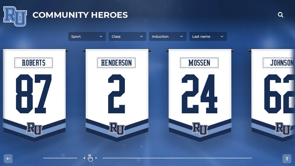
Championship banners installed permanently in school corridors are viewed at close range by athletes, students, and families daily — a gray balance color cast in a team photograph or neutral background is immediately visible and cannot be corrected after the banner is hung
What Gray Balance Is and Why It Matters for Championship Banners
Gray balance is the relationship between Cyan, Magenta, and Yellow ink percentages that is required to produce a visually neutral gray — a tone with no perceptible shift toward red, green, or blue — on a specific printing system and substrate combination.
In theory, equal percentages of Cyan, Magenta, and Yellow should mix to neutral gray: 50C 50M 50Y should produce the same visual result as 50% black ink. In practice, CMYK inks are not optically pure. Cyan ink in particular absorbs slightly more light than an ideal ink would at its design wavelength, making equal CMY mixes appear warm — shifted toward a reddish or orange tone. To compensate, achieving a visually neutral gray requires a higher Cyan percentage than Magenta or Yellow at each tone level. For standard coated-paper offset printing, the gray balance target is approximately 64–66% Cyan to balance 50% Magenta and 50% Yellow at the midtone. That ratio changes for large-format banner substrates, where different ink formulations and surface absorption characteristics shift the gray balance point from the paper standard.
The specific gray balance curve for each substrate is encoded in the vendor’s ICC output profile. When a championship banner file is soft-proofed through the vendor’s ICC profile, neutral gray zones in the artwork — white backgrounds, gray gradients in team photographs, neutral shadow areas in action shots — will show any cast resulting from the mismatch between the file’s CMY values and the substrate’s actual gray balance curve.
For championship banners, gray balance failures affect three content categories that are common to nearly every athletic recognition banner:
Team photographs. A team photograph taken under gymnasium or arena lighting contains neutral gray zones: architectural backgrounds, floor markings, court surfaces, and the white or near-white areas of athletic uniforms. When gray balance is off, these zones take on a green, blue, or warm cast, making the photograph read as incorrectly white-balanced — a quality defect immediately visible to the students and families who attended the season the banner commemorates.
Neutral background fields. Championship banners frequently use a neutral gray or white background field behind school-color headline text. On a correctly balanced file, these fields read as clean white or gray. With a gray balance error, a white vinyl field prints as slightly warm or slightly cool throughout the banner — a defect most visible in direct sidelighting or when comparing the banner alongside one produced in a prior season.
Shadow zones in mascot artwork and school seals. Mascot illustrations and school seals that use dimensional shading — drop shadows, emboss effects, or gradient fills representing volume — depend on neutral grays in the shadow zones to maintain correct color relationships. A gray balance error shifts those shadows toward green or warm, changing the perceived color of adjacent school-color fills.
Before and After: Gray Balance Symptoms on Championship Banners
Use this table during art review to identify whether the championship banner file has a gray balance problem. The symptom column describes what appears on the finished banner or soft proof; the cause column identifies the specific gray balance relationship responsible.
| Content Element | Symptom Without Gray Balance | Symptom With Correct Gray Balance | Primary Cause |
|---|---|---|---|
| White vinyl background | Printed background appears warm/creamy or slightly cool | Prints as neutral white matching the substrate’s white point | CMY percentages in white or near-white zones are not zeroed or are unbalanced |
| Gray gradient in team photograph background | Gradient shows a green or warm cast across the tonal range | Gradient reads as neutral from highlight to shadow | Gray balance curve in source file does not match substrate ICC profile |
| White jersey areas in team photograph | Jerseys appear slightly yellow, pink, or blue compared to reference | Jerseys read as neutral white at all tonal densities | Color cast from uncorrected gray balance in midtone and highlight zones |
| Shadow zones in mascot artwork | Drop shadows appear greenish or brownish instead of neutral | Shadows read as clean neutral gray, preserving dimensional appearance | CMY imbalance in low-saturation shadow colors |
| Neutral architectural background in gym photography | Concrete block, bleachers, or gym floor take on a cast | Backgrounds read as neutral, receding correctly behind subject | Gray balance mismatch in midtone CMY values |
| Championship year lettering in gray or silver | Silver metallic type reads as warm gold or cool blue-gray | Silver type reads as neutral metallic gray | CMY imbalance in the specific percentage range used for silver simulation |
| Headshot photograph in athlete profile panel | Skin tones appear shifted toward green or warm orange | Skin tones maintain natural balance with neutral background | Gray balance error in midtone range affects skin tone perception across neutrals |
Why Banner Substrates Challenge Gray Balance
Gray balance calibration is substrate-specific. The CMYK gray balance values that produce a visually neutral gray on 100 lb. coated offset paper will not produce the same neutral on a 13 oz. vinyl banner substrate — because the ink absorption, optical brightener content, and surface finish of each substrate alter the balance point.
Vinyl banner substrates have a different optical white point than coated paper — typically warmer and slightly lower in optical brightness. When a championship banner file with gray balance calibrated for coated paper is output on vinyl without substrate-specific correction, the result shifts slightly warm in the highlights and midtones.
Polyester fabric substrates used for dye-sublimation champion banners introduce a fabric base color that can vary between slightly warm and slightly cool depending on fiber composition and base treatment. Gray balance verification for fabric banners must account for the base material’s inherent color, which becomes visible in near-neutral zones and open white areas.
Mesh banner substrates physically interrupt the ink layer with open cells, which affects how neutral tones read visually across the banner surface. The periodic interruption of the ink layer by mesh openings creates a visually averaged color that may read differently from a solid gray patch of the same CMY percentage on a non-porous substrate.
The substrate-specific gray balance behavior of each material is encoded in the vendor’s ICC output profile. Using the vendor’s ICC profile for soft proofing is the core step in any championship banner gray balance preflight — without it, evaluating gray balance by eye against a monitor or generic proof is unreliable.
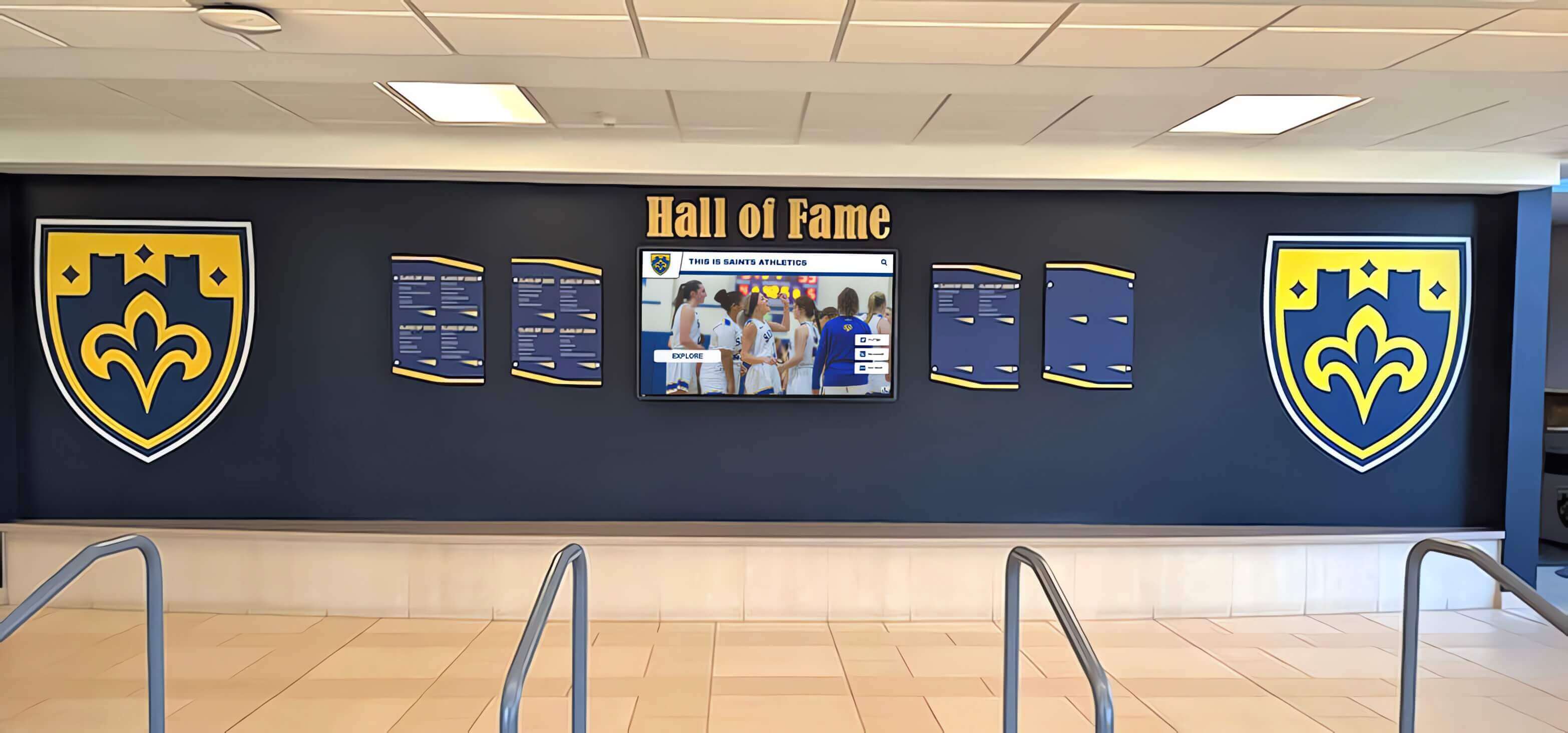
Championship banners and digital recognition displays installed in the same lobby are compared side by side by every visitor — a gray balance cast in the printed banner's photographic content is immediately visible against the color-accurate output of a calibrated adjacent screen
Step-by-Step Championship Banner Gray Balance Preflight
This seven-step workflow applies at the pre-production approval stage — before the championship banner file is submitted to a commercial large-format vendor.
Step 1: Confirm the Vendor’s ICC Profile and Gray Balance Target
Before opening the design file for evaluation, confirm with the vendor:
- The substrate-specific ICC output profile they use for the exact banner material and ink combination the championship banner will be produced on. Request the profile file by email and confirm its name and revision date.
- Whether they apply a gray balance correction curve at their raster image processor (RIP) and what that curve targets at 50% Magenta and 50% Yellow — what Cyan percentage they target for a neutral visual gray on that substrate.
- Whether they expect the file delivered in RGB (with the vendor’s RIP managing gray balance conversion) or in a converted CMYK state (where the file must encode the correct gray balance before submission).
If the vendor manages gray balance entirely at the RIP and expects RGB delivery, gray balance verification in the design application is still valuable as a quality check — but the critical step is confirming that the vendor’s RIP gray balance curve is calibrated for the specific substrate. Request documentation of their gray balance target or a recent substrate characterization data set if available.
If the vendor expects a CMYK-converted file, the gray balance correction must be applied before conversion, through the design application’s soft-proof and conversion workflow.
Step 2: Set Up Soft Proofing with the Vendor’s ICC Profile
With the vendor’s ICC profile in hand:
- In Adobe Photoshop: Go to View > Proof Setup > Custom. In the Device to Simulate field, navigate to the vendor’s substrate profile. Set rendering intent to Relative Colorimetric with Black Point Compensation checked. Enable Simulate Paper Color to preview the substrate’s white point and inherent cast.
- In Adobe InDesign: After setting up the proof via View > Proof Setup > Custom with the vendor’s profile, activate soft proofing via View > Proof Colors.
- In Adobe Illustrator: Apply the same workflow via View > Proof Setup > Custom with the vendor’s profile.
With soft proofing active, examine the banner artwork systematically. Compare neutral zones — white backgrounds, gray shadows, near-neutral photograph backgrounds — against a neutral reference. On a calibrated monitor, a visually neutral swatch will have no perceptible shift toward red, green, or blue. If the soft-proofed white or gray zones carry a visible cast under the substrate profile, the file’s CMY values at those tone levels do not match the substrate’s gray balance curve.
Step 3: Evaluate Neutral Tone Zones Using the Info Panel
Use the Info panel with a secondary readout set to the vendor’s CMYK profile to measure the CMY ink values in neutral zones throughout the banner artwork:
- In Adobe Photoshop: Open Window > Info. Set the secondary readout to the vendor’s CMYK profile. Place the cursor over key neutral zones: white backgrounds, gray shadow areas in team photographs, neutral architectural elements in photographic backgrounds.
- Read the C, M, and Y values. For a balanced gray at any tone level, the Cyan percentage should be higher than both Magenta and Yellow by a substrate-specific margin. On standard coated-paper output, the relationship at 50% M / 50% Y is approximately 64–66% C. For large-format vinyl, the Cyan requirement is typically 2–8% higher — confirm the exact target from the vendor’s ICC profile data or their substrate characterization documentation.
- If the measured CMY values show M and Y significantly exceeding C at any tone level in the neutral zones, or if C and M are equal when C should be elevated, the file’s neutral axis is not balanced for the substrate. The soft proof should confirm the visual consequence.
For photography-heavy championship banners — where team portraits and action photographs constitute the dominant visual content — this inspection step is most efficiently performed using a Color Sampler tool: place sampler points at five or six neutral locations across the photograph (highlight, midtone, three-quarter shadow, and full shadow zones) and read the CMY values at each. The pattern of values across the tonal range reveals the gray balance curve embedded in the image data and whether it matches the substrate target.
Step 4: Inspect Team Photographs for Color Casts in Neutral Areas
Championship banner team photographs require individual evaluation for gray balance, independent of the banner layout soft proof. A photograph brought from a third-party source — school photographer, sports photographer, yearbook staff — was processed for a display or print output that may not match the banner substrate’s gray balance.
In Adobe Photoshop, evaluate each team photograph individually:
- Open the photograph in Photoshop with the vendor’s ICC profile active in the soft proof.
- Place Color Sampler points in:
- A white or near-white area in the photograph (white jersey numbers, court paint, wall surface behind athletes)
- A neutral midtone area (concrete stands, bleacher seating, floor markings)
- A shadow area that should read as neutral dark gray (shadowed wall, dark floor boundary)
- Observe the CMY values at each sampler point. In a correctly gray-balanced source, C should be elevated above M and Y at each tone level by the substrate-appropriate margin.
- If any sampler zone shows equal M and Y with lower C, or M and Y significantly higher than C, the photograph has a warm color cast that will reproduce on the banner substrate.
Correction approach: For photographs with a gray balance cast, apply a Curves adjustment in Photoshop with the composite gray balance target as a reference point. A Color Sampler on a neutral zone before and after the Curves adjustment confirms whether the correction has brought the CMY relationship into balance. Do not attempt to correct gray balance by applying a blanket CMY adjustment to the full image without evaluating individual tone zones — corrections made without tone-level verification frequently overcorrect highlights while undercorrecting shadows or vice versa.
Step 5: Check Neutral Gray Fills and Borders in the Banner Layout
Championship banner layouts frequently use neutral gray for structural design elements: thin rule lines, border treatments, section dividers, and simulated shadow or emboss effects on text. These elements are typically defined as CMYK swatches in the design application and are separate from photographic content.
Evaluate each neutral gray element in the layout:
- In Adobe InDesign or Illustrator, click on each neutral gray element and open the Color panel to read its CMYK values.
- Apply the same gray balance test: at the ink percentage level of the gray, is Cyan elevated above Magenta and Yellow by the substrate-appropriate margin?
- For a border or rule line defined as 20C 20M 20K (a commonly used approach for neutral grays in CMYK layouts), soft-proof the element against the vendor’s substrate profile to confirm the visual result is neutral rather than slightly green or warm at banner production scale.
- For elements defined using the substrate’s ICC profile-aware gray balance — where Cyan is elevated above M and Y at each level — the soft proof should confirm neutral reproduction.
Correct any neutral gray fills that show a cast under soft proofing by adjusting the Cyan channel upward to match the gray balance target for the tone level. Document the corrected CMYK values for each named gray swatch so they can be reused consistently if the championship banner design is updated or reprinted in a future season.
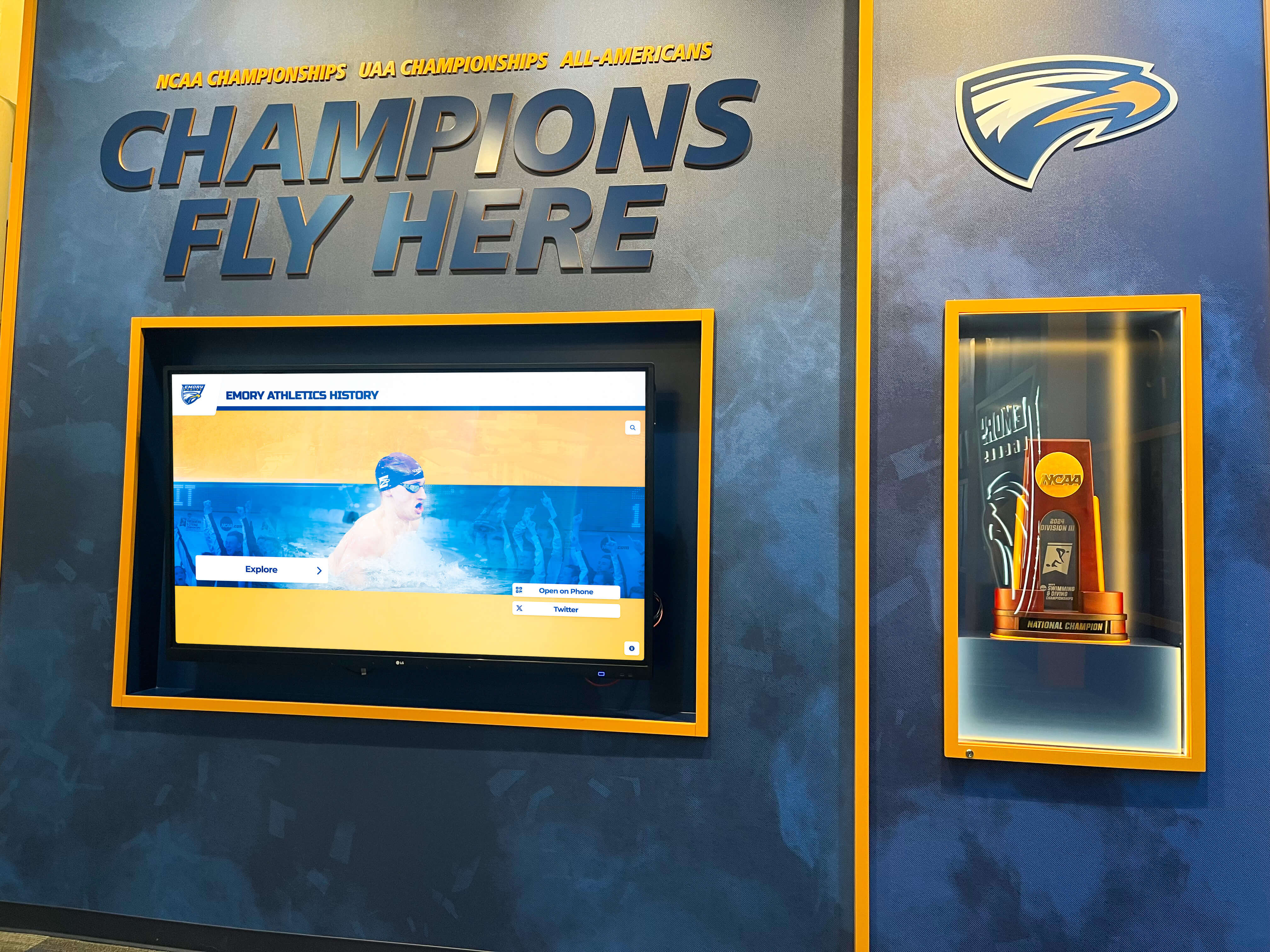
Championship recognition programs spanning multiple sports accumulate banner artwork across many seasons — a consistent gray balance standard applied to each substrate ensures the newest banner matches the photographic quality and neutral-axis color accuracy of those already installed in the gymnasium
Step 6: Verify Gray Balance Through a Physical Gray Ramp Proof
A soft proof using the vendor’s ICC profile is the most practical gray balance verification available before file submission — but it is a mathematical simulation, not a physical output. The ICC profile models the substrate’s color behavior, but the model may not capture every interaction between ink formulation, substrate surface, and production conditions on a specific press and print run.
For championship banners that:
- Contain team photographs with significant neutral background areas
- Use neutral gray design elements that must read as precisely neutral alongside school colors
- Will be installed alongside banners produced in prior seasons where color consistency is visible
request a physical press proof that includes a gray ramp — a series of neutral gray patches ranging from 5% to 100% tone in 10% increments, produced on the actual production substrate using the standard production ICC profile. A visual evaluation of the gray ramp under D50 viewing conditions confirms whether the substrate’s actual gray balance curve is consistent with the ICC profile model.
If the gray ramp shows a color cast at any tone level on the physical proof, communicate the specific tonal range and cast direction to the vendor — warm cast in the shadows, cool cast in the highlights — and request adjusted ICC profile data or a corrected RIP gray balance curve before approving the production run. Athletic departments that manage academic and athletic recognition programs involving multiple annual banner productions benefit from documenting the press-proof gray ramp result for each vendor and substrate combination, creating a quality baseline for future orders.
Step 7: Document the Gray Balance Standard for Repeat Production
A championship banner gray balance preflight is not a single-event check — it is the first production verification that establishes the neutral-axis standard for every subsequent banner the program produces on the same substrate.
Before approving the banner file for production:
- Record the vendor’s ICC profile filename, version, and the gray balance target (Cyan percentage at 50% M / 50% Y) for the substrate.
- Document the corrected CMY values for each named neutral gray swatch in the design file.
- Record the press-proof gray ramp result — whether it passed as neutral or required vendor correction.
- Archive the corrected source files alongside the gray balance documentation, tagged by vendor, substrate, and production date.
This documentation allows the same gray balance standard to be applied immediately when a championship banner from any year needs to be reprinted, when a new sport’s banner is added to the gymnasium collection, or when a replacement banner must match the color quality of the original. Hall of fame recognition programs that build a visual archive of championship banners across decades depend on consistent production documentation to ensure each new addition matches the quality of those already displayed.
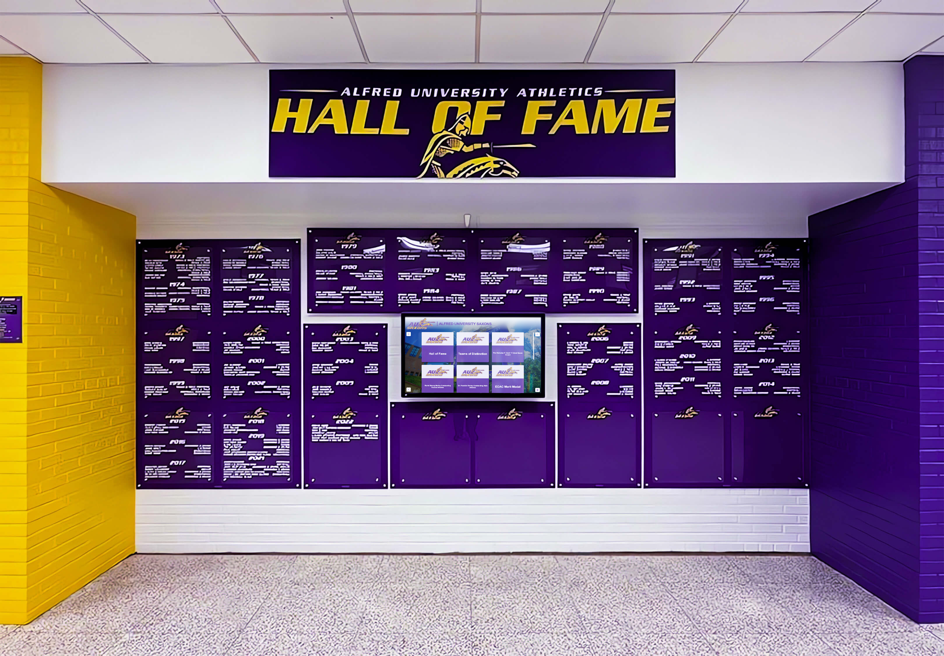
Deep school colors on dark backgrounds amplify any gray balance cast in adjacent neutral zones — a team photograph or neutral border that reads correctly against a light background may show a visible cast when positioned against a saturated navy, maroon, or forest green field on the finished banner
Common School Color Scenarios and Gray Balance Considerations
School Navy With Team Photograph on White Vinyl
The scenario: A championship banner combines a school navy headline band at the top with a team photograph centered on a white vinyl field. The team photograph was taken indoors against a gray concrete background.
Gray balance considerations: The concrete background in the photograph occupies a mid-gray tone zone — the range where gray balance errors are most visible. If the photograph was processed with a gray balance calibrated for coated-paper display output, the concrete will show either a warm or cool cast when reproduced on vinyl through the vendor’s substrate profile. Separately, the white vinyl field between the navy band and the photograph will reveal any substrate white-point cast that the banner’s gray balance does not account for.
Soft-proof the photograph against the vendor’s vinyl ICC profile and place Color Sampler points in the concrete background zone. Correct the Curves before converting to the CMYK output profile. For hall of fame tools that display athlete histories digitally, the same photographs displayed on screen must be calibrated to look correct there — but the print version requires its own substrate-specific gray balance verification.
Maroon Program With Athletic Action Photography
The scenario: A championship banner for a maroon-and-gold program features an action photograph with bleacher seating and athletic facility lighting in the background. The bleachers are neutral gray concrete. The maroon and gold school colors in the athlete’s uniform surround the neutral background area.
Gray balance considerations: School maroon occupies the warm-hue range of the CMYK gamut and requires significant Magenta and Black to build correctly. A gray balance cast that shifts neutral zones toward warm will cause the concrete bleacher background to read as slightly maroon-adjacent — blurring the visual boundary between the school color and the neutral background. Correct gray balance keeps the bleacher seats clearly neutral, sharpening the visual contrast between the school-color uniform and the neutral background. Schools that recognize academic achievers alongside athletic champions — as in academic achievement award programs — often use similar banner formats for both programs; consistent gray balance production ensures both types of recognition banners can coexist in the same corridor without visible color inconsistencies.
Forest Green Program With Historical Archive Photographs
The scenario: A championship banner for a long-standing athletic program incorporates historical photographs from prior decades alongside current-season team photographs. The historical photographs were digitized from print originals and show varying white balance across the original photographic processes.
Gray balance considerations: Historical photographs digitized from prints carry the inherent color balance of the original photographic process — which may include a warm or cool bias from the film stock, development chemistry, or ambient light of the era. Applying a consistent gray balance correction to all photographs in a multi-era championship banner risks overcorrecting some photographs while undercorrecting others. For this scenario, evaluate each photograph individually with Color Sampler points in known neutral zones, apply corrections on a per-photograph basis, and confirm all photographs reach a consistent visual neutral for the vendor’s substrate profile before assembling the final banner layout. Schools managing recognition displays that span many decades of athletic history — similar to how academic decathlon recognition programs track achievement over time — benefit from a centralized photographic archive where gray balance corrections are applied and documented per photograph at the archive level rather than on a per-banner basis.
Connecting the Gray Balance Preflight to Your School’s Recognition Program
A championship banner gray balance preflight protects one of the most permanent artifacts in a school’s athletic recognition program. Unlike a game program or social media graphic where color inconsistencies are transient, a championship banner installed in a gymnasium will be visible to students, athletes, and visitors for years — often decades. A gray balance cast that makes a team photograph look incorrectly lit or gives a white background a warm tint is a visible quality defect that persists for the life of the installation.
The gray balance preflight integrates directly with other championship banner production checks in a comprehensive preflight workflow. A file that passes gray balance verification should also pass dot-gain compensation verification for the same substrate, total ink coverage review to confirm ink limits are not exceeded, black-point compensation preflight to preserve shadow detail in photographs, and PDF/X compliance verification before final submission.
Physical championship banners and adjacent digital recognition displays — touchscreen hall-of-fame kiosks, digital wall-of-honor screens, and recognition scrolls — are increasingly installed in the same corridor or gymnasium spaces. Digital recognition display programs calibrate their screens to reproduce school colors accurately on a display-specific white point. Printed championship banners calibrated through a gray balance preflight reproduce school colors accurately on a substrate-specific white point. Both outputs are serving the same community with the same visual identity — the gray balance preflight on the printed side is the production step that ensures the two representations of the school’s athletic program look intentional and consistent rather than accidentally different.
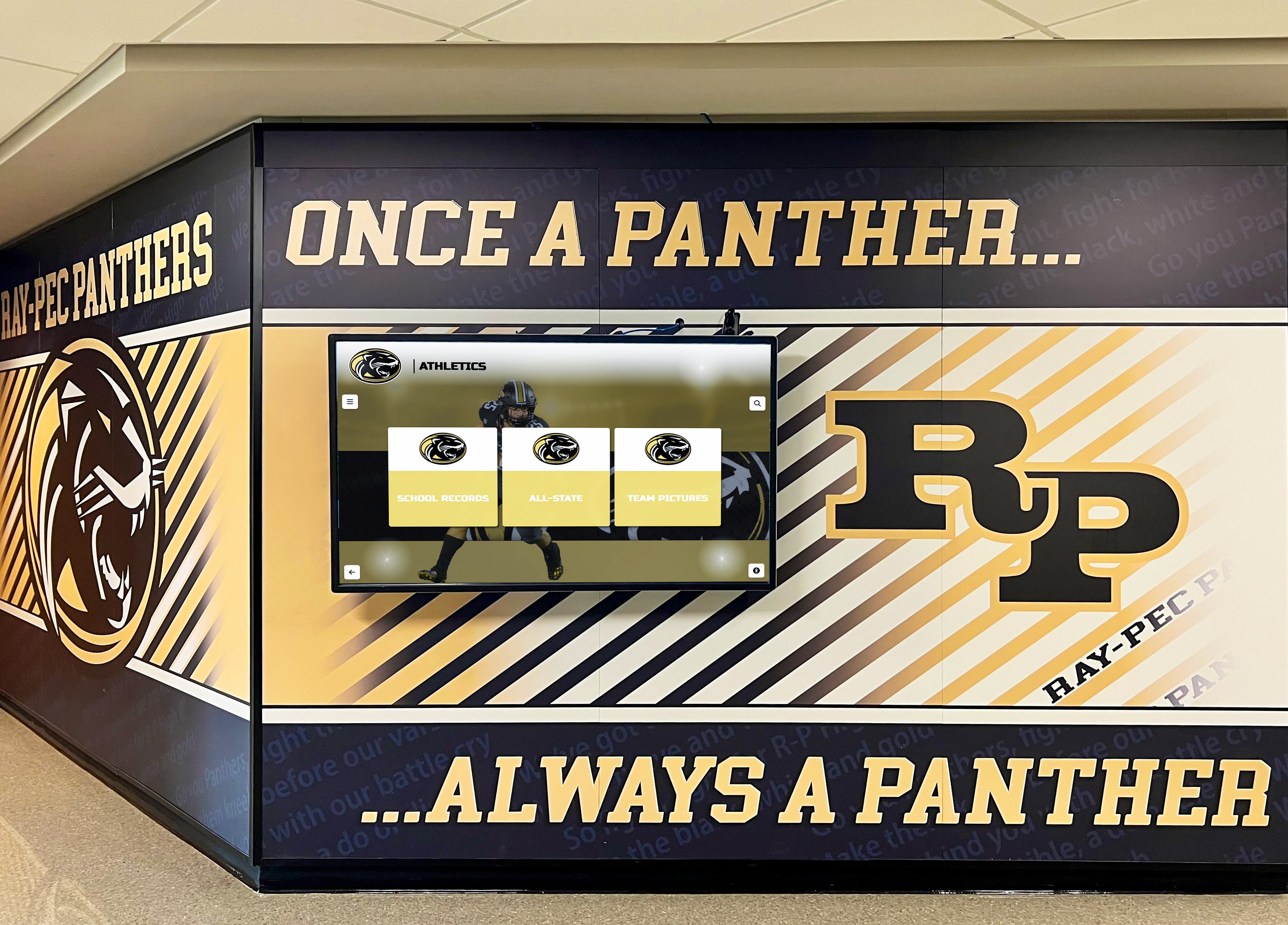
Physical banners and digital recognition screens share wall space in school corridors and gymnasiums — a gray balance preflight on the printed banner ensures neutral tones and school colors reproduce consistently alongside the calibrated color of the adjacent digital display
For athletic programs that also manage printed archival recognition materials — record boards, retired-jersey displays, historical photograph collections — maintaining a gray balance production standard across all banner substrates creates a unified visual quality level for every form of printed recognition the program produces. Schools building long-term recognition programs spanning alumni recognition events and reunion displays alongside current athletic championship banners benefit from the same documented gray balance standards that ensure historical and current materials can share display space without visible production inconsistency.
Creating championship banner artwork with accurate school colors?
Rocket Graphics is building an AI-powered platform to help school staff generate championship banner artwork and athletic recognition graphics with school colors built in from the start — no manual CMYK gray balance correction required.
Get notified when Rocket Graphics opens.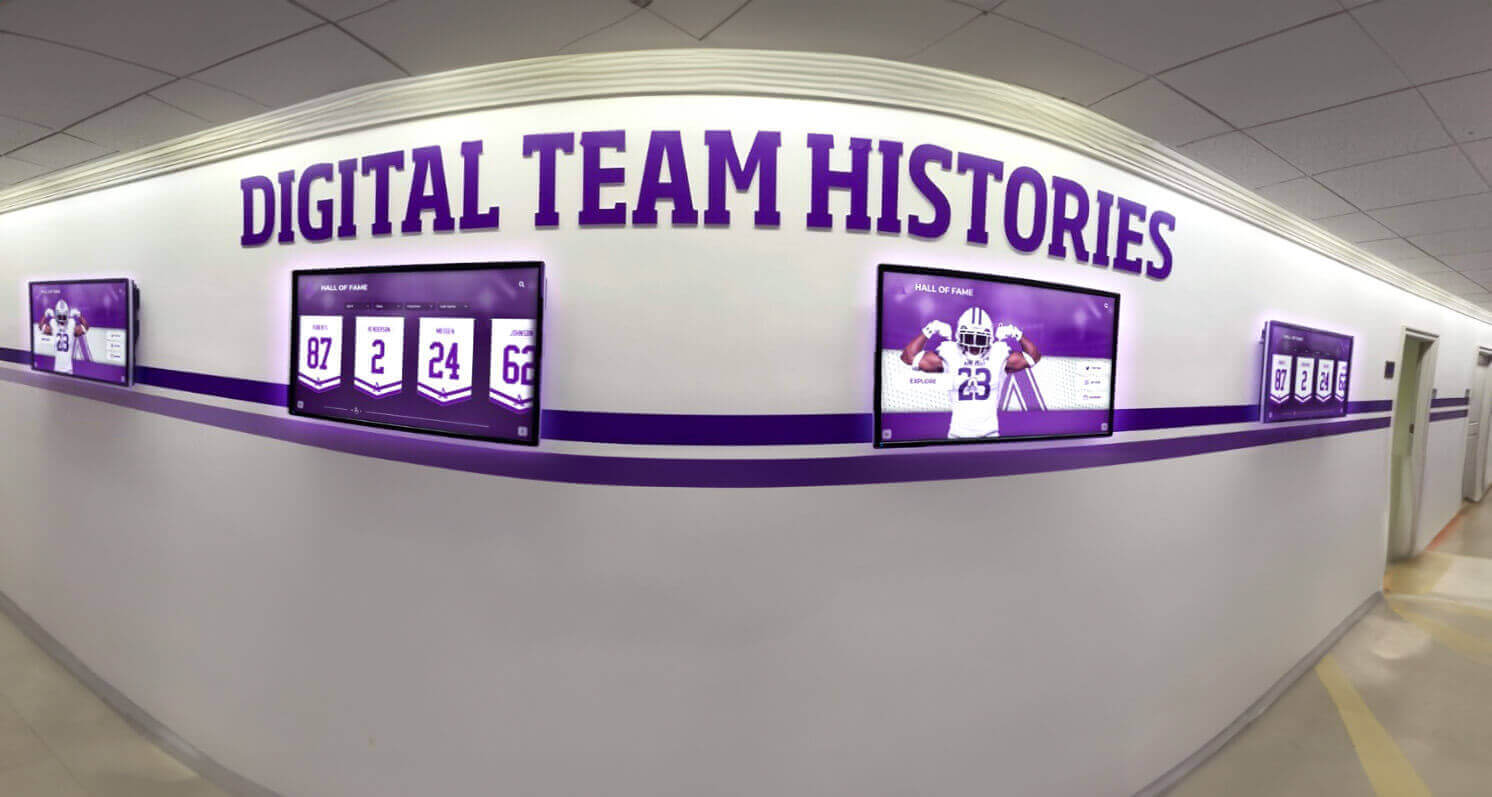
Digital championship records and printed championship banners installed in the same hallway are compared directly by every visitor — gray balance preflight ensures the printed banner's neutral tones and photographic content match the visual quality expected alongside calibrated digital recognition displays
Frequently Asked Questions: Championship Banner Gray Balance Preflight
What is gray balance in championship banner printing?
Gray balance is the specific relationship between Cyan, Magenta, and Yellow ink percentages that produces a visually neutral gray — with no perceptible color cast — on a given printing substrate. In CMYK printing, equal percentages of C, M, and Y do not produce a neutral gray due to inherent cyan ink impurity; Cyan must be elevated above M and Y at each tone level to achieve visual neutrality. For championship banners, correct gray balance ensures that white backgrounds, shadows in team photographs, and neutral design elements reproduce without a warm, cool, or green cast on the finished banner substrate.
Why do banner substrates require different gray balance settings than coated paper?
Each printing substrate has a different optical white point, ink absorption rate, and ink interaction characteristic that shifts the gray balance point. The CMYK percentages that produce visually neutral gray on coated paper will produce a slightly warm or cool result on vinyl or polyester fabric because those materials absorb and reflect light differently. The substrate-specific gray balance curve is encoded in the vendor’s ICC output profile; soft-proofing the banner file against that profile is the standard method for confirming neutral tones will reproduce correctly on the production substrate.
How do I check gray balance in a championship banner file?
Open the vendor’s substrate ICC profile in Adobe Photoshop and activate soft proofing via View > Proof Setup > Custom with Simulate Paper Color enabled. Place Color Sampler points in neutral zones — white backgrounds, gray shadows in team photographs, neutral border elements — and read CMY values in the Info panel. For visual neutrality, Cyan should be elevated above Magenta and Yellow at each tone level by the substrate-appropriate margin. Any zone that shows a visible cast under soft proofing indicates a gray balance mismatch between the file’s ink values and the substrate profile.
Can a gray balance color cast in a championship banner be fixed after printing?
No. A gray balance cast is a property of the printed ink on the substrate surface and cannot be corrected after production. A championship banner that arrives with a visible cast in team photographs or neutral backgrounds must be reprinted at full cost. The gray balance preflight is the production step that identifies and prevents this defect before the file reaches the vendor — making it far less expensive than any correction attempted after installation.
Do I need a physical press proof to verify gray balance on a championship banner?
A soft proof using the vendor’s ICC profile is the minimum verification for gray balance before file submission and catches most errors. For banners with significant neutral photographic content or banners that will be installed alongside prior-season productions, a physical press proof including a gray ramp — neutral patches from 5% to 100% tone — is strongly recommended. The physical proof confirms that the vendor’s actual ink, RIP settings, and substrate produce the neutral tones the ICC profile model predicts.
Every Championship Banner Deserves Neutral, Consistent Color
A championship banner gray balance preflight is a production check that takes less time to run than a reprint takes to order. The workflow is straightforward: confirm the vendor’s ICC profile and gray balance target, activate substrate soft proofing in the design application, evaluate neutral zones and team photographs with Color Sampler measurement, check that neutral gray design elements carry the correct CMY relationship for the substrate, and request a physical press proof with a gray ramp for banners where photographic neutral accuracy is critical.
The athletes who earned a championship banner are represented in that banner for years — in the team photograph, in the colors of their uniforms, and in the neutral tones that frame and support the school colors around them. A gray balance preflight is the production step that ensures those photographs and neutral fields reproduce faithfully, without a color cast that would be immediately visible to everyone who walks past the banner in the gymnasium.
For athletic recognition programs building championship documentation across physical banners and digital recognition award displays, applying a consistent gray balance standard to every banner submission ensures the printed record of the athletic program matches the visual quality that administrators, athletes, and families expect — season after season, sport by sport, for the full history of the program.
Create Championship Banner Artwork with School Colors Built In
Rocket Graphics is building an AI-powered platform to help school staff create championship banner artwork, athletic recognition graphics, and social media content with accurate school colors and neutral color balance from the start — no design experience or manual gray balance correction required.
Get notified when Rocket Graphics opens.