A championship banner dot-gain compensation preflight is a production step that checks whether a design file accounts for the ink-spread behavior of the specific banner substrate — vinyl, fabric, or mesh — before the file reaches a commercial large-format print vendor. The direct answer: dot gain increases tone values on banner substrates more than on coated paper, causing school colors to print darker than the approved digital proof, photographs to lose highlight and midtone separation, and small type to fill in at production size. Every championship banner file destined for a gymnasium, lobby, or athletic corridor should undergo a dot-gain compensation preflight before vendor submission to confirm that the file’s ink values, color profile assignment, and total area coverage will produce accurate school colors and legible detail on the specific substrate the vendor will use.
This guide is written for school administrators, athletic directors, facilities managers, and recognition-program coordinators who approve championship banner artwork before commercial production — not for professional prepress operators who handle these checks daily.
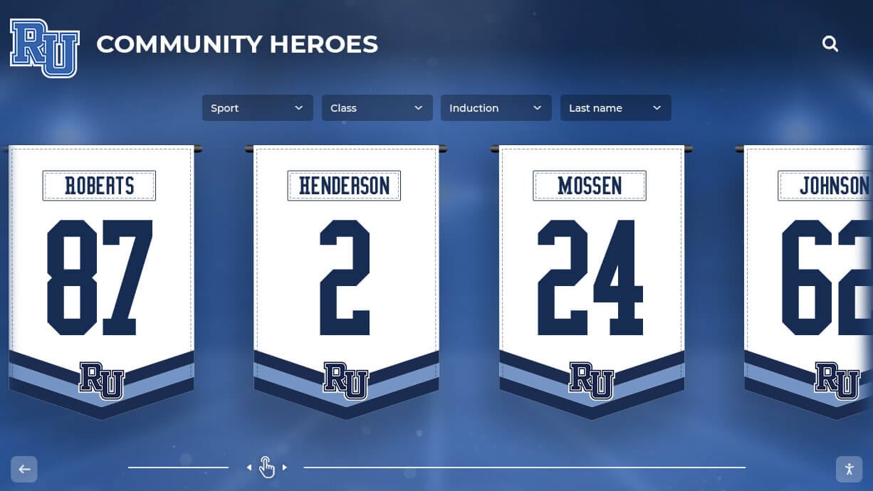
Championship banners installed permanently in school corridors and gymnasiums represent a long-term record of the athletic program — dot-gain compensation preflight before production ensures the school colors printed on the substrate match the approved digital proof rather than a darker, shifted version of it
What Dot Gain Is and Why It Matters for Championship Banners
Dot gain — formally called tone value increase (TVI) — is the physical expansion of printed ink dots beyond their intended size during the printing process. When ink is deposited on a substrate, it spreads into the material rather than landing precisely within the boundaries specified in the digital file. The result is that a halftone dot specified at 50% of the print area can physically cover 65% or more of the surface, making that region appear noticeably darker than the digital proof predicted.
For championship banners, dot gain matters because:
- School color accuracy depends on precise CMYK ink builds. A navy blue defined as C:100 M:80 Y:0 K:20 was calibrated for a specific substrate. On a banner vinyl that causes 20% more dot gain than coated paper, that same ink build prints as a heavier, darker navy — potentially indistinguishable from flat black at the viewing distance of a gymnasium installation.
- Photographs lose midtone and highlight separation. A team photograph with bright highlights and crisp uniform detail has its tonal range compressed when midtones gain significantly. What reads as a well-exposed photograph at proof becomes a low-contrast print with blocked shadows and flat midtones on a high-dot-gain substrate.
- Small type fills in. Reversed white type on a dark school-color background depends on precise ink placement to maintain the white counter spaces of each letterform. Dot gain on the surrounding dark ink field can close in on those white areas, making small type difficult to read at production size.
According to the International Organization for Standardization’s ISO 12647-6 standard for large-format display printing, tone value increase values for large-format inkjet substrates typically range from 18% to 30% at the 50% nominal tone value — significantly higher than the 10–17% specified for commercial sheetfed offset printing on coated stock. That elevated range is why championship banner files cannot simply reuse CMYK values approved for a printed game program, sports banquet collateral, or other coated-paper output. A sports banquet program printed on coated stock and the championship banner hanging in the same gymnasium may share identical school-color specifications in the brand standards document, but each requires substrate-specific verification before production.
How Banner Substrates Amplify Dot Gain Compared to Standard Print Stock
Not all substrates behave the same way. The dot gain characteristics of a banner material depend on its surface texture, absorption rate, and the ink type the vendor uses. Understanding which substrate category the championship banner will be printed on determines the appropriate compensation target.
Outdoor vinyl (solvent or latex inkjet): The non-porous surface of smooth vinyl creates high optical dot gain — ink droplets spread laterally before drying, and the specular surface optically amplifies the apparent tone value of the ink layer. Total dot gain on smooth vinyl at 50% often reaches 22–28%.
Polyester fabric (dye sublimation or direct-print): Ink absorbs into polyester fibers and wicks slightly before bonding. Dye sublimation printing transfers ink through heat, which can introduce additional bleed; direct-print fabric adds fiber-level absorption. Combined dot gain on polyester fabric at 50% can reach 25–35%.
Mesh banner (vinyl mesh for ventilated outdoor banners): The mesh structure creates open voids that physically interrupt the ink layer. Printing must compensate both for dot gain in the solid ink zones and for the visual effect of the mesh pattern on the finished color appearance. Effective dot gain on mesh substrates varies considerably by mesh density and is best evaluated through press proof rather than simulation alone.
Backlit film (for illuminated banner panels): Backlit substrates have a different white point when illuminated versus when photographed for a proof. Dot gain is compounded by the fact that light transmission through the ink layer changes perceived tone values under illumination. Championship banners intended for backlit display cases or illuminated athletic corridor panels require substrate-specific proofing under the intended illumination source.
Championship banners are produced across every sport — from football and basketball programs to swim teams and youth athletics — each sport using a substrate appropriate for its installation environment. That range of substrates means there is no universal CMYK ink-build compensation that applies to all banner productions; the preflight process must be tailored to the vendor and substrate combination for each order.
The Effect of Uncorrected Dot Gain on School Color Elements
The following table shows the expected effect of uncorrected dot gain on the most common championship banner content categories. Use this during art review to identify which elements in the specific banner file carry the greatest risk from substrate dot gain.
| Content Category | Uncorrected Dot Gain Effect | Visual Risk Level |
|---|---|---|
| Dark school-color background field (navy, maroon, forest green) | Prints darker than approved; loses distinction from flat black | High |
| Team photograph with dark uniforms | Shadows block up; midtone tonal separation reduced | High |
| School-color type on white background | Slightly heavier weight; may affect fine type at production size | Medium |
| White reversed type on dark school-color field | Counter spaces fill in; legibility reduces at small sizes | High |
| Mascot art with gradient shading | Gradient collapses in darker tone zones; dimensionality lost | Medium |
| Photographic highlight detail | Highlight tones shift darker; white jerseys and numbers go gray | Medium |
| School seal or crest with fine lines | Fine lines thicken; thin strokes merge with adjacent color fields | High |
For championship banners that combine multiple content categories — team photos, reversed type, and a dark school-color background — uncorrected dot gain affects each element simultaneously, compounding the overall quality difference from the approved proof.
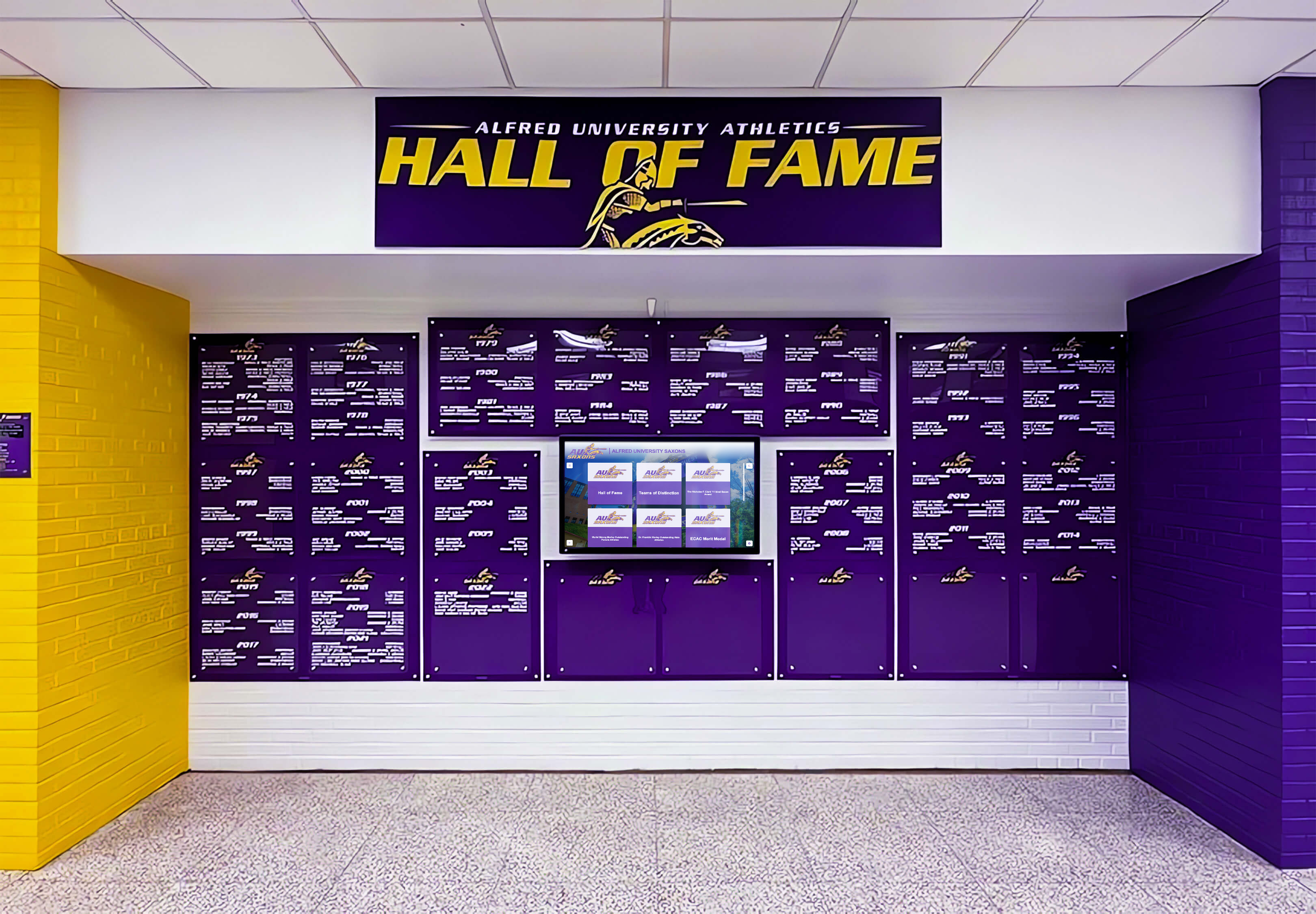
Deep school colors such as dark purple fall in the tone zone where banner substrate dot gain causes the most visible shift — a dot-gain compensation preflight ensures the ink build specified for each school color matches what the chosen substrate will actually reproduce at installation
Step-by-Step Championship Banner Dot-Gain Compensation Preflight
This seven-step workflow applies to championship banner artwork at the production approval stage — before the file is submitted to a commercial large-format vendor.
Step 1: Confirm the Substrate and Request the Vendor’s ICC Profile
Before opening the design file, confirm in writing with the print vendor:
- The exact substrate material they will use (e.g., 13 oz. smooth vinyl, 8 oz. polyester fabric, 6 oz. mesh).
- Whether they have a substrate-specific ICC profile available for soft proofing. Most professional large-format vendors maintain ICC profiles for their commonly used substrates and ink combinations — request the profile by email and confirm the profile name and revision date.
- Whether the vendor applies dot gain compensation curves at their raster image processor (RIP), and if so, what compensation target they apply at 50% tone value.
If the vendor applies compensation at the RIP and expects files delivered in an RGB source profile, do not apply additional dot gain compensation in the design application — double compensation produces results lighter and less saturated than intended. Clarify the hand-off protocol before proceeding.
Step 2: Assign the Vendor’s ICC Profile for Soft Proofing
Once you have the vendor’s ICC profile:
- In Adobe Photoshop: Go to View > Proof Setup > Custom. In the Device to Simulate field, navigate to the vendor’s profile. Set rendering intent to Relative Colorimetric. Check Simulate Paper Color to simulate the substrate’s white point, which is particularly important for fabric and mesh substrates where the base material is not pure white.
- In Adobe InDesign: Go to View > Proof Colors after setting up the proof via View > Proof Setup > Custom. Use the same profile and intent.
- In Adobe Illustrator: The same View > Proof Setup > Custom workflow applies.
With the soft proof active, review the banner layout systematically. Compare the soft-proofed view against the approved proof or screen design. School colors that appear noticeably darker, heavier, or less saturated under the substrate profile indicate that the file’s current CMYK ink values will reproduce differently on the substrate than on the standard CMYK proof.
Step 3: Evaluate School Color CMYK Builds Against the Substrate Profile
The school’s brand standards specify CMYK ink-percentage builds for primary and secondary school colors. These builds were defined for a standard coated-paper output and may not be appropriate for a high-dot-gain banner substrate.
For each named school color in the banner artwork:
- Locate the current CMYK ink values in the design file — use Photoshop’s Info panel or InDesign’s Color panel with the cursor over a solid color field.
- Soft-proof the current values using the vendor’s substrate profile.
- Compare the soft-proof result against the school’s physical color standard: a Pantone spot-color chip, a calibrated printed color swatch, or a digitally archived color reference.
- If the soft-proofed result is visibly darker than the color standard, the ink build requires compensation. The degree of reduction depends on the substrate’s specific dot gain curve, but a working reduction target of 10–15% across all CMYK channels is a common starting point for high-dot-gain vinyl and fabric substrates — confirm the specific target with the vendor’s ICC profile data or their published substrate specifications.
Step 4: Check Total Area Coverage (TAC)
Total area coverage (TAC), also called total ink coverage, is the sum of all CMYK ink percentages at any single point in the artwork. High TAC values cause ink saturation problems on banner substrates: the substrate cannot absorb or cure all ink channels at high coverage levels, resulting in bleeding, offsetting, or color contamination.
Standard coated-paper printing tolerates TAC up to 300–320%. Most large-format banner substrates specify a maximum TAC of 200–260% in vendor file preparation guidelines. Check your artwork using:
In Adobe Photoshop:
- Go to Edit > Convert to Profile and convert to the vendor’s CMYK profile.
- Open Window > Info and set a secondary readout to Total Ink.
- Move the cursor over the darkest, most ink-heavy areas in the layout — typically dark school-color fields overlapping with mascot artwork or reversed type.
- Identify any areas where Total Ink reads above the vendor’s specified maximum, and flag them for reduction before export.
Rich black backgrounds such as C:60 M:40 Y:40 K:100 can push TAC above 240% by themselves. The championship banner rich black setup guide covers TAC management for black elements in full detail.
Step 5: Inspect Small Type and Fine-Line Artwork
Small type and fine-line elements — school crests, seal borders, trophy engravings reproduced photographically — require individual inspection for dot gain vulnerability.
For reversed white type:
- At 100% display zoom, measure the counter (enclosed space) size of the smallest type on the layout. If counters in letters such as e, a, and s, or tight spacing in condensed typefaces are narrow, they are at risk of filling in when surrounding ink spreads.
- Confirm minimum type size against the vendor’s specifications for the intended substrate. Many large-format vendors specify minimum legible reversed type sizes for each substrate category.
- Enable Overprint Preview in Acrobat or InDesign to confirm reversed type is set to knockout — not overprint — before checking dot gain vulnerability. White type set to overprint is invisible in print regardless of dot gain. The championship banner overprint preview checklist covers overprint verification in full detail.
For fine-line mascot art and school crests:
- At 100% display zoom with soft proofing enabled, evaluate whether fine strokes and detail lines retain their visual separation from adjacent dark ink fields.
- Strokes thinner than 1.5 points (0.53 mm) are at risk of merging with adjacent colors on high-dot-gain substrates.
Step 6: Review Photographs for Highlight and Shadow Detail
Team photographs and athletic action images require evaluation at both ends of the tonal range.
Highlights: Enable soft proofing with Simulate Paper Color checked. Assess the highlight regions of the photograph — white jerseys, bright athletic equipment, light-colored court surfaces — under the substrate profile. If the substrate’s white point causes highlights to shift noticeably gray under the simulation, the photograph’s highlight levels need to be pulled slightly lighter in the source file, or you need written confirmation from the vendor that their RIP applies a highlight correction for that substrate.
Shadows: Confirm black-point compensation is enabled during any RGB-to-CMYK conversion. Dot gain in shadow zones compounds with shadow compression from the color conversion; a photograph converted to CMYK without black-point compensation on a high-dot-gain substrate loses shadow detail at both the conversion stage and the substrate stage simultaneously.
Step 7: Generate a Preflight Record and Request a Press Proof
Before marking the file approved for production:
- Document the substrate name, vendor ICC profile filename, and TAC limit confirmed from the vendor’s specifications.
- Record the school color CMYK builds used in the file and whether any were adjusted for substrate dot gain compensation.
- Note any small type or fine-line elements flagged during inspection and their confirmed minimum sizes.
- Request a physical press proof from the vendor on the actual production substrate before approving full-run production. A digital soft proof approximates dot gain behavior using a mathematical model; a physical press proof confirms the actual output under the vendor’s specific inks, RIP settings, and substrate combination.
For championship banners that will hang permanently in a gymnasium or athletic facility — examined by athletes, students, and families who attended the season the banner commemorates — a press proof is the most reliable quality gate available before the production run commits the design to permanent installation.
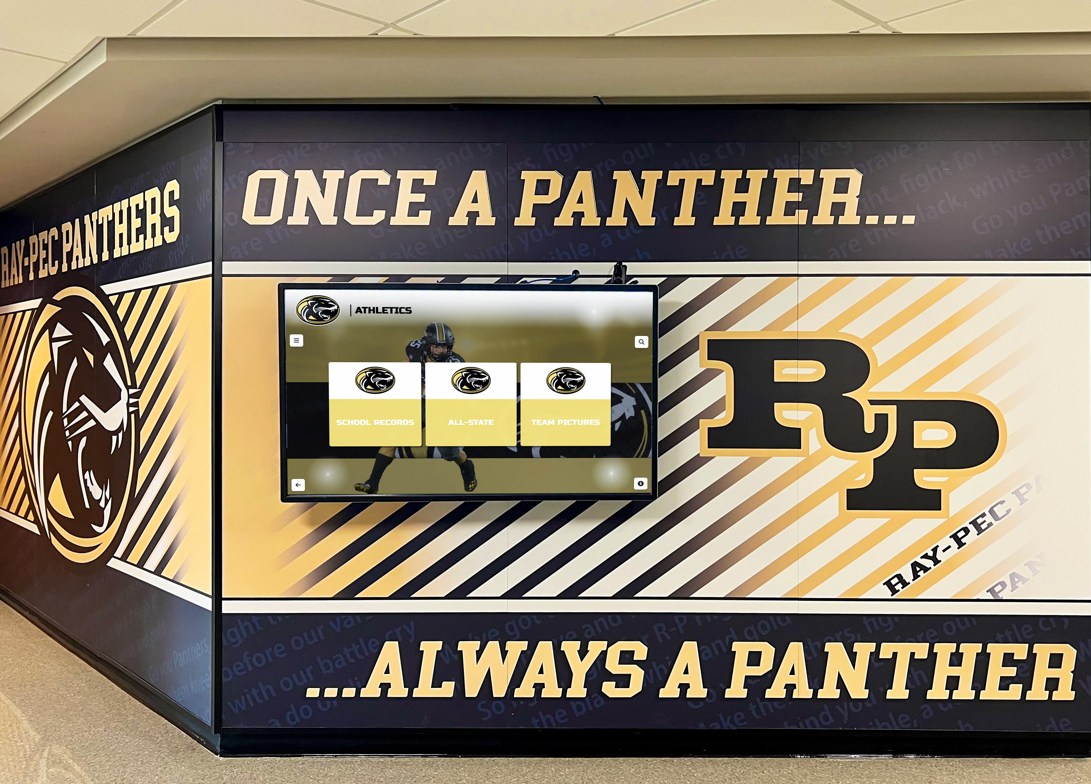
Physical banners and digital displays often share corridor and gymnasium wall space — dot-gain-compensated banner production ensures the printed school colors match the digital equivalents visible on nearby screens, reinforcing a consistent visual identity across both media
Common School Color Scenarios and Dot Gain Resolutions
School Navy Blue on Smooth Vinyl
The scenario: The championship banner features a full-bleed navy background. The school’s brand standards specify C:100 M:72 Y:0 K:18 as the CMYK build for navy, calibrated for 100 lb. coated paper. On 13 oz. smooth vinyl, the dot gain for cyan and black at high ink percentages causes the navy to print nearly indistinguishably from flat black.
Resolution: Request the vendor’s ICC profile and soft-proof the existing build. If the proofed result is darker than the school’s reference swatch by more than a half-step, reduce the C and K channels proportionally — a starting-point adjustment might be C:85 M:62 Y:0 K:10 — and re-proof. Confirm with the vendor whether their TAC limit would cap the original build. Athletic programs that use championship banners to honor youth athletes of the year deserve a finished banner that presents the school’s official navy, not a flat-black approximation of it.
Dark Maroon Championship Lettering on White Vinyl
The scenario: Large championship lettering in the school’s maroon — C:20 M:95 Y:50 K:30 — is positioned over a white vinyl field. The maroon should read distinctly from generic brown or dark red. On a high-dot-gain vinyl substrate, increased dot spread in the M and K channels pushes the maroon toward a darker, less saturated hue.
Resolution: Reduce the K channel first — K ink contributes most to darkening without contributing to the color identity of maroon. Reducing K from 30 to 15–20, soft-proofed on the vendor’s profile, often brings the maroon back into acceptable range without requiring adjustment to the M channel that defines the color. Championship banners that recognize wrestling and multi-sport champions should carry the school’s authentic maroon identity regardless of the production substrate.
Small Reversed Type in School-Color Bands
The scenario: Athlete names, graduation years, and record statistics are set in white reversed type at 12–14 pt within a dark green school-color band running along the bottom of a championship banner. On the substrate soft proof, the type appears marginally acceptable, but the counter spaces in lowercase letters look tight.
Resolution: Increase the type size to 14 pt minimum, or switch to a heavier weight of the same typeface where stroke widths are wider and counter spaces proportionally larger. Confirm with the vendor whether their specific substrate-and-ink combination for dark green fields has a historical minimum type size recommendation for reversed type. Annual recognition banners displayed in school athletics halls alongside senior recognition materials depend on legible, durable type to faithfully record each athlete’s name for the program’s long-term history.
Team Photograph on Polyester Fabric Banner
The scenario: A team photograph taken in indoor gymnasium lighting is placed prominently on a polyester fabric championship banner. The vendor uses dye sublimation printing on 6 oz. knit polyester. The photograph was provided by the team photographer as a JPEG in sRGB.
Resolution: Convert the sRGB image to the vendor’s dye-sublimation CMYK profile using Relative Colorimetric rendering intent with black-point compensation enabled. On the soft proof, evaluate the highlight zones with Simulate Paper Color checked — the off-white base of polyester fabric shifts apparent highlights. If white jersey lettering or light court flooring shifts noticeably gray under simulation, apply a Levels adjustment to pull photographic highlights slightly lighter before conversion. Evaluate the physical press proof under the same lighting conditions typical of the gymnasium installation environment.
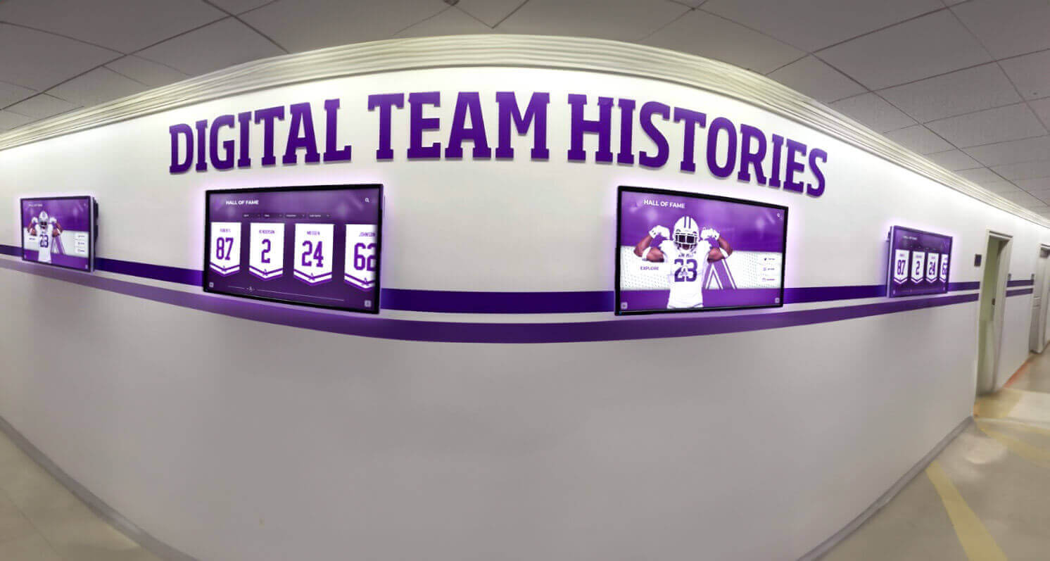
Championship records on digital screens and printed banners installed side by side in the same corridor are compared by visitors every day — a dot-gain compensation preflight prevents a visible color mismatch between the printed and digital versions of the same school colors
Connecting Championship Banner Preflight to Your Broader Recognition Program
A championship banner dot-gain compensation preflight does not exist in isolation — it intersects with the same school color standards that govern digital recognition displays, printed game programs, graduation honor materials, and athletic recognition collateral across the school year. The navy blue that requires dot-gain adjustment on a banner vinyl substrate will reproduce accurately on a calibrated digital display without any adjustment; those two outputs trace back to the same CMYK or Pantone reference, processed through different reproduction technologies.
Schools that recognize athletes through multiple channels — championship banners, digital hall of fame displays, printed programs, and annual award ceremonies — benefit from maintaining a centralized school color reference that documents both the intended color values and the substrate-specific adjustments applied for each output. When school yearbook cover designs and gymnasium championship banners use the same verified school color standards, the visual identity of the program reinforces itself across every format students and families encounter.
Programs that celebrate student achievement broadly — from athletic championships to academic Latin honors at graduation — produce physical and digital recognition materials across many substrates and output formats. Applying a dot-gain compensation preflight to championship banners ensures those materials faithfully represent the school’s brand alongside each other throughout the program’s history.
For programs that recognize outstanding young athletes, the championship banner may be the most visible and durable artifact of that recognition — permanently installed in a gymnasium or corridor, viewed by every student who passes through for years after the season ends. The preflight step that ensures those school colors are accurate is proportional in effort to the permanence of the installation it protects.
Designing championship banner graphics with accurate school colors?
Rocket Graphics is building an AI-powered platform to help school staff create championship banner artwork and athletic recognition graphics with school colors built in from the start — no design experience or manual CMYK conversion required.
Get notified when Rocket Graphics opens.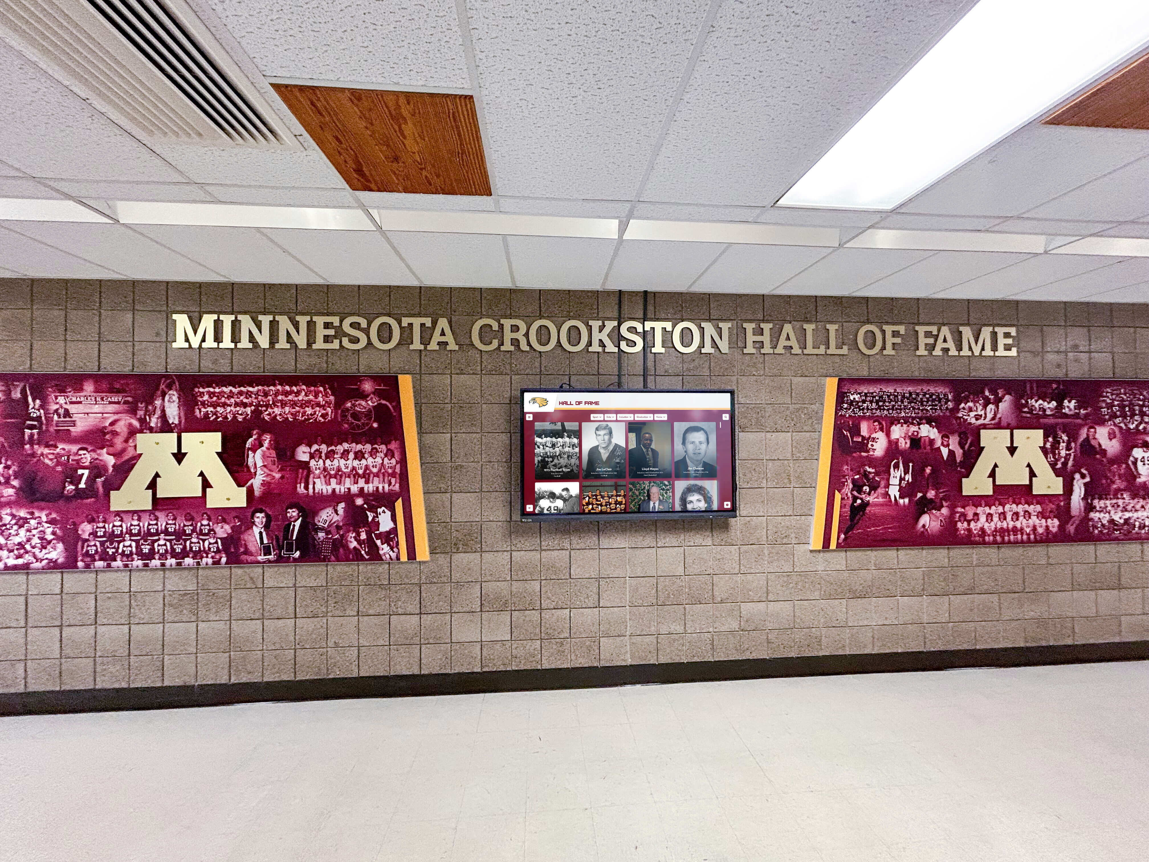
Maroon championship banner artwork requires dot-gain compensation to prevent the finished banner from printing as a darker, less-identifiable version of the school's official color on high-gain vinyl and fabric substrates installed in gymnasiums and corridors
Frequently Asked Questions About Championship Banner Dot-Gain Compensation Preflight
What is dot gain and why does it affect championship banner printing?
Dot gain (tone value increase) is the physical expansion of printed ink dots beyond their specified size as ink spreads on the substrate surface. Banner substrates — vinyl, polyester fabric, and mesh — have higher dot gain than coated paper, which causes school colors and photographs to print darker and less detailed than the digital proof. A dot-gain compensation preflight adjusts the source file’s ink values or confirms the vendor’s ICC profile will manage the compensation, before any ink is committed to production.
How much dot gain should I expect on a vinyl championship banner?
Most smooth vinyl substrates used for championship banners produce a tone value increase (TVI) of approximately 18–28% at the 50% nominal tone value under typical large-format inkjet production conditions, as referenced in ISO 12647-6 guidance for large-format display printing. The specific value depends on vinyl weight, surface finish, ink type, and the vendor’s RIP settings. Request the vendor’s ICC profile and press-proof data for the specific substrate rather than applying a generic estimate for production-critical school color approval.
Can I use the same CMYK ink builds from the school’s brand standards for a championship banner?
Not without verification. School brand standards define CMYK builds calibrated for standard coated-paper output. Those values will reproduce differently on a banner substrate with higher dot gain, printing darker and less saturated than intended. Run a soft proof using the vendor’s substrate ICC profile before approving the file, and compare the result against the school’s physical color reference. Adjust ink percentages if the soft proof diverges noticeably from the reference, and document the adjusted values for future banner productions on the same substrate.
What is the maximum total ink coverage I should use for a vinyl championship banner?
Most large-format vinyl banner vendors specify a maximum TAC of 200–260%, compared to 300–320% for standard coated-paper offset printing. Check the vendor’s file preparation specifications for the exact limit, as it varies by substrate, ink type, and RIP settings. Exceeding the substrate’s TAC limit causes ink saturation failures — including color bleeding, offsetting, and drying problems — that cannot be corrected after production. The championship banner rich black setup guide covers TAC management for dark elements specifically.
Do I need a physical press proof for a championship banner, or is a soft proof sufficient?
A soft proof using the vendor’s ICC profile is the minimum quality gate for a dot-gain compensation preflight. For championship banners that will be permanently installed in a gymnasium or athletic facility — viewed by athletes, families, and visitors for years — a physical press proof on the actual production substrate is strongly recommended. Soft proofs simulate substrate behavior using mathematical color models; a physical press proof confirms the actual output under the vendor’s specific ink, RIP, and substrate combination, including any dot gain behavior that the ICC profile does not fully model.
A Dot-Gain Compensation Preflight Protects Every Championship Banner It Clears
A championship banner dot-gain compensation preflight is one of the most reliable steps available to prevent a visible quality gap between the approved digital proof and the finished banner installed in a gymnasium. It requires a vendor email to request the ICC profile, a soft-proof review session in the design application, a TAC check, and a physical press proof for production-critical school colors — effort that is negligible compared to the cost of a reprint or the permanent installation of a banner where school colors printed darker than the program intended.
The workflow is straightforward: confirm the substrate and request the vendor’s ICC profile, soft-proof school color builds and photograph elements against that profile, check total area coverage against the substrate’s published limit, inspect small type and fine-line art for dot-gain fill-in risk, and request a physical press proof before approving the production run. Apply that workflow consistently to every championship banner file and the finished banners will represent the athletic program’s school colors faithfully — season after season, at every viewing distance, for every student and visitor who sees them.
Rocket Alumni Solutions builds championship banner graphics tools and recognition display systems designed with school color accuracy as a first-order requirement throughout the production workflow.
Create Championship Banner Graphics with School Colors Built In
Rocket Graphics is building an AI-powered platform that gives school staff tools to create championship banner artwork, athletic recognition graphics, and social media content with accurate school colors — no design experience or manual CMYK conversion required.
Get notified when Rocket Graphics opens.