Choosing the best fonts for sports graphics is one of those design decisions that looks obvious when done right and glaring when done wrong. The right typeface makes a halftime score update readable from across a gymnasium, a player spotlight post legible on a phone screen in bright sunlight, and a hallway recognition display look polished and permanent. The wrong one turns an otherwise well-designed graphic into a blur of overlapping letters nobody can read at game speed.
This guide covers the full range of type choices for school athletic graphics — from the condensed bold sans-serifs that dominate scoreboards and social media to the serif options that give hall-of-fame walls and record boards their sense of authority. Whether your athletic department is building a consistent graphic system from scratch, refreshing a visual identity that has gotten inconsistent over the years, or simply trying to figure out why your current graphics look “off,” understanding the underlying principles of sports typography is where to start.
Why Font Choice Defines Sports Graphic Readability
Typography in sports graphics is a performance requirement, not a preference. Every sports graphic is produced under time pressure and consumed in a distracted environment: a phone scrolling feed, a crowded gymnasium lobby, a hallway visited between classes, a touchscreen kiosk navigated by someone who has thirty seconds to find what they’re looking for. In each of those contexts, the typeface either enables fast reading or gets in the way of it.
According to the Nielsen Norman Group, users read on-screen text at roughly 20–28% slower than they read print, and their reading pattern is non-linear — they scan for key information rather than reading left to right. For school athletic graphics, this means every typographic decision is really a decision about what information can be found in under three seconds. The score. The player’s name. The school. If your typeface slows down any of those reads, it has failed its primary job.
The environments where sports graphics live create specific readability demands:
Social media feeds — viewed at 390–430px wide on a phone screen, in 2–5 second attention windows. Type must read at thumbnail size.
Hallway and lobby digital displays — viewed from 6–15 feet away, often in motion. Letterforms need significant weight and height to remain legible at viewing distance.
Scoreboards and record boards — viewed from 30–60 feet, often under variable lighting. The highest-contrast, most condensed bold type works best here.
Touchscreen kiosks and recognition walls — viewed up close, interactive, with multiple text sizes coexisting on screen. A clear typographic hierarchy — different sizes and weights for different information levels — matters as much as any individual font choice.
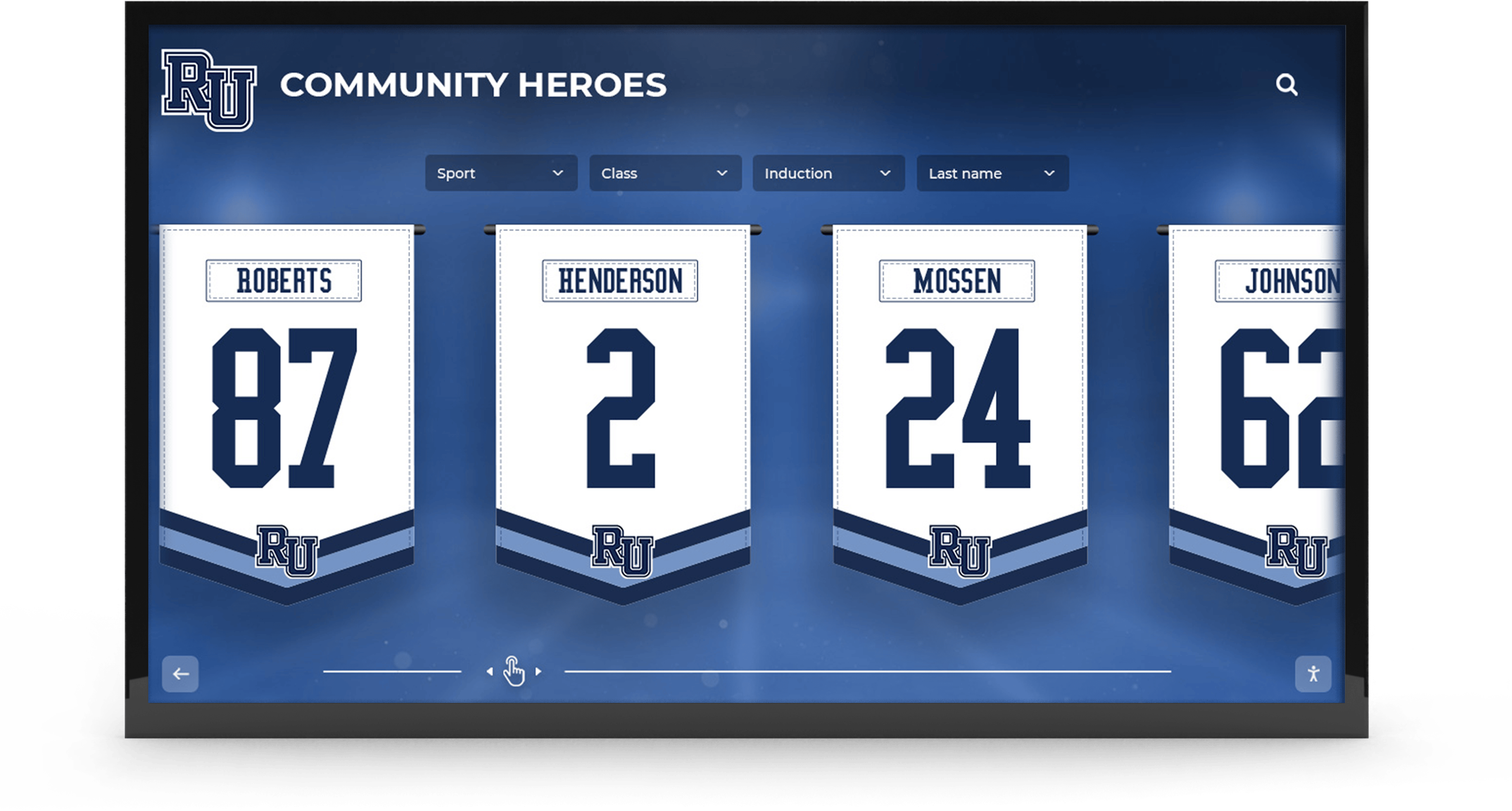
Digital trophy cases and recognition displays for schools illustrate this hierarchy problem clearly: a display needs to communicate a student athlete’s name, sport, achievement, and year simultaneously — and each level of that information needs to be readable independent of the others.

Multi-element school athletic recognition graphics like this community heroes display require typography that creates clear visual hierarchy — name, number, school, and recognition level must each read independently without competing for attention
Core Characteristics of Effective Sports Graphic Fonts
Before getting into specific font recommendations, it’s worth establishing the characteristics that separate a font that works in sports graphics from one that merely looks athletic.
High x-Height
The x-height is the height of lowercase letters relative to the capital letters in a typeface. Fonts with a high x-height — where lowercase letters are relatively tall compared to the caps — are more legible at small sizes and at distance because each letter occupies more visual space. In sports graphics, where text is often small relative to the overall composition, high x-height fonts read more clearly in tight spaces.
Strong Stroke Contrast (or Lack Thereof)
Fonts with very high contrast between thick and thin strokes — elegant for editorial typography — create legibility problems at small sizes and on screens because thin strokes can disappear or blur. For sports graphics, low-contrast or no-contrast typefaces (where all strokes have similar weight) maintain legibility across sizes and screen resolutions.
Condensed Width for Space Efficiency
Sports graphics are dense with information. Score + opponent + time + sport in a single graphic requires type that occupies horizontal space efficiently. Condensed typefaces — versions of a font with letterforms narrower than standard — solve this problem, allowing more text to fit in a graphic without shrinking the point size below readable levels.
Open Letter Spacing
Letters that are too tightly spaced become difficult to distinguish at distance or small size. The letters “rn” in a tightly spaced typeface can read as “m”; “cl” can read as “d.” Open letter-spacing (sometimes called tracking) maintains distinction between individual characters, which matters most for player names and team names where a misread creates communication failures.
Bold Weight Availability
For the primary information in a sports graphic — the score, the athlete name, the win/loss result — a bold or extra-bold weight is almost always necessary. Typeface families with robust bold options give designers a full range of emphasis tools rather than forcing the use of fake bold (which distorts letterforms).
The Best Fonts for Sports Graphics: Sans-Serif Workhorses
The majority of effective sports graphics typography is built around sans-serif fonts — letterforms without the small horizontal strokes (serifs) at the ends of letter arms. Sans-serif fonts tend to read more cleanly on screens and at distance because there are fewer fine details to blur or disappear under viewing constraints.
Bebas Neue
Bebas Neue is the all-caps condensed display font that appears on a significant portion of sports graphics produced for school and amateur athletics. Its defining characteristics: zero x-height variation (it only has capitals), extreme condensed width, uniform stroke weight, and extremely high visual impact at large sizes. A score in Bebas Neue at 72pt is readable from the other side of a gymnasium.
The limitations are real: it has no lowercase, making it unsuitable for body text or multi-sentence content. It’s best reserved for the primary information element in a graphic — score, name, number — while a secondary font handles supporting information.
Impact
Impact was designed specifically for newspaper headlines, which means it was built for maximum information density at high contrast on low-quality print surfaces. In sports graphics, its ultra-condensed, heavy-weight letterforms produce score and name treatments that read at any size. It’s one of the most screen-familiar typefaces in existence, which both gives it broad readability and marks it as somewhat overused in amateur sports graphics.
Oswald
Oswald is a refined, screen-optimized version of the classic condensed gothic typeface style. It’s available in six weights (ExtraLight through ExtraBold), giving designers a complete toolkit for creating typographic hierarchy within a single font family. The ExtraBold weight performs excellently as a primary display element; Regular works well for secondary text. Oswald’s strong x-height and open letter forms make it one of the most reliably legible options for school sports graphics across screen sizes.
Barlow Condensed
Barlow Condensed is a geometric sans-serif with a contemporary, clean aesthetic that works at any size. Its nine weights — from Thin through Black — provide more typographic range than most competing condensed fonts. The Medium and SemiBold weights are particularly effective for secondary text on sports graphics, where something heavier than Regular but lighter than Bold is often needed to create information hierarchy without visual noise.
Rajdhani
Rajdhani brings a slightly technical, precision-oriented aesthetic that works well for athletics contexts where the visual language should communicate performance and accuracy. It’s not as visually loud as Bebas or Impact, which makes it well-suited for school recognition displays, record boards, and hall-of-fame installations where authority matters more than visual aggression.
School sports bulletin boards and wall recognition displays often benefit from typefaces like Rajdhani precisely because they need to be present and readable without dominating the room — the athlete and achievement are the visual focus, not the typography.

Hallway digital displays for team histories require a typographic hierarchy that allows visitors to read primary information (team name, year, championship) at walking speed — with secondary details available to those who stop to look closer
Display Fonts: When Impact Is the Goal
Not all sports graphics require maximum readability efficiency. Some — game day posters, championship announcements, senior night designs, and spirit week graphics — are designed to stop the scroll or command attention on a hallway wall. For these, a wider category of display fonts becomes available.
Freshman (Varsity-Style Block Letters)
The varsity block letter aesthetic — thick, rounded, interlocking letters styled after traditional athletic letterman jackets — reads instantly as “school sports.” Freshman and similar varsity-style fonts work well for graphic headers, homecoming announcements, and spirit campaign graphics where the athletic identity signal is more important than information density.
Use sparingly and only for short text (team names, single words, slogans). At more than four or five words, varsity block letters become difficult to parse quickly.
College Fonts and Collegiate Serifs
Collegiate or university-style serif fonts communicate academic athletic tradition — the kind of visual language associated with established athletic programs that have been competing for decades. These fonts work well for hall-of-fame induction graphics, athlete recognition posts that emphasize career achievement, and display applications inside school buildings where the environment calls for permanence.
Archival display programs for schools frequently use collegiate serif typography precisely because the goal is to communicate that the program’s history is worth preserving and displaying with authority — not just promoting a current season.
Tungsten and Anton (Heavy Display Options)
Tungsten and Anton are heavy, condensed display fonts that perform like Impact but with more refined letterforms. They’re well-suited for score graphics, win-result announcements, and any format where a single piece of information — the final score, the player’s name, the record broken — needs to command the entire visual field.
School Display Typography vs. Social Media Typography
The font that works perfectly on a social media post may be entirely wrong for a hallway recognition display — and vice versa. The two environments have different size constraints, viewing distances, viewing durations, and aesthetic expectations.
Social media sports graphics are viewed on phone screens, in scroll feeds, at varying brightness levels. The primary constraint is size: if a graphic is shared as an Instagram Story or feed post, the text must read at the phone’s native display size without zooming. This environment favors high-contrast, high x-height fonts at large point sizes. Secondary information (opponent name, game location, date) should be in a smaller but still clearly distinct size and weight.
Hallway and lobby digital displays are viewed at 6–15 feet by audiences in motion. The primary constraint is viewing distance and ambient lighting. Type needs to be large enough to read while walking past, and the color contrast between type and background needs to be high enough to remain legible under overhead fluorescent or LED lighting. Sans-serif fonts at bold weights outperform fine-detail typefaces in this environment without exception.
Touchscreen recognition kiosks are viewed up close, interactive, with variable attention — some users will spend three seconds, others three minutes. The typographic requirement is hierarchy: a clear size and weight system that lets a quick visitor read name and achievement and lets a thorough visitor read full career records and statistics. A two-family pairing — bold condensed sans-serif for names and headlines, regular weight for body information — typically works best.
Scoreboards and record boards are viewed from the greatest distances. The best-performing typefaces here are the most extreme condensed bolds — Bebas Neue, Impact, Tungsten — at the largest sizes the display can accommodate, with maximum contrast (white on dark, or dark on light) between type and background.
Athletic touchscreen displays that serve as living athletic history must balance these reading modes — the same screen may be glanced at by a student walking to class and studied by an alum returning for homecoming.

A school hallway digital display combining mascot branding with recognition content — typography must serve viewers at multiple distances, from the 15-foot walk-by to the 2-foot close read at the touchscreen
Font Pairing for Sports Graphics: The Two-Font Rule
The most reliable typographic approach for school sports graphics is the two-font system: one primary display font for the most important information, one secondary font for supporting text. More than two typefaces in a single graphic almost always creates visual noise that reduces readability rather than enhancing it.
Effective Pairing Structures
Bebas Neue + Oswald Regular — Bebas handles the headline (score, name, result) at large size in all caps. Oswald Regular handles the supporting information (opponent name, date, sport) at a smaller size. The contrast between the extreme weight difference creates clear hierarchy; the shared condensed DNA keeps the pair visually coherent.
Impact + Roboto Regular — Impact dominates the primary field. Roboto Regular, a clean geometric sans-serif optimized for screen legibility, handles all secondary text. This pairing works particularly well for social media graphics where the primary information needs to stop the scroll and secondary details need to be readable without effort.
Montserrat Bold + Montserrat Regular — Single-family pairings are the most visually unified approach. Montserrat’s exceptionally clean geometric forms work across sizes. Bold drives the name and achievement; Regular handles biographical details. This approach is particularly effective for hall-of-fame and recognition display graphics where visual authority matters more than visual drama.
Anton + Lato Regular — Anton is high-impact like Bebas Neue but with slightly more character. Lato Regular is a humanist sans-serif with outstanding legibility at small sizes. This pairing suits programs that want energetic game-day graphics and polished recognition graphics from the same font system.
The pairing principle extends to recognition display platforms. School social media graphic platforms built for athletic departments that allow schools to set a consistent typography system ensure that every graphic produced — whether a game-day score update or an end-of-season award recognition — uses the same two-font system automatically.
Color and Contrast: The Typography Multiplier
A perfect font choice produces bad results in poor contrast conditions. The WCAG (Web Content Accessibility Guidelines) standard for large text is a minimum 3:1 contrast ratio; for normal text, 4.5:1. Sports graphics that aspire to read at distance or at small sizes on phones should target a higher ratio — 5:1 to 7:1 — to account for varied viewing conditions.
The Most Reliable Sport Graphic Color Combinations
| Background | Text Color | Approximate Contrast |
|---|---|---|
| Black | White | 21:1 |
| Dark Navy | White or Light Yellow | 12:1–15:1 |
| Dark Red/Maroon | White | 8:1–12:1 |
| White | Black | 21:1 |
| Gold/Yellow | Black | 7:1–10:1 |
| Gray (medium) | White or Black | Below 4.5:1 — avoid |
Medium-value backgrounds — medium gray, medium blue, medium green — are the most problematic for sports graphics because they sit between light and dark text and provide insufficient contrast with either. The solution is to move to the extreme ends: very dark backgrounds with very light text, or very light backgrounds with very dark text.
Drop Shadows and Outlines
When a graphic’s background includes photography — an action shot, a player photo, a stadium image — the background value varies unpredictably. A text element placed over a player photo may have black text over a dark jersey that’s nearly unreadable. The standard solution: a thin text outline or a soft drop shadow in a contrasting color behind all text elements. This technique adds contrast locally around each letter without affecting the overall graphic aesthetic.
For hallway and lobby digital displays, a semi-transparent dark panel behind text blocks — rather than placing text directly over a variable background — provides more reliable contrast than any shadow technique.
Athletic booster club graphics programs that produce frequent event promotion materials benefit from this dark-panel convention — it standardizes the readability of fundraiser and event graphics without requiring graphic design expertise for each individual production.
Fonts in School Athletic Recognition Displays
The font choices that define a school’s social media sports graphics feed eventually migrate to physical and digital recognition environments — the hallway mural, the trophy case display, the digital record board, the touchscreen hall-of-fame installation. When these environments are designed as a cohesive system, the same typeface families appear across every surface, creating the visual coherence that signals a serious, well-organized athletic program.
For Rocket Alumni Solutions’ touchscreen hall-of-fame and digital recognition systems, typography is one of the first configuration decisions — which font families will display athlete names, achievement dates, and statistical records across the interactive display, and how those choices align with the school’s existing visual identity.
Display headers (athlete names, team names): Bold condensed sans-serif at the largest size. The name should be immediately readable from six feet away on a wall-mounted display.
Sub-headers (sport, year, position): Medium weight sans-serif, two to three sizes smaller than the primary display. Creates clear separation between identification information and contextual information.
Body text (career records, achievements, biographical notes): Regular weight, high-x-height font at a size readable from arm’s length on a touchscreen — typically 14–18pt at full screen dimensions.
School memorabilia displays that feature archival photographs and records alongside typography need the type to have enough visual authority to hold its own next to historical photographic materials without competing with the photographs for attention.

Students engaging with a lobby display at typical informal viewing distance — the font choices for lobby screens must enable quick scanning from several feet away while rewarding closer viewing with readable detail
Quick Reference: Font Recommendations by Use Case
| Use Case | Recommended Font | Weight | Notes |
|---|---|---|---|
| Score / game result graphic | Bebas Neue or Impact | All caps | Largest text in the graphic |
| Player name on social post | Oswald ExtraBold or Barlow Condensed Bold | 36–72pt | Should dominate the graphic |
| Supporting text on social post | Oswald Regular or Roboto Regular | 14–18pt | High contrast background needed |
| Hall-of-fame display header | Montserrat Bold or Rajdhani SemiBold | — | Clean, authoritative |
| Hallway screen text | Anton or Barlow Condensed Bold | — | Minimum 24pt equivalent at display scale |
| Record board | Bebas Neue or Tungsten | — | Maximum contrast, high viewing distance |
| Spirit / poster headline | Freshman (varsity) or Anton | Short text only | Not for body copy |
| Body / detail text | Roboto, Lato, or Open Sans | Regular | Legibility over personality |
Where to Source Sports Graphics Fonts
The majority of the fonts mentioned in this guide are available through Google Fonts at no cost, which means they can be embedded in web-based graphics tools and school display platforms without licensing concerns. Bebas Neue, Oswald, Barlow Condensed, Montserrat, Anton, Rajdhani, Lato, and Roboto are all in the Google Fonts library.
For premium options — Tungsten, FF Din Condensed, and similar commercial typefaces — licensing is typically available through Fontspring or Adobe Fonts, both of which offer institutional licensing appropriate for school districts.
Free social media graphics platforms for schools typically embed a curated set of approved typefaces that work across all graphic types — removing the font sourcing and licensing complexity from the production workflow. If a school’s athletic department is producing graphics at volume across multiple sports and seasons, a platform that handles typography selection as part of the template system eliminates a significant source of visual inconsistency.
Programs that use AI-powered sports graphic generators benefit from having typography handled systematically rather than selected per-graphic — the same font pairing applies to every output, creating a consistent visual identity without requiring a designer to make type choices on every post.

A school hallway combining a mural with an athletic records board — the typographic requirements differ substantially between large-format decorative display and data-dense records communication, often requiring distinct font choices for each context
Typography as the Foundation of Athletic Visual Identity
Typeface choices are not merely aesthetic decisions for school athletics programs — they are decisions about what information gets read, what gets missed, and what impression the program makes every time a graphic appears on screen or on a wall. The best fonts for sports graphics share a common set of characteristics: they’re readable at distance and at small size, they work in high-contrast and low-contrast conditions, they’re available in weights that allow a clear information hierarchy, and they’re visually coherent with each other as a system.
For school athletic departments that want their graphics to look as serious and well-organized as their programs, typography is where that investment pays off most visibly. A consistent two-font system applied across social media, hallway displays, record boards, and recognition walls creates the kind of coherent visual identity that builds program prestige over time — the same way consistent branding builds institutional credibility.
Alumni recognition websites and digital history archives that incorporate consistent athletic program typography across their displays demonstrate how typeface decisions made for current season graphics can anchor a recognition environment that serves the school community for decades.
Frequently Asked Questions About Sports Graphics Typography
What are the best fonts for sports graphics?
The best fonts for sports graphics are condensed, bold sans-serif typefaces that read clearly at small sizes and at distance. Top choices include Bebas Neue and Impact for score and headline graphics, Oswald and Barlow Condensed for balanced display and supporting text, Montserrat Bold for recognition displays, and Anton for high-energy social media posts. These fonts all share high x-height, strong letterforms, and legibility across screen resolutions and viewing distances.
What font is used in most sports graphics?
Bebas Neue and Impact are the most commonly used fonts in amateur and school sports graphics because both produce high-impact, high-legibility results with minimal design effort. Bebas Neue is the current dominant choice for professionally produced athletic graphics; Impact has a longer history but is considered over-used by many designers. Oswald is increasingly popular as a more refined alternative with a complete weight range.
What font is best for digital school hallway displays?
For school hallway and lobby digital displays viewed from 6–15 feet, bold condensed sans-serif fonts — Barlow Condensed Bold, Oswald ExtraBold, or Anton — produce the best results. The most important factor is high contrast (white on dark, or dark on light), a bold weight, and sufficient point size to read at distance. Thin or light-weight typefaces fail at viewing distance regardless of the font family.
Should I use the same font for social media posts and hallway displays?
Using the same font family across social media and hallway displays is ideal for visual consistency, but sizes, weights, and layout must adapt to each environment. A font like Oswald or Barlow Condensed works across both contexts because of its wide weight range — ExtraBold for hallway screen headlines, SemiBold for social media display text, Regular for supporting information. Maintain the font family; adapt the weight and size.
How many fonts should a school sports graphic system use?
A school sports graphic system should use a maximum of two typeface families: one primary display font for headlines, names, and scores, and one secondary font for supporting information. Effective pairings include Bebas Neue with Roboto, Oswald Bold with Oswald Regular (single-family), or Anton with Lato. More than two families creates visual inconsistency without adding clarity.
Build Athletic Recognition Displays That Make Every Letter Count
Rocket Alumni Solutions helps school athletic departments create touchscreen halls of fame, digital record boards, and recognition walls designed for maximum readability — with typography systems that work at every viewing distance, from a student walking past in the hallway to an alum exploring the full program history at a touchscreen kiosk.
Explore Athletic Recognition Solutions